

What are sans serif fonts? Most people who work with a computer are used to reading these names (serif, sans-serif, sans…) on their font list when editing a text document on a word processor or using image edition software to add some text to a photograph.
But for designers, knowing more than the font names are essential.
Sans serif fonts, then, are the ones that don’t have these ornamental lines in them. They started being widely used during the 1920s Bauhaus movement. They were seen as more modern and informal than the usual fonts with serifs that we still see in print and screens.
Today, these sans serif fonts are used in blogs and online articles in newspapers with large bodies of text because their legibility on-screen is excellent. They are also used in small texts, titles, captions… Almost everywhere!
The sans-serif fonts are classified into three or four groups (depending on if you split the last category into grotesque and neo-grotesque or not). Let’s learn about the particularities of each one of them!
See also: 20 Best Creative Custom Fonts PowerPoint Design
Why do typefaces matter?
When you’re writing a marketing pamphlet or creating a poster, the typeface you choose may seem of little importance. But in reality, typefaces make a big impact in conveying your message and capturing the attention of your target audience. Choose the wrong typeface, and your project may not achieve its intended purpose. On the other hand, when you choose a suitable typeface, your message will be more effective and easier to read.
Guide to choosing a typeface
Now you can answer the question, “What are serif and sans serif?” but you may still be wondering how to choose the suitable typeface for your next project. Here are a few tips to help you narrow down your options.
Consider your brand
The quickest way to choose a typeface is to consider your brand’s style using actionfonts.com. Are you youthful and energetic? Or formal and refined? Do you want to show off your modern aesthetic or create an air of authority? As we’ve already discussed, serif and sans serif typefaces give off a completely different vibe, so it’s essential to choose the typeface that matches your brand.
Don’t overdo it
It’s easy to get excited about all your typeface options, but it’s usually best to stick with just one or two fonts per project. Using too many typefaces will confuse the reader and leave your brand lacking a cohesive, recognizable style.
Feel free to mix and match
Though you probably don’t want to choose more than a few typefaces for your project, you should feel free to mix serif and sans serif fonts. Selecting only one typeface category may look a little bland. Choose one typeface for titles and another typeface for the body paragraph to maximize readability and add interest.
Typeface categories
Understanding the connotation of each typeface category can help you choose the right one for your next project. But if you’re used to scrolling through your typeface options and selecting one at random, you may need a more extensive introduction.
There are essentially three different categories of typefaces: serif, sans serif, and script. We’ll dive into the differences between each typeface category below. But for now, it’s essential to keep in mind that since there are thousands upon thousands of typefaces available, being able to decide if you need a serif, sans serif, or script typeface ahead of time will significantly help you in your search.
Once you’ve decided on the particular mood or emotions, you want to evoke with your content, you can match that up with a typeface. Different styles of type create different moods. You need to make sure you’re picking one that matches the tone of your content.
So, what are sans serif fonts? What about serif fonts? How do they differ, and how can you tell them apart?
Sans Serif
Sans serif typefaces are considered more modern than serif typefaces. They lack the strokes that distinguish a serif typeface, hence using the French word “sans,” which means “without.” Sans serif typefaces are often used to signify something clean, minimal, friendly, or modern.
Some of the most popular sans serif typefaces are Arial, Helvetica, Open Sans, Calibri, and Verdana. Sans serif fonts are often used on the web for large text groups because of the lower DPI (dots per inch) that screens have compared to print. Sans serif fonts are generally easier for children to read because they’re simpler.
See also: 20 Best Fonts for Professional PowerPoint: Adios! You Won’t See Arial and Times New Roman Anymore
When is a Sans Serif typeface right for you?
If you want to convey a friendly, approachable vibe, a sans-serif typeface may be the best choice. Many companies choose sans serif typefaces when they want to be seen as young, hip, and casual. Start-up and technology companies often use this category of typeface to convey their relatability and cutting-edge style. As we mentioned above, this is also the preferred font style for designing websites, thanks to the increased readability.
Types of Sans Serif fonts
There are three main types of sans-serif fonts: humanist, transitional, and geometric.
Humanist Sans Serif
Humanist sans serif typefaces emulate calligraphy and have minimalist contrasting strokes. The design of these typefaces is suitable for small text and small text, so they’re often used in government, education, or finance work. Gill Sans and Whitney are considered Humanist sans serif typefaces.
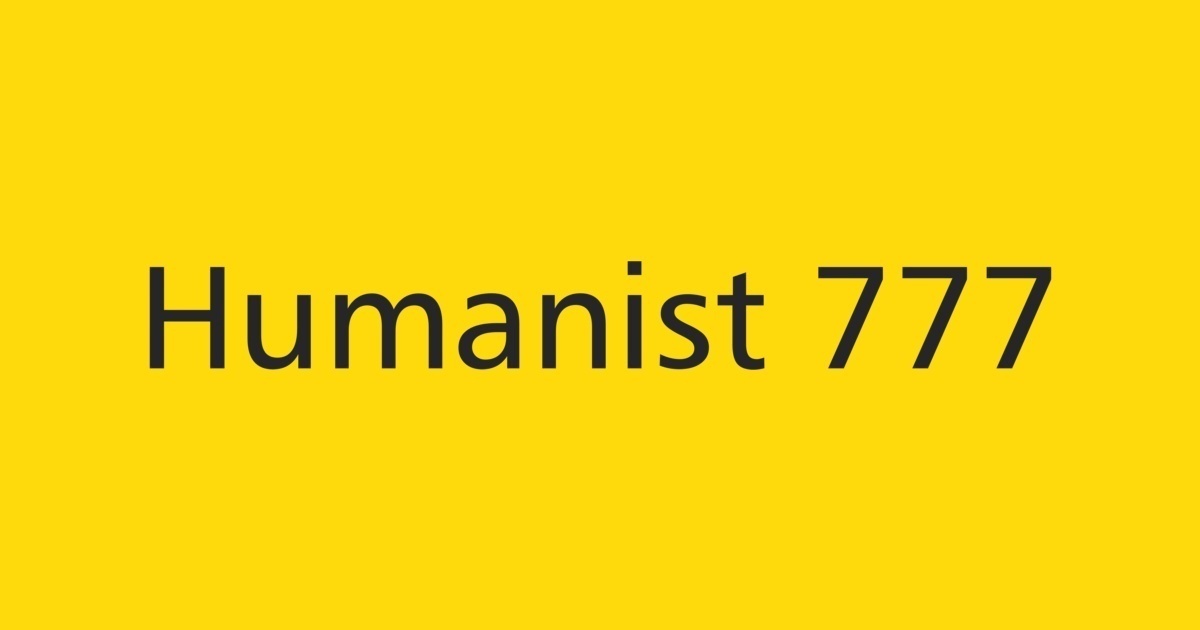
The earliest designs were inspired by classic letters like Roman square capitals. Their designs are more varied than the other categories.
Transitional Sans Serif
Transitional sans serif typefaces have strong strokes and more upright and uniform characters than Humanist typefaces. Their natural and modern feel works great for tech and transportation writing.
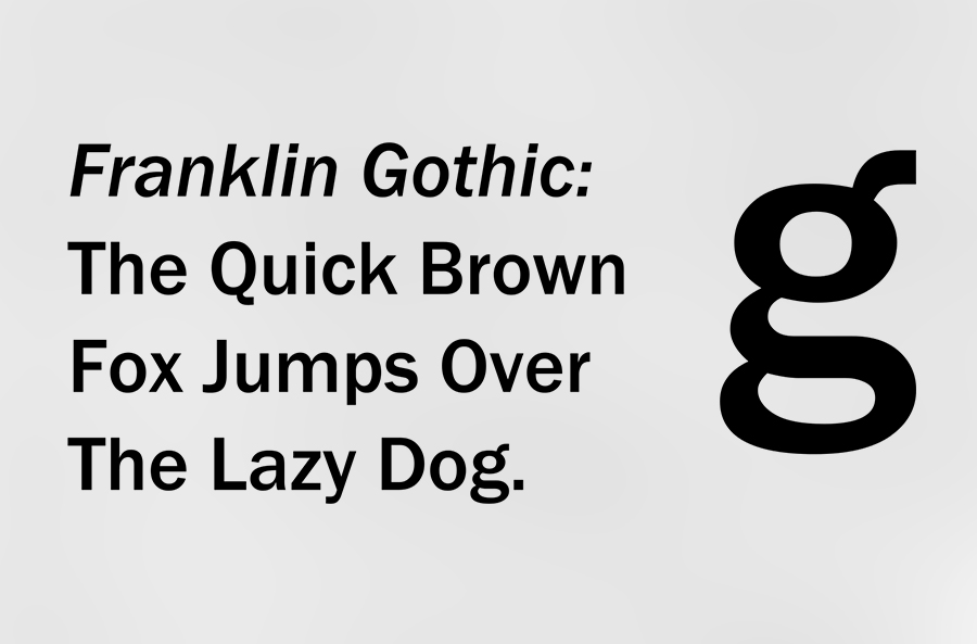
Grotesque Style, the first sans serif designs found from the 19th century to the early 20th. They were solid designs, suitable for advertisements, titles, and posters. The terminals of the curves in these fonts are usually horizontal, and there’s a slight variation in the width of the strokes.
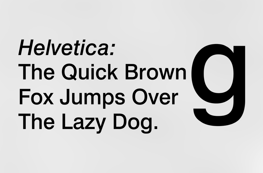
This was the evolution of the previous type, the grotesque. They also have limited variation, but they were more versatile and were very useful for readable bodies of text. They often feature a “folded up”-like design, where the strokes curve and end with horizontal and vertical lines.
Geometric Sans Serif
Geometric sans serif typefaces use geometric shapes to form the backbones of the letters, which creates a strict, objective, and universal feel. The letterforms are often simple. Such letters like “a” with an opening would be circular or square and then repeated with other letters with the same type of opening.
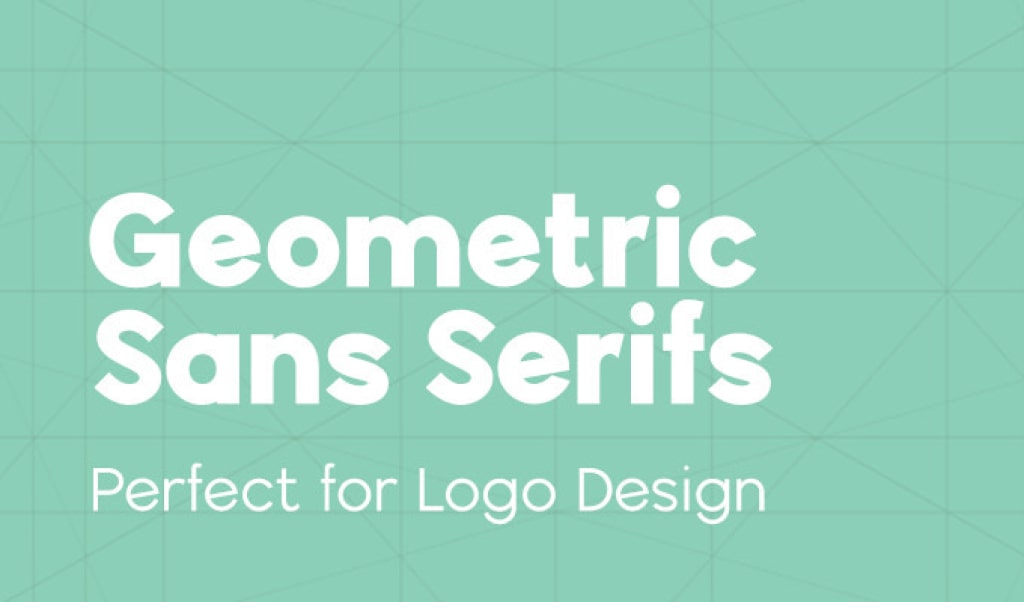
These typefaces have in common that they are designed after geometric elements, such as circles and squares. They became very popular during the 20s and 30s because their design was perceived as modern and clean.
See also: Font Pairing Tips and Tricks for Dummies
Serif
What is a serif font? This typeface is recognizable by the little lines or strokes that extend from letters. As you can see in the text above, the “i” and “f” have distinguishable feet. The “S” also extends down and up at the ends.
When is a Serif typeface right for you?
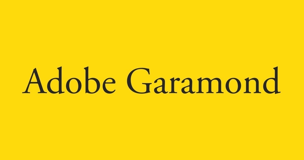
Serif typefaces are some of the older typefaces. Their mood is often classic, romantic, elegant, formal, and established because of their age. Some well-known serif typefaces include Times New Roman, Georgia, and Garamond.
Many people believe that serif typefaces should be proper in printed works because the little serifs make it easier and quicker to identify the different letters, but that might not necessarily be true.
In any case, serif fonts are a good choice when you want your message to convey experience and trustworthiness. Many brands choose serif fonts because they believe it gives customers more confidence in their brand and gives them a better reputation than brands that use sans serif fonts.
See also: The Only Guide You Need to Download and Install Fonts for Professional PowerPoint
Types of Serif fonts
There are three different kinds of serif typefaces: humanist, transitional, and slab serif. There are also a few more categories of serif typefaces, like Renaissance, baroque, modern, and wedge, but we’ll focus on the three listed previously.
Humanist Serif
Humanist serif typefaces emulate classical calligraphy with contrasting strokes. These typefaces were the first Roman typefaces. Other characteristics of Humanist typefaces are small x-height and low contrast between strokes.
You’ll often see classic and traditional content printed with a humanist serif typeface, like books and articles.
Transitional Serif
Transitional serif typefaces have sharper serifs and more contrasting strokes to create a solid and dynamic style and are often used in law or academics. The influence of a pen has gone with Transitional typefaces. An example of this is the vertical stress in the bowls of letters, meaning the thinnest part of the letter.
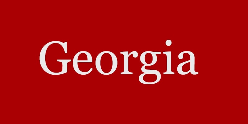
In the Humanist typefaces, the vertical stress is actually on a diagonal since that’s how the vertical pressure of a letter generally is when words are handwritten. Georgia and Baskerville are Transitional serif typefaces.
Slab Serif
Slab Serif, or Egyptian or square serif, typefaces have heavy and boxy serifs with almost no contrast in the letter’s strokes.
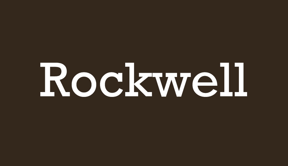
This creates a friendly yet authoritative feel, like in a marketing application. New typefaces were very suitable for advertising and such, so a bolder typeface was important.
See also: How to Embed Fonts in PowerPoint into Various Platforms
Serif vs. Sans Serif fonts
When it comes to choosing serif vs. sans serif fonts, there’s no one-size-fits-all solution. “When it comes to typography, there’s no one right way,” says Young.
The best font for you and your brand will entirely depend on what you want your designs to say to your audience. Here are a few things to keep in mind when choosing fonts for your brand:
Choose a font that feels you uniquely
Serif and sans serif fonts can both be equally effective—the key is to choose a font that feels you uniquely. “Both typefaces have their place in logo design, but the decision on which to use should be made thoughtfully,” says Downey. “Your font choice should accurately reflect your brand’s personality.”
Think about where and how people are going to interact with your brand
Choosing a font style that feels on-brand is essential, but choosing a type that makes sense on the mediums and platforms people will use to interact with your brand. “Serifs are naturally easier for the eye to read quickly and we can find this typeface in most books and newspapers,” says Downey. “Sans-serifs on the other hand, mainly dominate the digital world on websites and apps.”
“For brands that intentionally want their aesthetic to feel classic and aren’t as worried about how the branding with appear on a screen, a sophisticated font is a great choice,” says Young. “Brands that want a modern aesthetic that scales well at different sizes and is easy to read on screens are going to choose sans serif for their main branding elements.”
Don’t get stuck in the “serif = traditional, sans serif = modern” mindset
Generally speaking, serif fonts are more traditional, while sans-serif fonts have a more modern feel. But there are exceptions to every rule. “Although the rule of thumb is that sans-serif equals modern and serif equals traditional, we need to break those design stereotypes,” says Downey. So, depending on how you use your fonts, you can create a modern look using serif fonts—or a more traditional feel with sans serif fonts.
Let’s visit RRSlide to download free PowerPoint templates. But wait, don’t go anywhere and stay here with our RRGraph Design Blog to keep up-to-date on the best pitch deck template collections and design advice from our PowerPoint experts.


