

2022 color trends are surrounded by color shades that make us feel oh-so serene. Ahead, industry experts dish details on the palettes we’ll be seeing more of in the coming year.
It’s the right time for some fresh air, wouldn’t you say? Some experts look to 2022 and see a design landscape infused with colors that make us feel healthy, serene, and centered. These clarifying blues, delicate greens, and grounded earth tones nudge awake and aim us at a peripheral field that’s filling with optimism.
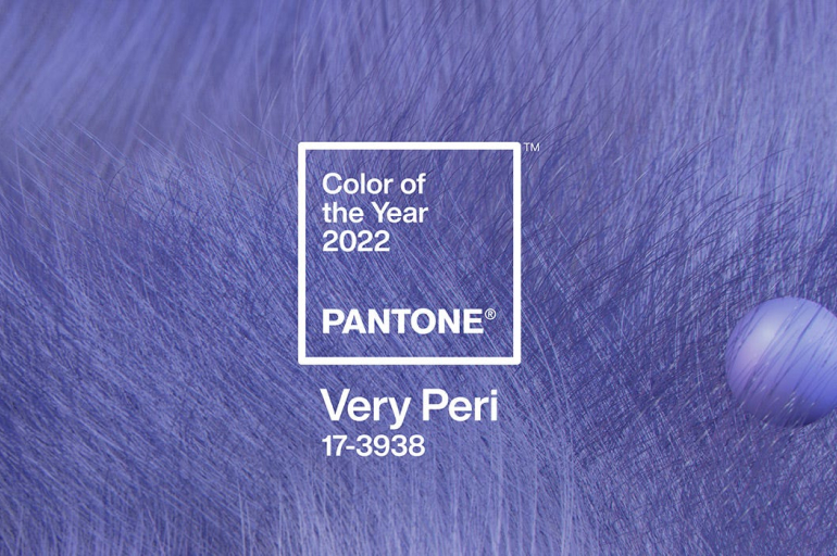
1. Very Peri
Introducing the Pantone Color of the Year 2022, PANTONE 17-3938 Very Peri, a vibrant periwinkle blue hue with a vivifying violet-red undertone blends faithfulness and constancy of blue with the energy and excitement of red. A new Pantone color whose dynamic novel presence encourages personal inventiveness and creativity, PANTONE 17-3938 Very Peri, the happiest and warmest of all the blue hues, introduces an empowering mix of newness. We are living in transformative times.
As we emerge from an intense period of isolation, our notions and standards are changing. Displaying carefree confidence and a daring curiosity that animates our creative spirit, curious and intriguing PANTONE 17-3938 Very Peri helps us to embrace this altered landscape of possibilities, opening us up to a new vision as we re-write our lives. Rekindling gratitude for some of the qualities that blue represents complemented by a fresh perspective that resonates today.
2. Breezeway
We desire to embrace a sense of renewal and explore new hobbies or adventures that excite us. This 2022 color of the year, Breezeway MQ3-21, evokes feelings of coolness and peace while representing a desire to move forward and discover newfound passions.
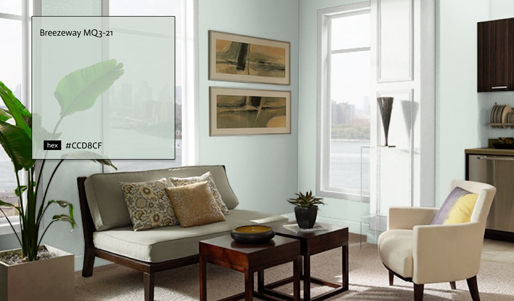
This color is a silvery green shade with cool undertones inspired by naturally stunning sea glass found on salty beaches.
3. Blanched Thyme
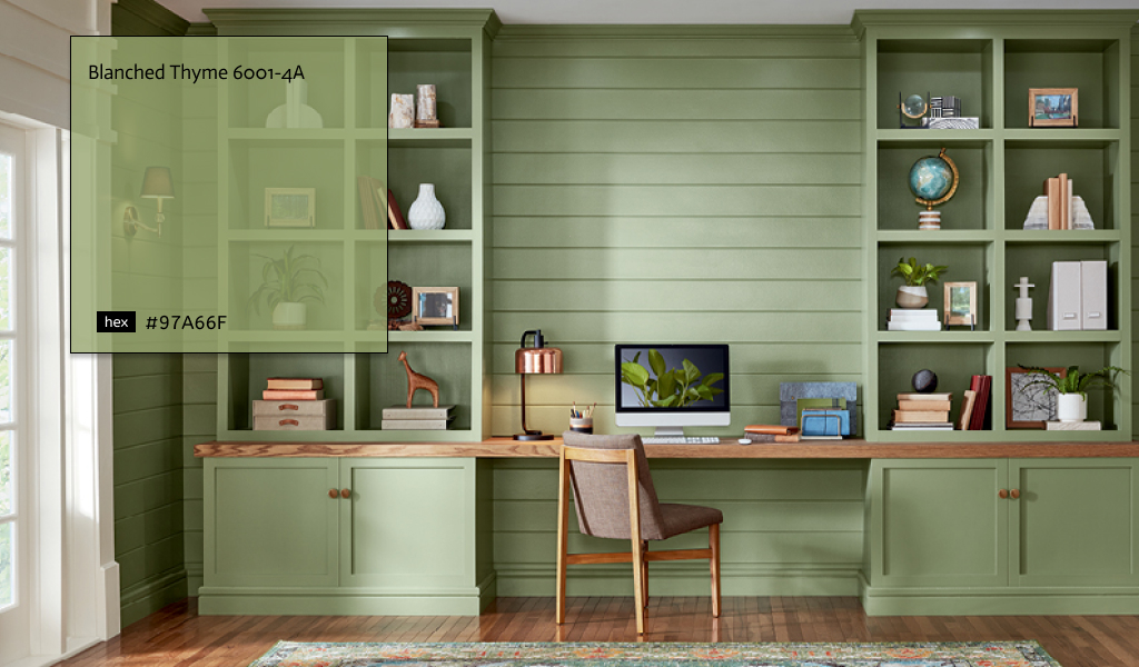
A calm, organic green that works beautifully with warmer wood tones for a natural and balanced look. Natural greens help us refocus on our physical and mental well-being. Blanched Thyme promotes a space that is grounding, inside and out. Choose warm tones and wooden elements to pair with this naturally grounding green.
As a whole, the palette showcases dustier versions of our favorite vibrant hues, proving that color is here to stay—just in a more nuanced way. It’s dynamic enough to be noticeable but neutral enough to go with nearly any design you already have in your project.
4. Guacamole
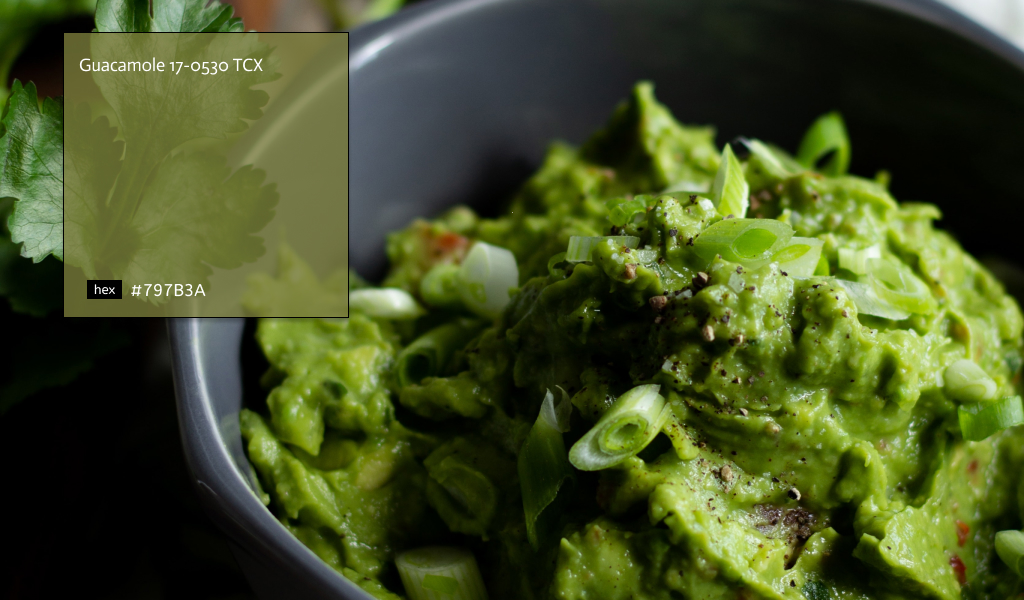
We have taken our green- and guac-loving affinity to a whole new level. Guacamole is not only named after our fav food but is also one of our fav greens to use on any wall or accent. This vibrant yet soothing green brings organic energy to any space, which is needed because we all know you’ve probably killed at least three plants this year.
To give your extra design zen or create that project retreat you’ve always desired of our trend palette for this year is the perfect blend of bold colors and calm hues.
5. Olive Sprig
Olive Sprig is relaxed, but the enticing green emulates the feeling of soothing aloe vera or a fragrant plant – brightening any space with organic liveliness. Olive Sprig blends in with nearly any environment, a versatile color that lives well inside or outside.
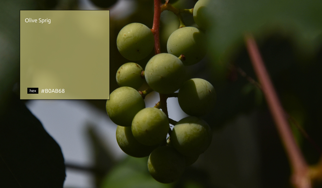
Olive Sprig is a mid-tone, neutral, lush green with an organic green undertone. It is a perfect paint color for any layout. The color can help create a sanctuary nuance in your graphic design or pairs beautifully with brass accents and wood tones on an island.
6. Breakfast Room Green
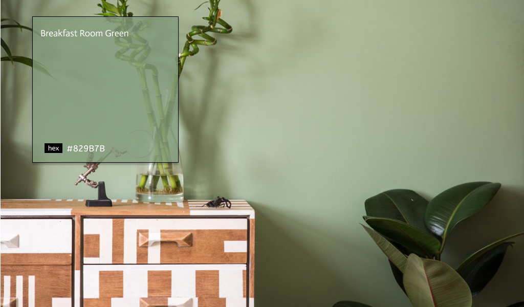
Breakfast Room Green is the most cheerful of our greens, remaining lively in bright sunlight and softer candlelight. High-end paint brand Farrow & Ball—known for their timeless take on classic hues and world-class color formulations. It is named a selection of five paint colors as trends for 2022, noting that the chosen shades “evoke the warmth and harmony of a more innocent age while celebrating life today.”
7. Williams Evergreen Fog
Introducing the Sherwin-Williams 2022 Color of the Year: Evergreen Fog SW 9130. Embrace the opportunity to begin again with a soothing, organic gray-green hue.
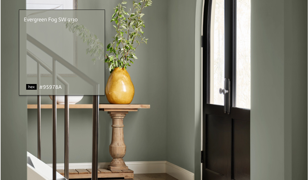
Evergreen Fog SW 9130 is a versatile and calming hue, a chameleon color of gorgeous green-meets-gray, with just a bit of blue. It’s a simple but sophisticated wash of beautiful, organic color for spaces that crave a subtle yet stunning statement shade.
8. October Mist
October Mist 1495, the Benjamin Moore 2022 color, makes room for creativity trends. This gently shaded sage quietly anchors an area while encouraging individual expression through color.
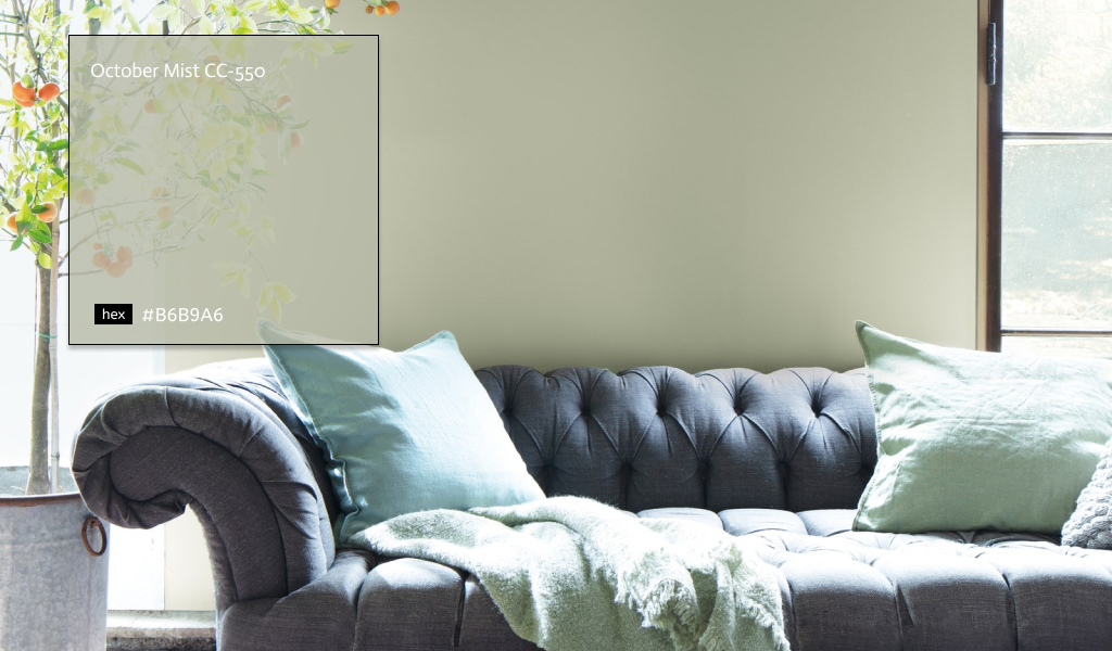
Described by the brand as a gently shady sage, the hue would look stunning and calming. Do design projects for creativity. She was evoking the silver-green stem of a flower. October Mist creates a canvas for other colors and your imagination to blossom.
9. Calming Coral
Inhale. Exhale. Calming. Coral. Ahhh…. Feel better? This muted, peachy pastel gets along splendidly with other members of the pastel family. It plays especially well with dusty yellows and pinks for a nostalgic tint to your design work. Consider contrasting it with sky blue to round out a soothing, natural palette.
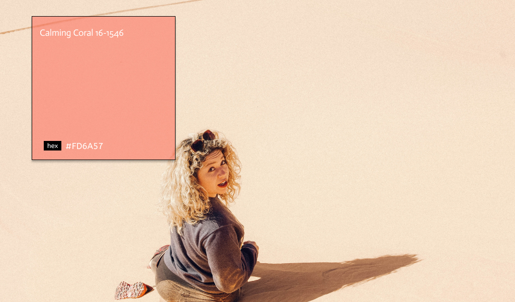
There’s a reason Calming Coral feels like a soothing bath bomb when expertly employed. You can practically (or virtually) feel the fuzz, and the most typical reaction is to… soak it in. Its warmth encourages us to embrace our vulnerability, bringing feelings of comfort and peace to the forefront.
10. Velvet Violet
Some purples stand up and shout, desperate for attention—on the contrary, Velvet Violet whispers and draws the eye with its come-hither magnetism. And yet, it represents the boldest of our 2022 color trends, still able to turn heads without over-the-top flamboyance. The hue carries a decidedly regal tone, confident in its dignified grace and allure.
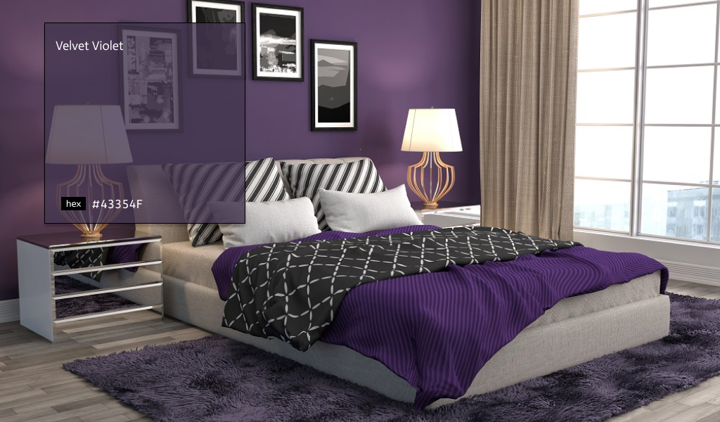
Velvet Violet embodies purple’s traditional associations with royalty. Its natural complement is a contrasting shade of green—like an emerald—which perfectly pair up. Given its darker placement on the color spectrum, it also serves as a superb base for flashy accents of the neon-electric sort.
11. Pacific Pink
The 2022 color trends in this year’s report bring to mind images of a fading flower pressed between pages of an old book. Tactile and rosy, whereas hot pink was remarkable for a hot minute (okay, millions of minutes), this subtle hue is about to have a banner year.
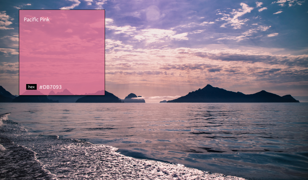
Pacific Pink is reminiscent of that inevitable blush that appears when a sense of giddiness overcomes you. It looks marvelous when paired with other pink and peachy tones. And like its namesake, apply it to a complementary light teal to evoke the sun setting over a glimmering Pacific beach.
12. Green Reigns Supreme
It’s easy being green—at least. We can determine and share the performance pattern and success rate of ads employing specific colors. This year’s data shows that shades of green dominated click-through rates and conversions.
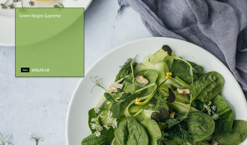
So if you want your projects to perform like a pro, consider adding a touch of emerald, jade, lime, mint, and beyond. From extraterrestrial neon to tropical plant life, green is taking the gold across the board.
13. Moody Blues
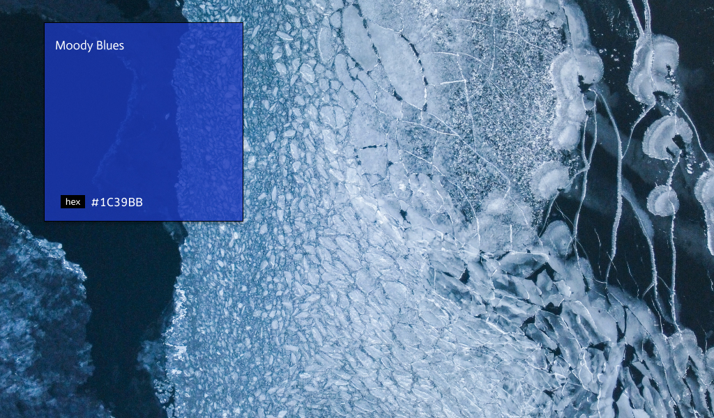
Shades of blue are going to be the go-to for today’s trends for those who want to stay away from neutral paint tones. A shade such as Goodnight Moon, an intense midnight blue hue, is dark and alluring and the perfect saturated style for a dramatic dining area.”
It also sees 2022 color trends bringing about a decidedly blue period. In particular, a luminous mid-tone blue, cool and warm simultaneously as it evokes the lightness of clear skies. It works well to complement the naturals or other mid-tones with a reassuring simplicity yet positivity that resonates well with consumers.
14. Natural Territory
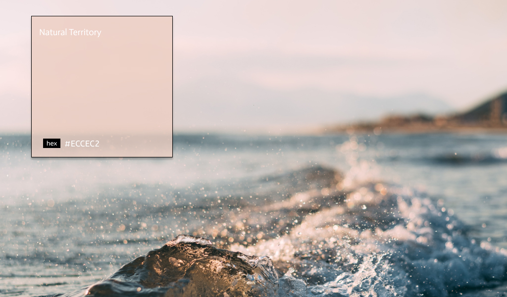
Despite the popularity of bold color statements, some people are still looking to imbue their spaces with as much calm and serenity as possible. We can call it Natural Territory.
For a neutral with added warmth, we predict a proliferation of terrestrial tones. New organic hues are growing increasingly nuanced, from natural, earthy tones such as clay and plaster to richer pigments that tap into the warm tactility of terra-cotta.
15. Textured Whimsy
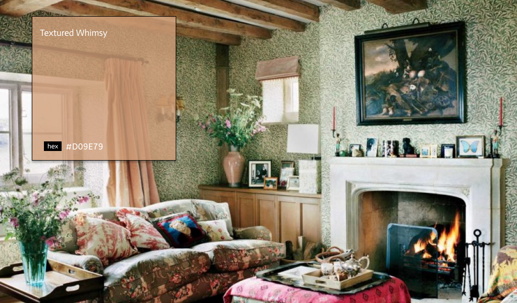
Playful and light-hearted, Whimsy is a bouquet of colors, textures, and patterns. Colors such as deep reds and greens, golden yellows, and shades of purple can create a moody feeling, or soft, muted yellows, pinks, and purples can feel more mythical. Have fun with this theme by mixing and matching place settings, layering different fabric types and practices, and utilizing hanging florals or floral archways.
It’s not just the colors themselves used to inject personality. Another statement we’re seeing is color washing, a faux-finish painting technique that gives you a very soft, textured color application—much like the transparent look of watercolors.
16. Laurel Leaf
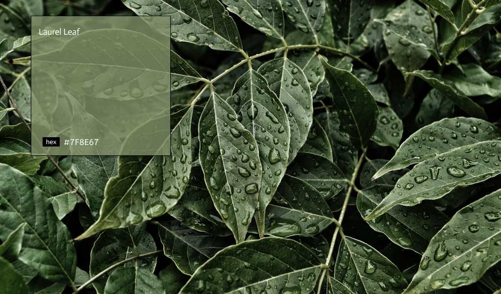
People spent more time outside enjoying their backyards, parks, and other outdoor spaces during the pandemic. And now those shades of green are versatile. This dusty green shade mimics the rejuvenating appeal of eucalyptus leaves and reflects a renewed desire to incorporate elements of nature into our design project.
Because of its organic feel and warm undertones, Laurel Leaf pairs beautifully with creamy whites, cozy beiges, light to medium wood tones, and leafy house plants. Try it in your project to foster a comfortable, relaxing atmosphere, or use it to inspire focus and concentration for the people.
17. Art and Craft
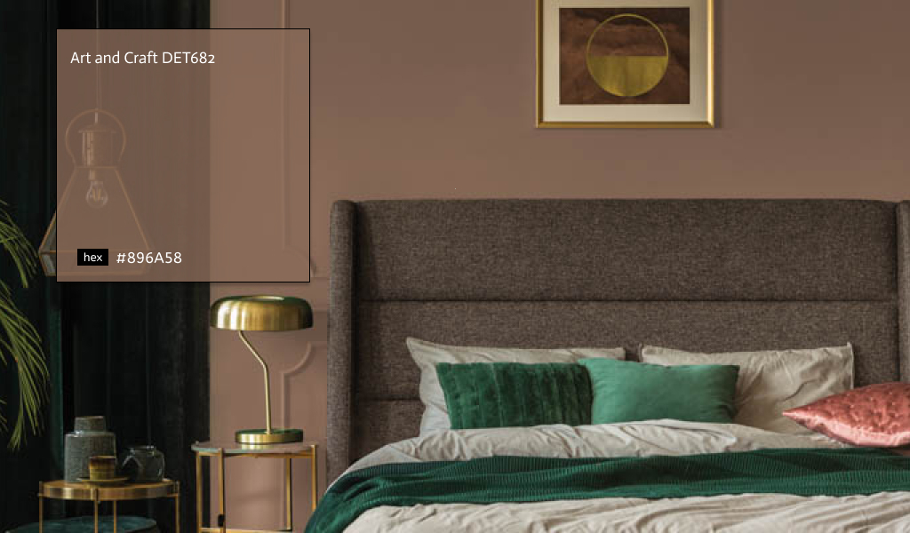
This 2022 color is a warm, earthy shade reflecting a broader back-to-nature trend this year. Art and Craft DET682 is a soft, sophisticated brown that channels the richness of walnut wood and offers a soothing, grounding effect. Art and Craft is genuinely a down-to-earth color that signifies stability, comfort, and calm, a color that expresses what we all seek right now.
This moody, complex color draws inspiration from the bohemian aesthetic of the 1970s as well as today’s folksy cottagecore trend. Pair this chocolatey brown with light, breezy neutrals to brighten it up, or opt for vibrant jewel tones to lean into a luxurious look. These 2022 color trends are available at Dunn-Edwards stores and numerous independent retailers across the U.S.
18. Citron
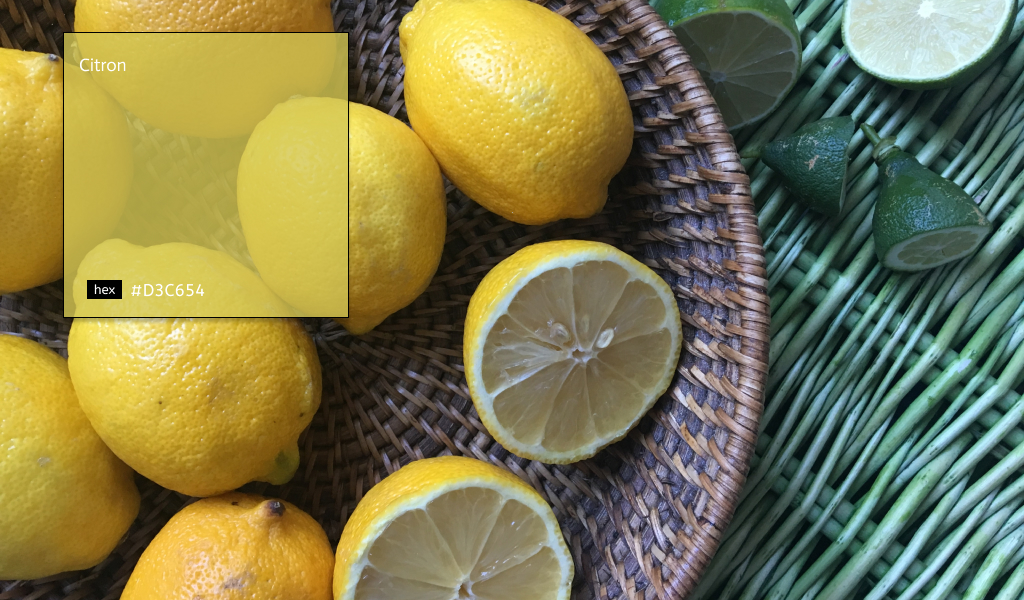
In the past, yellow has had a bad reputation for feeling dated and overwhelming. However, sunny shades are making splashes in the design scene. In particular, buttery and citron tones resembling the petals of a sunflower seamlessly energize any space, they are deployed in.
Look out for nature-inspired hues like earthy olive greens and citron yellows. Think of grounding and calming colors but also uplifting and cheerful for simple, natural, and beautiful spaces.
19. Deep Aubergine
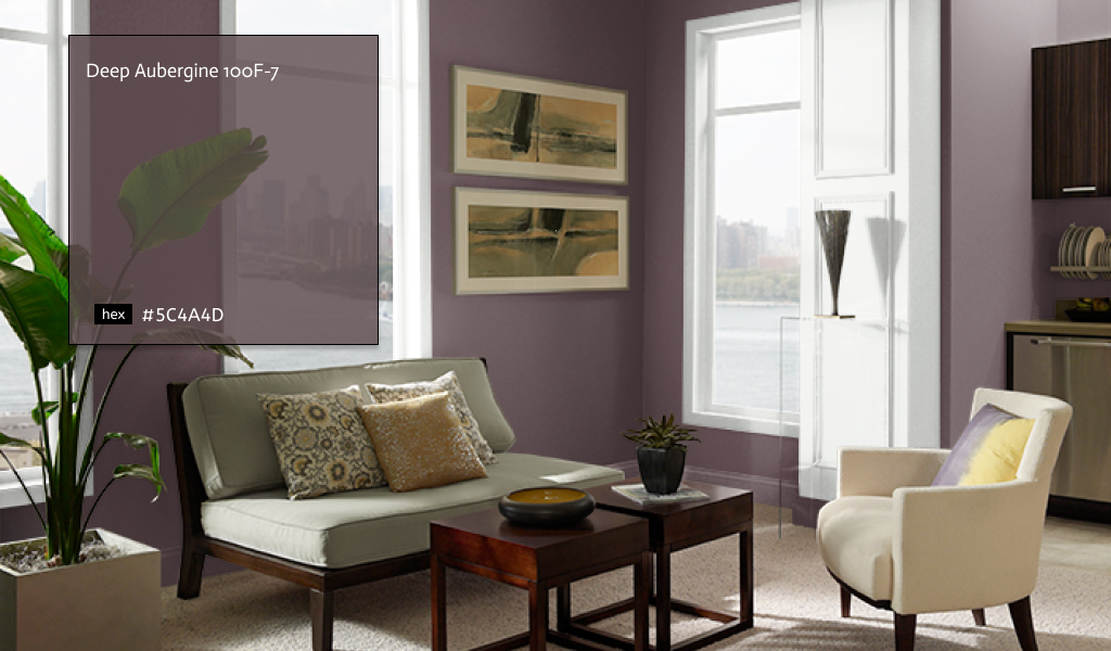
We love the mixed-use of almost black hues. Instead of always using traditional black, we like to add a twist by utilizing colors such as a deep and dark aubergine. The use of dark hues can be incorporated into design anywhere. This monochromatic design element embodies a sensuous sophistication when blended with neutral furnishings and textiles, adding a bold yet classic aesthetic to any design.
20. Chartreuse
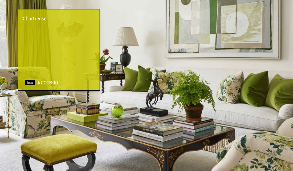
Let it be known that we are obsessed with chartreuse, electrifying, and joyful, the vibrant shade is not for the faint of heart, but when it’s deployed fearlessly, it’s always the star of the show. The green-yellow shade works well in many different applications for any design project.
21. Gray-Green
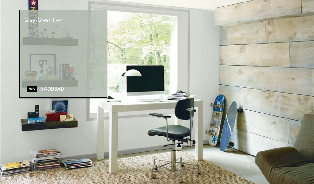
Leading paint companies Benjamin Moore, PPG, and Sherwin-Williams all agree: 2022 is the year for gray-green. The sophisticated hue symbolizes balance and harmony often seen in the natural world. The tint is subtle enough to be used throughout the design work, such as a pop of color. The soft green shades just enough vibrancy to the space while complementing its surrounding greenery.
22. Warm Neutrals
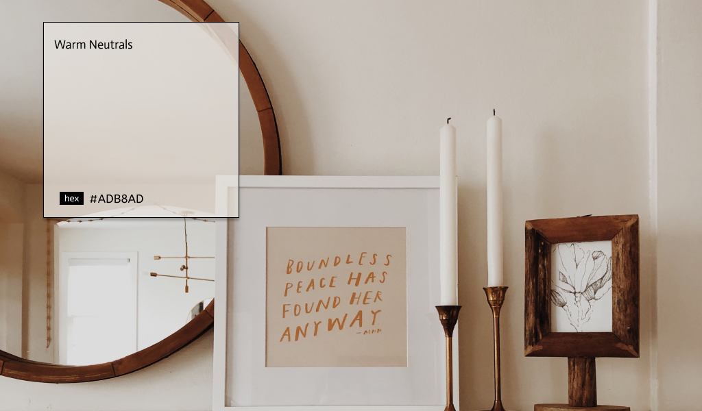
Warm, neutral paint colors are having a moment as well. Along with bringing warmth and versatility to a space, a neutral paint palette can instantly make the design feel cozy and comforting. Some of our favorite neutrals are Neutral Territory, a sandy beige with subtle red undertones, and On Point, a light greige that gets brighter in natural light. Consider a rich neutral for a high-traffic area of your space for a versatile shade that will work with various decor styles while creating a more attractive ambiance.
23. Olive Green
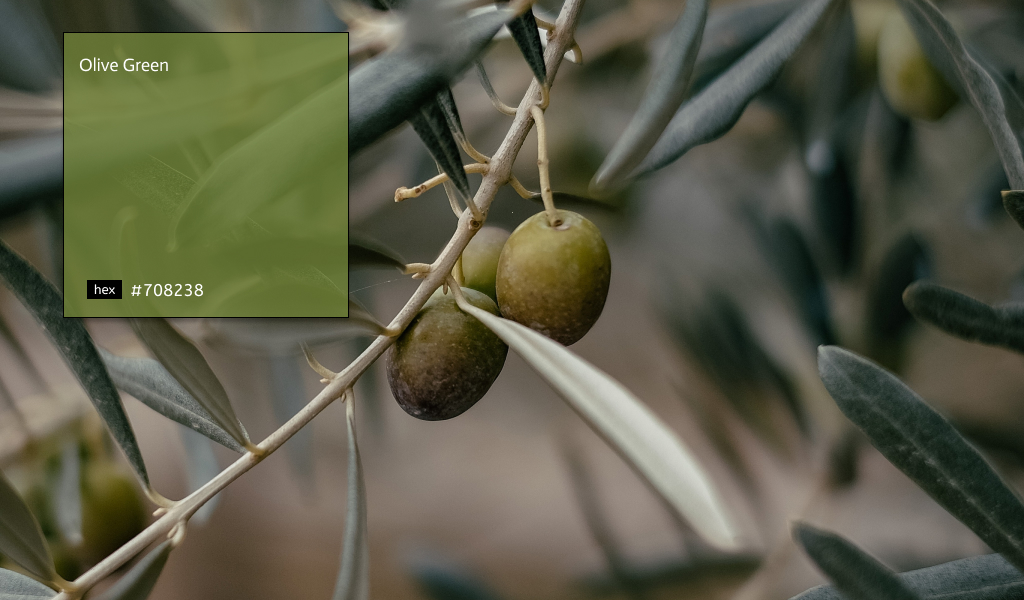
Cecilia Halling, Creative Director at Elicyon, says colors like a honeycomb, lilac, zesty curry lime, olive-yellow, dark navy, cherry, and maple will be in vogue in the new year. It’s the most exciting of surprises. If you need more proof that greens of every hue are on the rise, look no further than the color trends from Behr, Benjamin Moore, Sherwin Williams, and PPG.
24. Shades of White
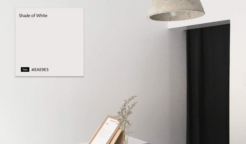
Neutral colors will take over the color trends in 2022. With so many people working, this has been transformed into part-time or transitional workspaces during the day; therefore, we suspect that colors today will continue to veer neutral, as they create a sense of light and clarity while encouraging functionality. Many of us are still spending more time at home, and our spaces should develop a sense of calm.
25. Earthy Tones
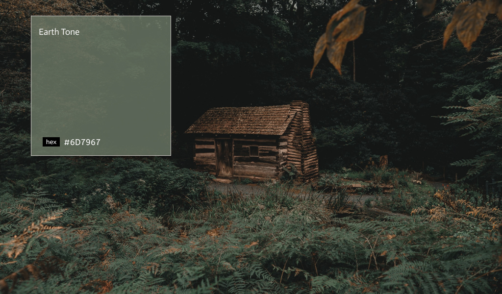
With an ever-important focus on relaxation and wellness, for 2022, we’re forecasting color trends that both combine and reinforce our connection to nature and instill a sense of cozy comfort in the design project. Think earthy tones like hazy greens, soft and timeless blues, soothing sandy greys, and warming muted blush hues. These nature-centric tones give a calming, serene feel to a space.
26. Soft Neutrals
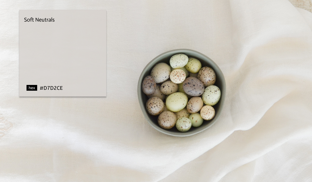
Light and calming tones, greens, and blues will bring calmness and comfort for people, with a pop of fun, bold and colorful accents. You can incorporate Soft Neutrals color scheme through lighting, textured and patterned scattered color patterns.
27. Unique Shades of Green and Yellow
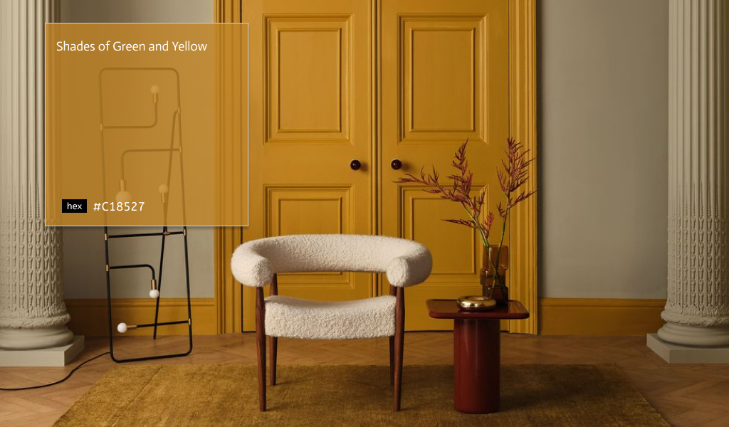
Subdued greens and mustard-toned yellows are an unexpected but endearing combination. To incorporate this trend in your design, Smith suggests layering with off whites textures, such as boucle and white oiled timbers, which will create an understated and timeless elegance.
28. Subdued Pops of Color
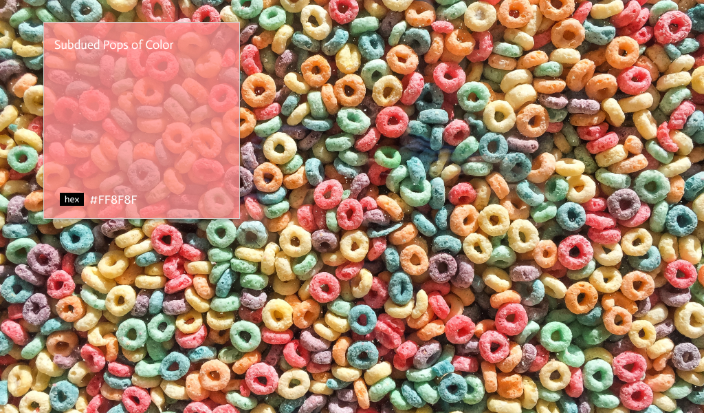
Because of the pandemic, our homes, which have been our sanctuaries, will be turned into calming and inspiring places. We mention neutral pops of color, including subdued shades of yellow, red, and blue, as the color trends to look out for next year, as these will add simple, effective splashes to warm our homes.
29. The Rise of Lilac
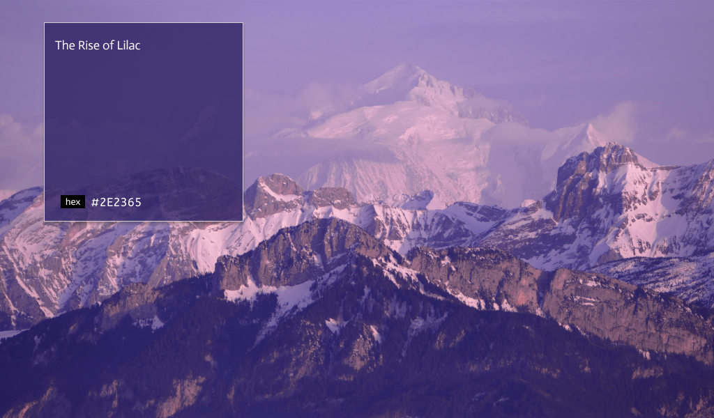
A key color trend to note is the rise of lilac. As a gentle, welcoming hue, lilac will be a trending color over the next year in the design world. For playful yet creative spaces, lilac adds radiant energy to any spread.
30. Crimson Red
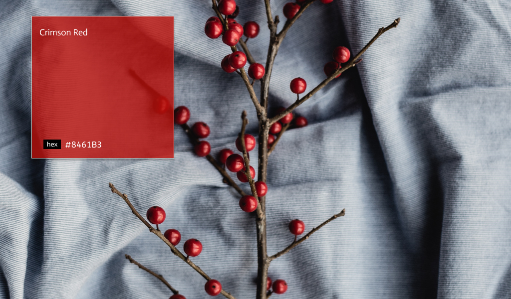
Speaking of nature-centric, a rich and earthy crimson shade is gorgeous and will bring a touch of maturity and glamour to any design. This unique shade perfectly ties in with the whole color palette and will be the staple shade to carry through into the autumn months. We think this indulgent shade would be perfect to create a forgiving vibe for your creative project.
See also:
8 Possible Presentation Design Trends 2022 We Need to Prepare
7 Color Schemes Inspiration for PowerPoint
Nature-Based PowerPoint Color Palette to Raise Audience’s Awareness for This Lonely Planet
What’s your signature color?
While 2021 focused on cultivating joyful optimism, 2022 color trends will be a more relaxed lifestyle. For the first time since we can remember, nearly every major paint company is aligned on their color choices (save one—more on that later). And, we’re not just talking about picking a warm hue or a cool hue—no, they almost all chose some variation of green.
Let’s visit RRSlide to download free PowerPoint presentation templates with many categories. But wait, don’t go anywhere and stay here with our Blog to keep up-to-date on all the best pitch deck template collections and design advice from our PowerPoint experts yet to come!


