Have you read our old post about ‘Font Pairing Tips and Tricks for Dummies’? If not, we highly recommend you take a quick look at that typography article. Why is it so? Fonts have as big an influence on design manner as visuals.
Beautiful presentation visuals can all be undermined by poorly chosen typefaces. Hence, you must use a font that follows the rest of your design style, the personality, and the right voice you’re trying to convey.
That insight will help you determine the ideal font before creating your presentation design project using these 20 best fonts for Professional PowerPoint. Good luck!
Best fonts for professional PowerPoint
There are four types of fonts to analyze when looking to choose the best fonts for professional PowerPoint. Shortly, we merged Script and Decorative fonts.
Serif fonts
Serif fonts are traditional ones. They are known for their extra tail (or “feet”) at the end of each letter. Popular Serifs are Times New Roman, Century, Bookman, Lucida, Garamond, and more.
Sans Serif fonts
Sans Serif fonts are those without the tail. The word “Sans” is French for without, and Serif refers to the extra tails. They include Arial, Calibri, Helvetica, Verdana, Lucida Sans, Tahoma, and Century Gothic.
Script and decorative fonts
These fonts try to follow handwriting and are mostly reserved for special presentations. Here, you will see the 20 best fonts for professional PowerPoint you can use for your presentations.
What are the best fonts for professional PowerPoint? Let’s have a look at some of the most popular ones!
Calibri
Using the best fonts for professional PowerPoint is favored for obvious reasons.
It is the ideal choice when looking for a universal, readable Sans Serif PowerPoint font.
See also: 20 Best Creative Custom Fonts PowerPoint Design
Helvetica
Helvetica font family is in its neutral, a font that can blend into any style, like that of a chameleon but in the font world.
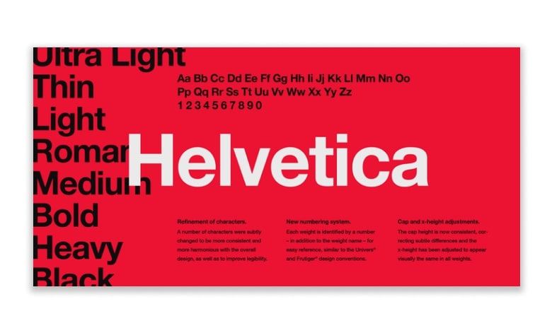
If I could summarise Helvetica in one sentence, it would be: “Clarity with complete simplicity.” In presentations, Helvetica is powerful and can add real impact, but it doesn’t take over the limelight.
Garamond
Next, one of the oldest fonts created in the 16th century in France by Claude Garamond led the whole European typography.
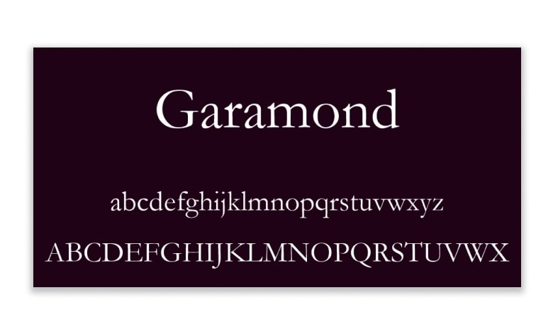
This font family is worth choosing for companies not chasing trends and making the identity look refined and elegant.
Futura
Futura is a geometric sans-serif typeface created by Paul Renner and published in 1927.
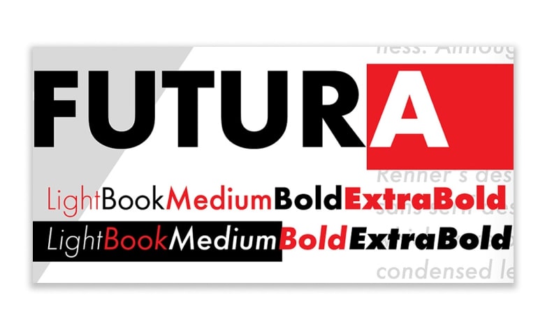
This font is based on geometric shapes, especially the circle, similar in spirit to the Bauhaus design trends of the period.
See also: What Are Sans Serif Fonts? Don’t Get Stuck in the “Serif = Traditional, Sans Serif = Modern” Mindset
Gill Sans
Gill Sans was created by British graphic artist and sculptor Eric Gill.
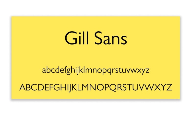
Another Sans Serif font, Gill Sans, gives a friendly and warm look without being too overstressed. Some refer to Gill Sans as ‘the British Helvetica.’
Rockwell
Rockwell font was developed with Monotype Design Studio in 1934, which saw the return to the reputation of slab serif fonts. Rockwell’s strong and friendly characters make this font particularly adaptable.
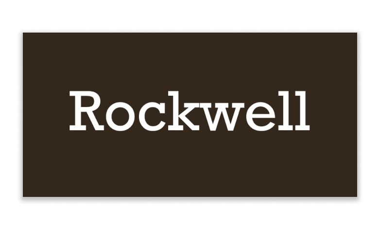
This font is ready in nine different variations: italics, different weights, and condensed font versions.
Verdana
Verdana is one of the easy choices of the best fonts for professional PowerPoint. It is a more recent font crafted in 1996 by Mathew Carter for Microsoft, so you know it is optimized for the screen.
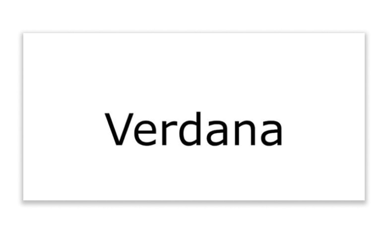
Its symbols include wide spaces and counters with tall lower-case letters that increase readability.
Fira Sans
In fact, you can use a font like Fira Sans as both your header and body font, with different fonts in the mix to create only an accent font.
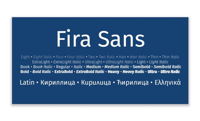
While this font is suitable in both normal and bold weights for most of the slide content, we see a nice serif launched as well to balance the single presentation font.
Palatino
Hermann Zapf created Palatino back in 1949 based on type styles starting from the Italian Renaissance era.
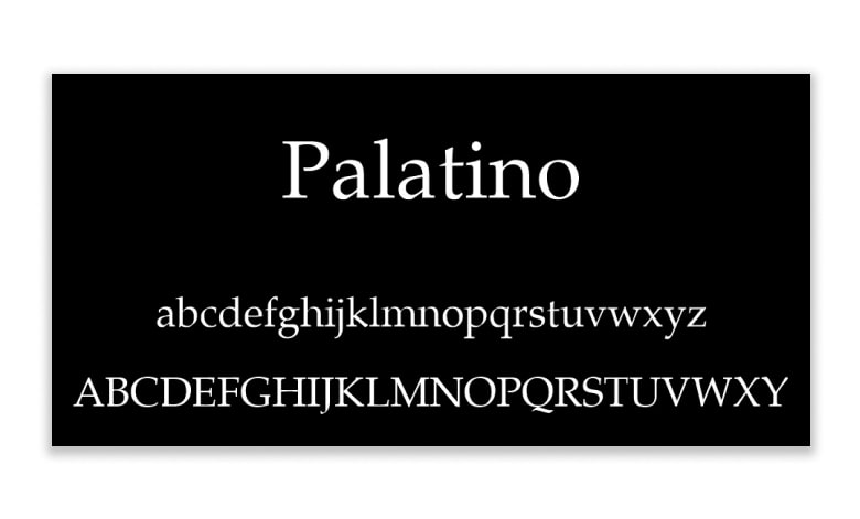
Hermann also intended to keep the font readable on low-quality paper and small-sized prints, including when viewed at a distance, making it the perfect fonts for professional PowerPoint presentation.
Tahoma
Tahoma provides separable characters from each other and looks more like Verdana, albeit tightly spaced for a more formal appearance.
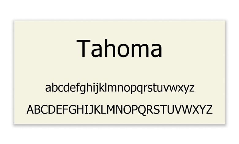
Tahoma fonts arrived with Windows 95 and have since been used in professional PowerPoint presentations for their uniqueness, clarity, and readability.
Georgia
Georgia is highly appreciated for its beauty and blends thick and thin strokes to give well-spaced Serif characters.
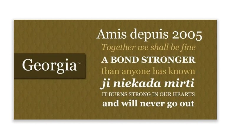
Georgia is the most similar font to Times New Roman, albeit bigger, making it ideal for presentations.
Corbel
This font was produced with one purpose in mind, and that’s to give clean text without confusion on the screen. It was created particularly for LCD monitors, so you know it’s optimized for any presentation project.
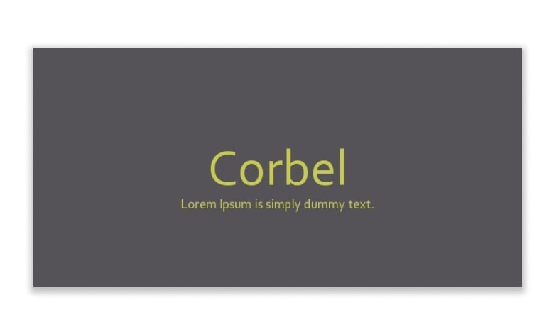
The font is neat and clean, making it a reasonable choice for any professional PowerPoint presentation that calls for large contrast. Also, its spacing allows for readability at a distance.
Segoe
The Segoe family of fonts is one of the best fonts for professional PowerPoint presentations.
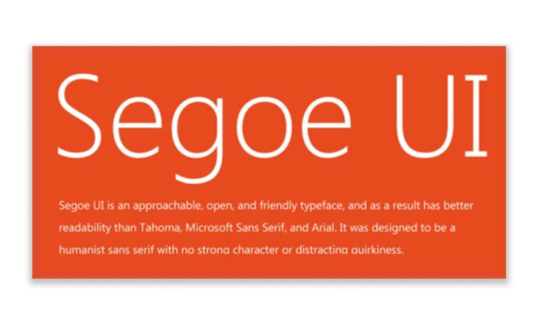
Segoe is pretty similar to Verdana and maintains a warm, inviting look, and that’s still spacious and precise on screens.
Century Gothic
Century Gothic is a sans-serif typeface with a geometrical style. Monotype Imaging published it in 1991, created to fight with the ever-famous Futura. Its style is very similar to the rival but with a larger x-height.
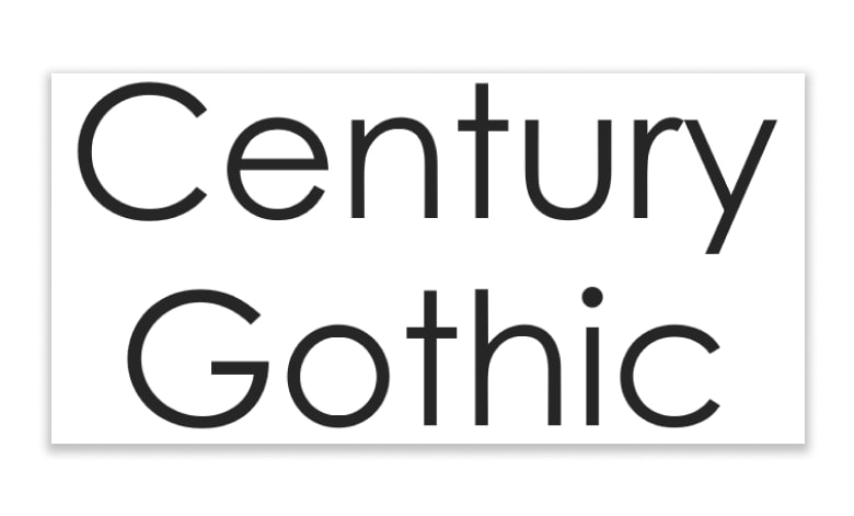
Importantly, this font is useful in advertising, such as headlines, display work, and small quantities of text.
Lato
We’ve all seen a million and two presentations using conventional fonts like Arial and Times New Roman.
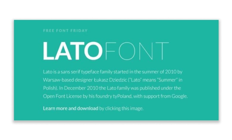
Plus, Lato’s variety of weights is ready – from thin to light to bold, which helps to increase this font’s overall interest.
Roboto
Roboto is one of the other great fonts for professional PowerPoint presentations. This font is yet another basic sans-serif font that works beyond many industries and types of presentations.
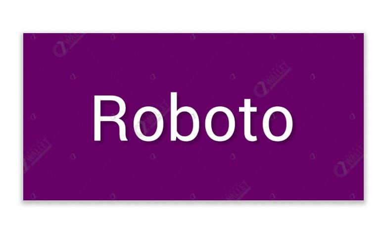
This font style is the perfect font to use for body text. The main body paragraphs are easy to read with this font in professional nuance and well designed.
Montserrat
Montserrat is our favorite font for us here at RRGraph Design.
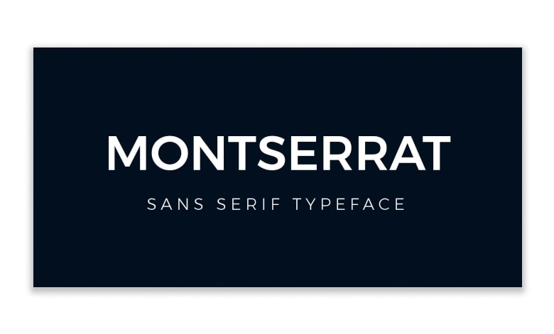
Besides, this font will let them know what to expect each time you move to a new slide. However, it’s one of the top font selections you can apply for the headings on your professional PowerPoint presentation.
Open Sans
We commonly use Open Sans fonts for professional PowerPoint presentation, especially for body paragraphs due to their legibility.
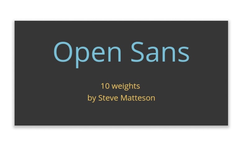
However, we shouldn’t cut Open Sans like only a paragraph typeface. You can also use it in professional PowerPoint presentations to help your headings stand out sharply.
Libre-Baskerville
Libre-Baskerville is a serif font style with several other fonts and color schemes to create a more traditional look and feel for your slides.
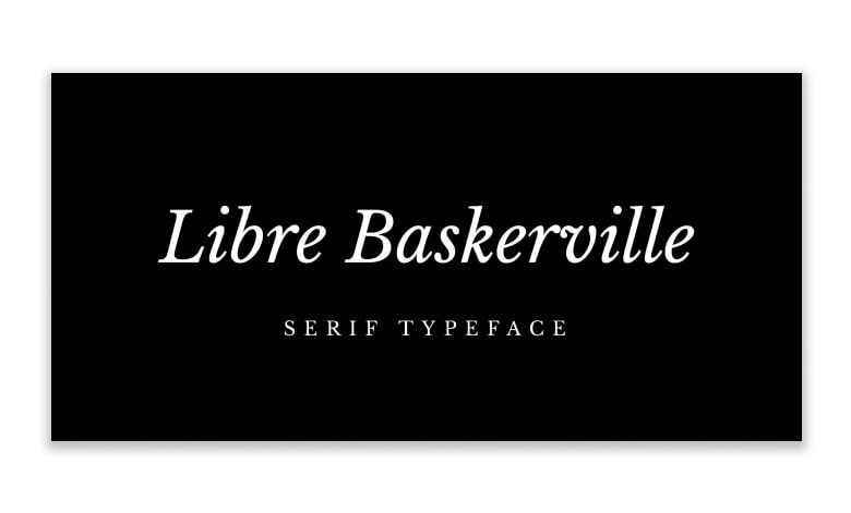
However, you also can use this font in body paragraphs easily, as it’s clear, legible, and readable.
Bebas Neue
It has developed in reputation and become something like the “Helvetica of the free fonts.” The family has four new members – Thin, Light, Book, and Regular – added by Fontfabric Type Foundry.
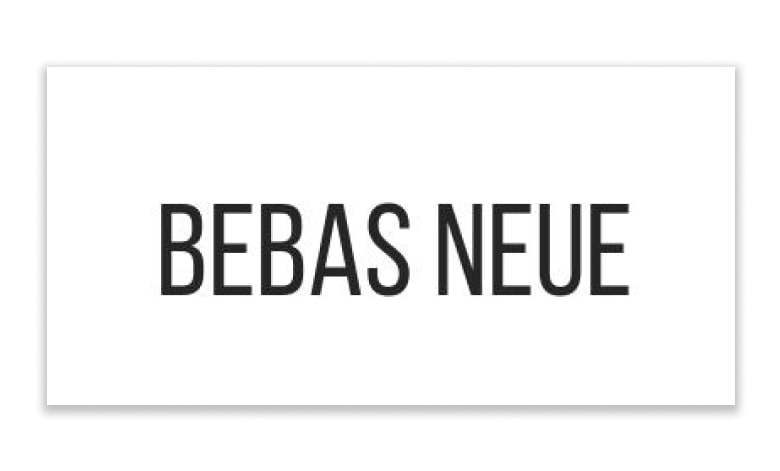
The new weights stay true to the style and grace of Bebas with the familiar clean lines, elegant shapes, a blend of technical straightforwardness, and simple warmth, which make it consistently proper for web, print, commerce, and art.
Are you choosing a font for headings or body text?
The first thing to think about is where you choose a font for headings or body text – does it need to be clearly understandable in longer paragraphs and smaller sizes? Or can you afford to go bigger? Are you looking for a bigger, more impactful slide title?
Whether your font is for the heading or body text will help inform your answer to the next question.
Serif or Sans Serif?
Serif fonts have tiny ticks or ‘wings’ at the end of their lines. Usually, they correlate with strictness, business-like, intellectual content. On the other hand, sans-serif fonts – have no marks on the ends of their lines, and we usually see them as modern, smooth, and clean.
The general sense is that serif fonts are better for print and body text, as the serifs lead the eye from one character to the next, like joined handwriting. Instead, sans serif fonts are better for titles and text displayed on a screen. But these are not complex and fast precepts!
The popular opinion is to pick one of each; possibly titles will be sans serif, and body text will be serif, but it’s up to you. You can determine what feels suitable for your brand. Do you want to appeal to tradition, create an intelligent vibe with a serif font, or want your text to feel fresh, speaking of technology, and progress with a sans serif choice? This leads to your final consideration.
See also: The Only Guide You Need to Download and Install Fonts for Professional PowerPoint
What about custom fonts?
Sometimes what we want is not the ordinary, the comforting, the Arial, and the Times New Roman; sometimes, we want something diverse. This is your opportunity to reach the almost endless world of the best fonts for professional PowerPoint presentations. Here, you can find fonts to fit nearly any reasonable necessity. There will be a custom font for you, from timeless, elegant, crisp, and futuristic to embellished scripts and decorative innovations.
But a word of caution on non-system fonts – custom fonts can be a convincing and attractive component of your presentation design. Still, if misused, they can also be its destruction.
A custom font will only appear in your presentation if played on a device by installing the fonts first. PowerPoint will replace your beautiful and carefully planned custom font with one system default on any other device. This can have destructive outcomes for your presentation design.
If you present your presentation exclusively from the same device, you shouldn’t have a puzzle. Still, suppose many devices or operating systems are available or intend to share your presentation with others to ensure your fonts survive the jump. In that case, it is safer to stay in the system’s default fonts. So, you can be confident now. Your carefully crafted designs will remain as you conceived them, and you can focus on delivering the very best professional PowerPoint presentation.
See also: How to Embed Fonts in PowerPoint into Various Platforms
3 Tools to help you choose better presentation fonts
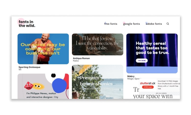
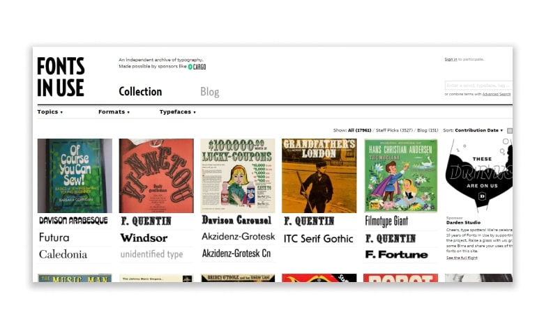
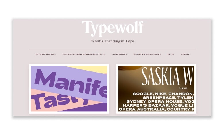
We’ve noted the three helpful tools mention in the video here to help you choose more effective typefaces for your next professional PowerPoint presentation.
Then, we’ve used ‘Fonts in Use many times; it is a handy tool for selecting fonts for any presentation design project.
Fonts in the Wild
Fonts in Use
Typewolf

Lastly, we’ve done the game with the 20 best fonts for professional PowerPoint. That every single person who has ever designed an Apple Keynote or Microsoft PowerPoint™ presentation should have it in their arsenal. Please go out and enjoy them.
See also: Font Pairing Tips and Tricks for Dummies
Ready to create your next presentation?
Furthermore, whether you use Microsoft PowerPoint or Apple Keynote, each of these presentation fonts can bring the best out of your presentation projects.
Let’s visit RRSlide to download free PowerPoint presentation templates with many categories. But wait, don’t go anywhere and stay here with our Blog to keep up-to-date on all the best pitch deck template collections and design advice from our PowerPoint experts yet to come!
