Creative custom fonts PowerPoint like beautiful calligraphic or artistic fonts are just a click away. But the problem with them is they are not suitable for severe business presentations. You need a no-nonsense font like Helvetica but with more personality.
Good news! There are more creative custom fonts in PowerPoint designed just for your needs, and we have extracted the best for you. See our favorite accessible creative custom fonts in PowerPoint and add the ones you like to your Font Library.
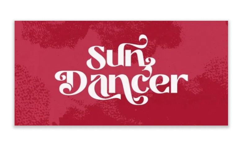
Prettywise
Prettywise is a vintage-inspired serif typeface that offers a beautiful retro vibe with a range of 30 ligatures and 100 stylistic alternates for you to mix and match. It also comes with ten different weight options!
We hope you liked our collection of the best PPT fonts. These typefaces are among the best fonts for PowerPoint presentations of any kind.
See also: 20 Best Fonts for Professional PowerPoint: Adios! You Won’t See Arial and Times New Roman Anymore
Metro Beardy
The Metro Beardy font is perfect for fun, lighthearted PowerPoint presentations that require a vintage aesthetic.
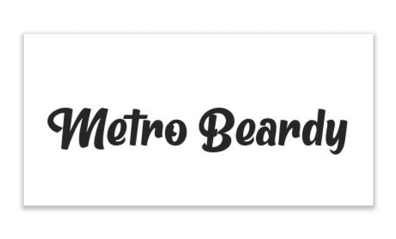
When we feature a bold retro look with a subtle hand-drawn effect, it’s super easy to install and use and is fully PUA encoded.
Wensley
The next option in our list of the best PPT fonts is Wensley, a stunning modern serif typeface with a classy, elegant appeal that’s perfect for impressing an audience!
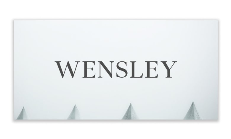
It pairs beautifully with script, signature, and handwriting fonts and comes with uppercase and lowercase letters, numbers, and punctuation, as well as a range of Latin characters.
Halva
Featuring sophisticated, angular lines and subtly rounded edges, Halva is a highly professional sans-serif font that will be perfect for a business or corporate presentation.
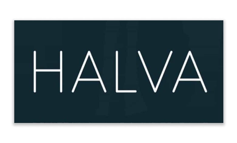
Being super versatile and easily legible, it’s also one of the most user-friendly Powerpoint fonts out there.
Aesthetic
Next in our list of the best fonts for Powerpoint is the Aesthetic sans serif font, a cheerful handmade brush style typeface that’s great for adding a touch of rustic charm to your presentation.
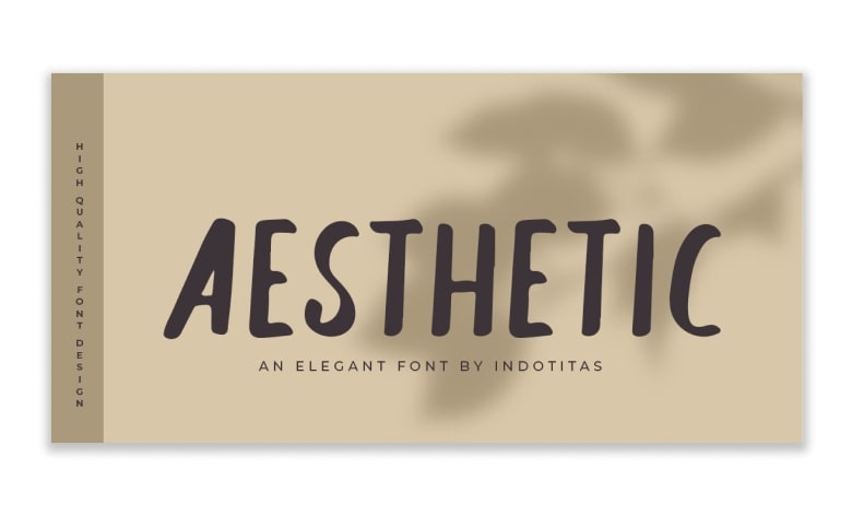
It looks best as a headline or title font and comes with a full suite of primary Latin characters, numbers, and symbols.
The Bold Font
Want to make a bold statement with your headings? Then, The Bold Font is the one for you. With its thick lines and geometric shapes, it is loud yet legible, powerful yet stylish.
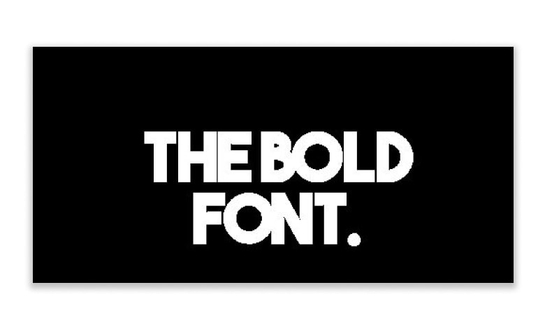
Check the way the alphabet “B” has been designed- the upper half is smaller than the lower. This uneven formation breaks the rigidity and yet maintains its corporate look. The font, available in uppercase only, is excellent for the headings in your Title Slides and Section Header slides in a presentation.
See also: What Is Sans Serif Fonts? Don’t Get Stuck in the “Serif = Traditional, Sans Serif = Modern” Mindset
Poppins
Poppins is the favorite creative font used by our designers, especially for any copywriting used in our presentation agency.
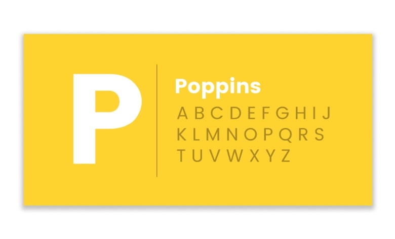
Geometric sans serif typefaces have been a well-known style tool because these actors took to the world’s stage. Poppins are one of the newcomers to this long tradition.
Viafont
This geometric, sans-serif font has an “A” worth dying for! The thick, bold font can hardly go unnoticed, but the alphabet “A” steals the show. The steep slope of the leg of “R” and the uneven thickness of the lines give it a seductive look. Available in uppercase only, which makes it ideal for headings.
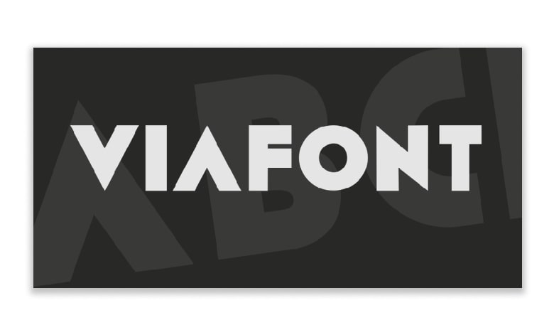
For example, we used it to make the word “Brand” look branded but used Bebas Neue for the sub-heading. Font combination further enhances the look of the design. A general rule while combining fonts is not to use more than 2 or 3 fonts (the ideal being 2).
See also: The Only Guide You Need to Download and Install Fonts for Professional PowerPoint
Kirvy
Now, here is a font that offers more flexibility. Kirvy is a simple, non-serif font family comprising four weights- thin, light, regular and bold.
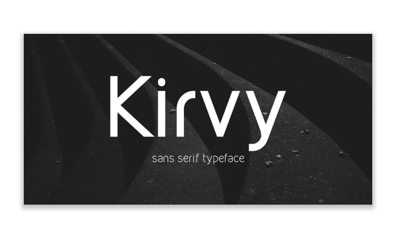
The thinness of this font and its contemporary style makes it look chic. We especially love the font in lowercase. In uppercase, the font looks elegant and sophisticated.
Optimus Princeps
Optimus Princeps means “the best ruler.” No wonder the designer used these words for this royal font. It looks majestic, in every flourish, every curve, and straight edge.
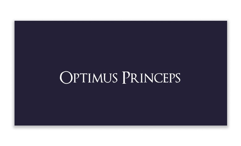
The ragged boundaries of the alphabet “O” and the trimming of the leg of “R” make the font appear designed using a quill, while the sharp edges and straight lines make it appear designed using a scale.
See also: Font Pairing Tips and Tricks for Dummies
Afton James
Everybody loves a thriller. We find Afton James font a thrilling font. The eroded edges give it a mysterious, old look, which we would probably see on a thriller novel cover.
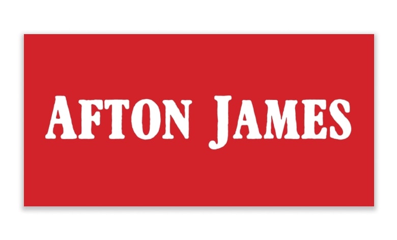
If you are talking about a legendary business character or some event that will join the pages of history, James Afton will be a good fit. Being available in uppercase only, you can use it for display headings.
Above
Want to lend a creative, stylish effect to your content? The Above Font is a classy decorative font that has a specific “free” personality to it. It is light, and the flourishing strokes on the edges give it a unique look and feel.
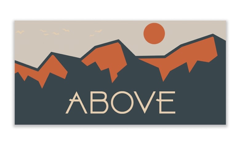
However, the drawback of creative fonts is that they backfire as they are not easy to read and may look cluttered if used abundantly.
Tellural
If you want a font that is a little less rigid and serious, go for the casual Tellural font. This sans-serif font is available in both uppercase and lowercase.
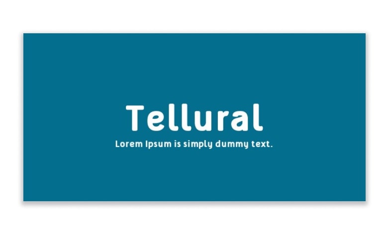
The uppercase, though, appears quite ordinary. It is the font in lowercase that makes it a bit unique. It seems as if a painter was asked to paint the store board name in a simple, regular font.
April Fools’ Day
Why people gave this font the name April Fools’ Day, we have no freaking idea.
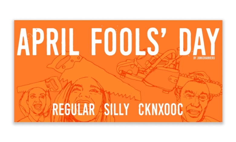
This sans-serif font appears to do anything but fool around. The threads and dots that appear to be coming out of the edges of the alphabet make it look ethereal.
Ghostlight
Ghostlight is one of the most beautiful and creative custom fonts in PowerPoint. This is the note from the author- “Ghostlight is a slab serif family designed with important inspiration from the classic typefaces Clarendon and Egizio.
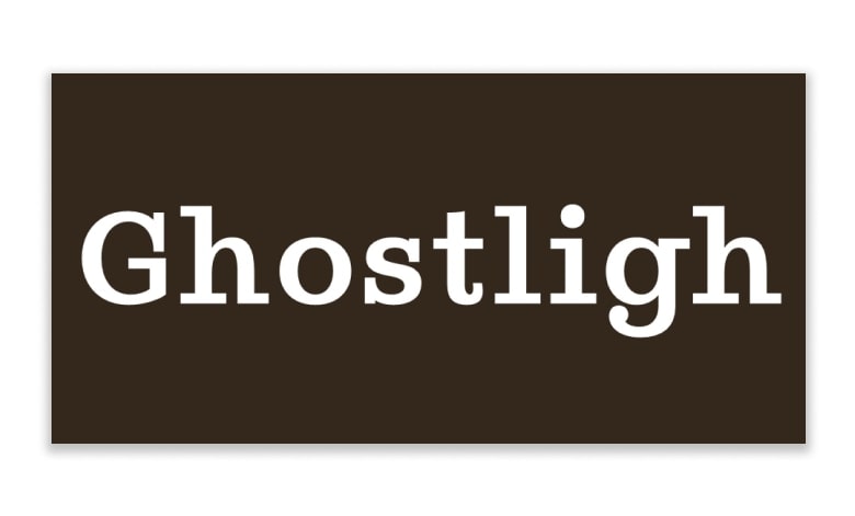
It has 5 weights and a beautiful italic, which makes it a great choice for both display and text contexts.” There is also a theatrical personality to the font. It is considered that Ghostlight is a light in the center of the stage that keeps the ghosts away from haunting the building!
Moon
You can’t help but love the Moon font. The name itself has such romanticism to it. But it is not a romantic font. It is sober and rounded that looks professional yet not rigidly boring.
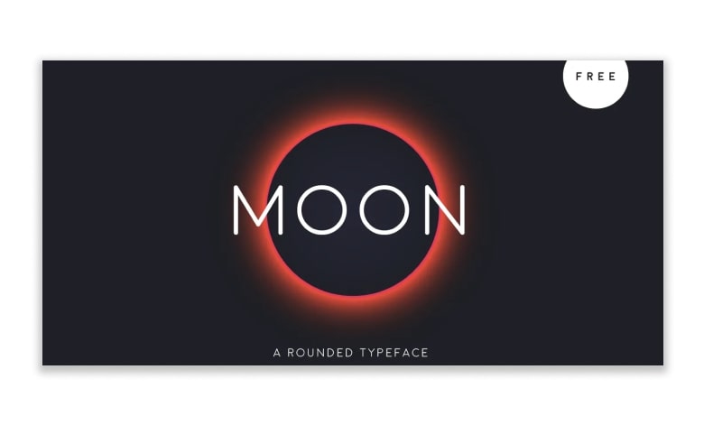
Under its roundness, every font has a personality- Moon does not appear to be imposing authority, which makes it endearing.
Capture It
We have used this powerful, mysterious eroded font in many of my designs, and every time we are asked by readers the name of the font used. It’s Capture It.
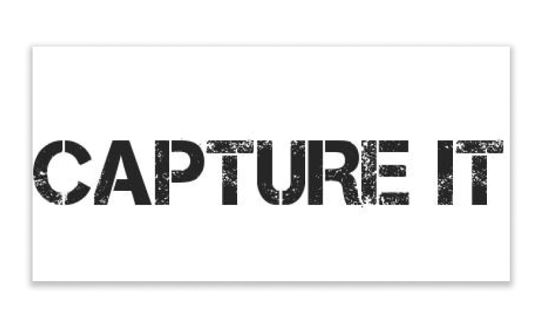
But that does not mean it is reserved for that purpose only; if you are talking about business targets, risks, challenges, or any concept that would look better with a rough touch, go for this font.
Sugar & Vinegar
Sugar, yes, please! Not all business presentations are as severe as a quarterly sales review. You can be from the travel industry, music industry, or food industry, and your presentations have to be business-oriented but still have the flavor of your industry. Arial and Times New Roman would be a disaster in the cover slide design. Sugar & Vinegar brings a personal handmade touch to the design.
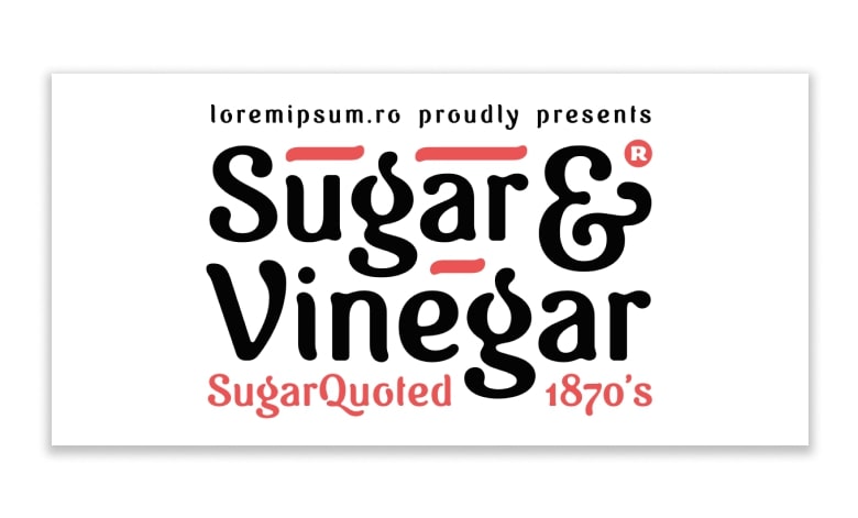
The note from the author says it all, “Sugar & Vinegar is an old-fashioned font, with a “handmade” warm touch, avoiding geometric shapes and sharp corners, created with a fluid, personal and expressive line, not relying on grids or very strict guidelines.
Gist Upright Extrabold
If you want a retro font with a contemporary touch to add style to your presentation, go for the Gist Upright font.
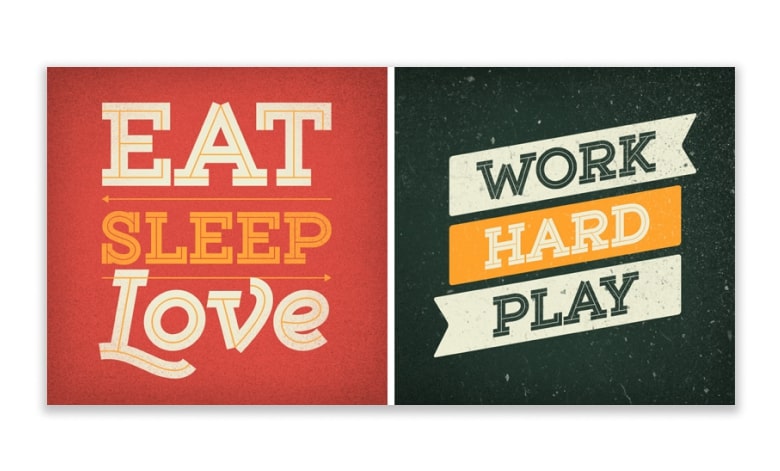
The line layers in the inline area make the font stand out. Sharp edges in the uppercase setting further add personality to the font.
Enso
The last creative custom font powerpoint is Enso font. What we love about the Enso font is the incomplete formation in all alphabets with a circular element.
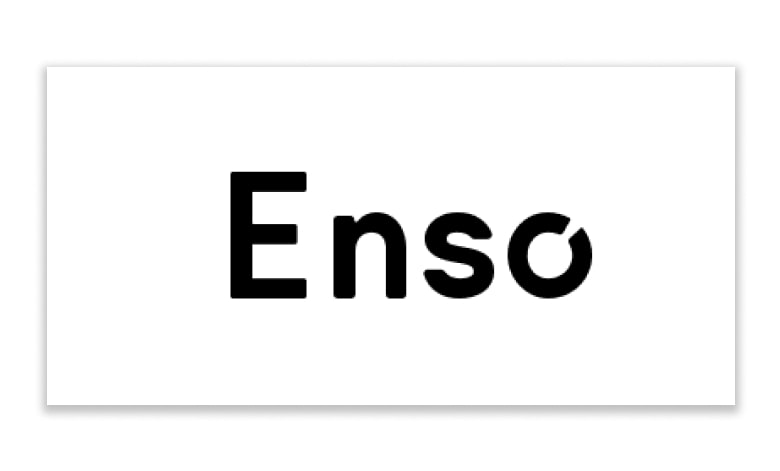
The brain instantly notices the missing space in the “o,” and this deliberate design makes the alphabet resemble a pie chart (doughnut to be more accurate).
See also: How to Embed Fonts in PowerPoint into Various Platforms
Closure
These were just 20 creative custom fonts PowerPoint that you can use in business PowerPoint presentations, marketing collaterals, and other designs.
We always share more creative, insightful, and informative articles for the designers and our beloved readers. See you in the following article!
Let’s visit RRSlide to download free PowerPoint presentation templates with many categories. But wait, don’t go anywhere and stay here with our Blog to keep up-to-date on all the best pitch deck template collections and design advice from our PowerPoint experts yet to come!
