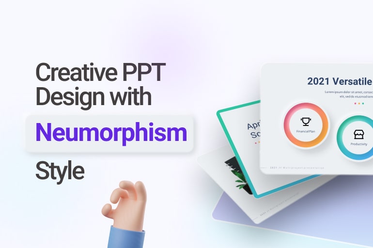
A neuromorphic design style has become increasingly popular in gadgets’ user interfaces in the last decade. People love its flawless, straightforward design, even though it doesn’t use any primary colors.
Also known as ‘soft design’ and geomorphic, its simplicity is the selling point of the style. But its simplicity doesn’t mean it has to look ugly or unattractive. Instead, this gem is considered to be one of the most accepted designs on this planet nowadays.
Making things simpler feels like the design is futuristic enough to make us feel like it has been designed by someone from 2050. Look how it sounds pretty contradictive; the style is both futuristic and straightforward.
That’s why, even though it was initially introduced as a gadget’s User Interface design, nowadays, it can be applied to anything. By anything, we mean it includes creative PPT design. Yes, you can also create innovative PPT designs with a neuromorphic style.
How to do it? Here we will give you a guide to creating a creative PPT design with a neumorphic style.
What you need to know before you create a creative PPT design with a Neumorphic style
Even though it seems like a futuristic design, this design can be traced back to the 1980s. Back then, it didn’t start as something big instead started as skeuomorphic. Steve Jobs, former CEO and founder of Apple Inc., was one of its ambassadors.
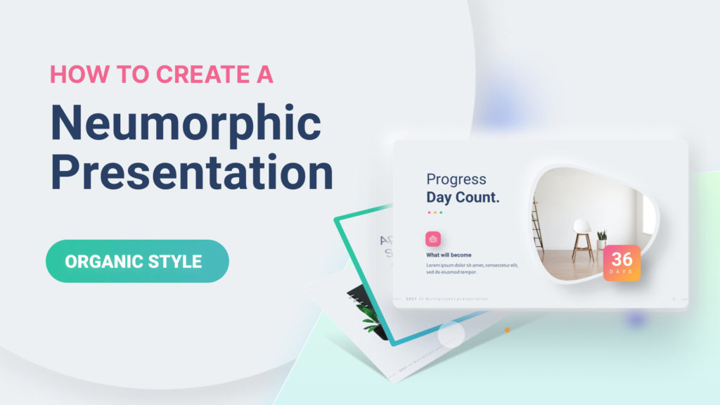
The skeuomorphic design was thought to give users a more intuitive experience while doing something with their gadgets. By mimicking real-life physical objects in graphics, shadows, shapes, and details, users were given a hyperreal experience.
Skeuomorphic style has been used in the earliest versions of iOS, surviving for almost two decades until passing the millennium change in the 2000s. However, the 2000s became the last decade when this style was considered an innovative way for developers to interact with customers.
It was in 2007 that Forbes said this style is as dead as a past life. iOS tried to keep this design as long as possible for their identity, but they finally gave up on the trend six years after the ‘death announcement’ made by Forbes.
Apple decides to change the design into a more minimalist and aesthetic design called Flat design. Inspired by the Swiss style, this decision lasted no longer than when the skeuomorphic type survived the ‘death announcement.’
See also: The Only Guide You Need to Make Parallax PowerPoint Presentation Design
What is a Neumorphic style?
So, what’s the creative ppt design with neumorphic style? The style is a user interface design style that mimics real-life objects, making it as clean and straightforward as possible. It combines flat design and skeuomorphism into one paradigm and takes only the best characters of both.
The style combines background colors, shadows, shapes, and gradients to make the buttons and switches in the user interface as close as possible to such things in real life. The style makes the buttons and switches appear almost like they are 3D with the combination of those things.
The most notable characteristics in neumorphic-styled-buttons are a darker shade of shadow below and a lighter shadow above. Its visual illusory, including visible movement when touched, makes users feel like they are pushing or switching on actual buttons under the screen.
Even though some people find its visibility level is lower than other styles, the whole world has accepted the style since its whole-world introduction in Apple devices. Nowadays, Apple decides to keep this style as part of its user interface design because of its success in creating an identity for its products.
How to create a creative PPT design with Neumorphic style
So, how to adapt the tone and create an innovative PPT design with a neumorphic style? The steps you have to follow are easy but mostly require precision to make it look almost like a 3D design on iPhones.
Here are the steps to create a neumorphic object:
Create an object
The very first step you need to do is to create an object. It doesn’t matter whether the thing will be a rectangle, circle, or even a star.
After you finally decide on the object, what you need to do with the object is to duplicate it into two.
Control the shadow
The next step that you need to do is to control the shadow of the object. You can do it by clicking the ‘Format Shape,’ expanding the ‘Change Style’ bar, and choosing ‘Shadow.’ There, you will find the tweaks for your object’s shadow, starting from its transparency and size blur, angle, and distance.
You can experiment with this part, but to make it looks more like the most common neumorphic style, make sure to set the angle to 45 degrees and blur the shadow by around 13 points. Also, make the size of the shadow slightly smaller than your object.
Control another object’s shadow
The exact formatting as the one before should be enough for your second object. However, after that, make sure to set the angle of the shadow to 225 degrees. If you made the shadow of your first object appear in its 4-o’clock direction, the shadow of your second object must occur at its 10-o’clock approach.
After that, change the color of this shadow to white to make this shadow bright. As a tip, you can change the slide’s background to dark first before setting this ‘bright shadow.’
Pile up the object
The next step you need to do is to pile up the object to match precisely one another. After that, choose both things and align them with ‘center’ and ‘middle.’
The purpose is to make one object fully cover another object. After that, we make it look like receiving light from one side and creating a shadow on one of its counterpart sides.
Blend them to match the background’s color
This part is also essential to replicate the creative ppt design with neumorphic style of an iPhone. Before doing anything with your objects, make sure to change their color similar to your slide’s background color.
Our suggestion is not to use plain white as the background color but give it a slight shade of grey to see the brighter shadow.
Spice them up
Don’t forget to ‘Group’ your objects into one object because it will prevent unwanted alteration in the future. After you have done all of that, try to spice up your thing.
For example, you can change the gradient of its color to create an illusion that makes it look like a pushed button.
Make many
Okay, after following all those six steps, now you must have understood how to create a neumorphic-styled button.
To create a creative PPT design with neumorphic style, you may require around ten or more of them. Seems tiring. Don’t worry, we have a solution for that.
This one trend we also love
Apple device users are not the only ones who love Neumorphic PPT designs. In addition, this style is one of the most attractive designs for PowerPoint presentations because it is futuristic yet straightforward.
Any presentation can use it, from formal ones to high school summer project reports. People can easily accept its simplicity, and its aesthetic value won’t overwhelm any other PowerPoint presentation design.
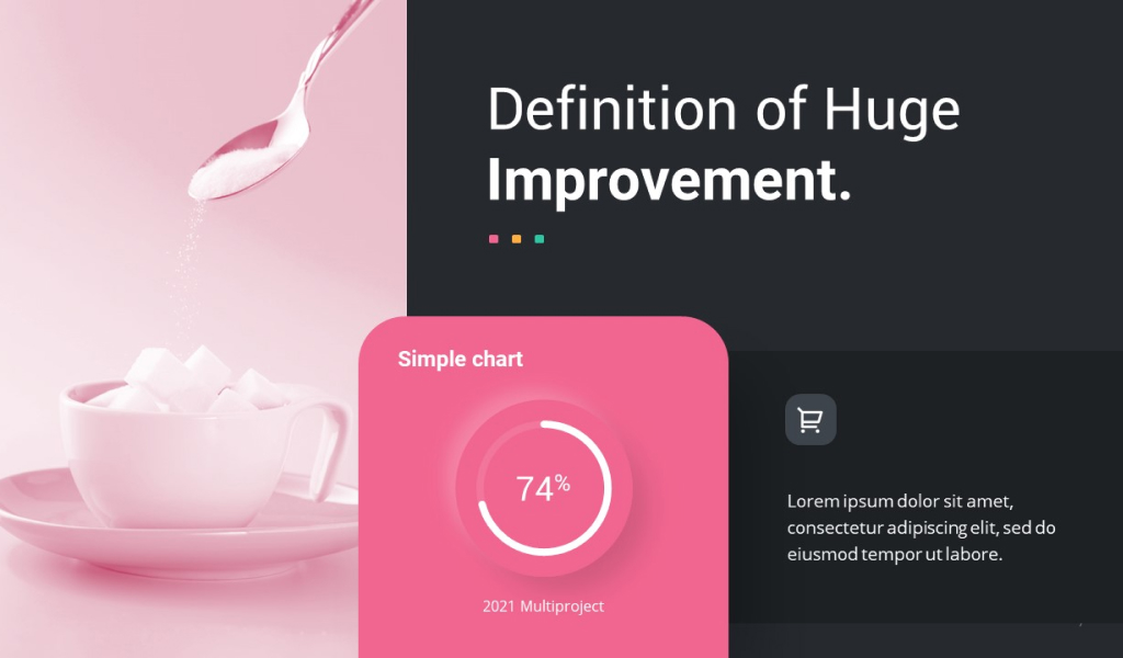
We can also apply it to a wide range of objects, not just rectangles or circles, but whatever you can think of.
Is there any single problem that prevents people from creating creative PPT designs with neumorphic styles? Because a single button requires so much effort, this style is only popular among those who see it.
Well, that’s not something that you need to worry about, though, because…
See also: Glassmorphism Presentation Templates 2022: New Design Trends with Glass Morphic & Overlay Glassy
…We can create creative PPT design with Neumorphic style or any other style
Yes, we can explain how to make it on your own and create the buttons for you. In addition to creating your presentation buttons, we can also design the whole presentation based on your specifications.
Compared to the other PowerPoint presentation styles, Neumorphic might still be a new style. However, as a professional PowerPoint presentation designer, RRGraph Team is always up to date with the latest design trend.
As soon as a new trend in PowerPoint presentation design emerges, we will incorporate it into our designs. We do it all to encourage our clients to present better.
Let’s visit RRSlide to download free PowerPoint templates. But wait, don’t go anywhere and stay here with our RRGraph Design Blog to keep up-to-date on the best pitch deck template collections and design advice from our PowerPoint experts.
