

Visuals are one of the best ways to communicate information quickly and effectively. That’s why businesses use infographics, videos, and animation to present data that is easy to understand and engaging for their audiences.
In 2022, data will be presented visually in more innovative and exciting ways than ever before. In this blog post, we will discuss the best ways to display data visually, provide tips for creating effective infographics and videos, and why visuals are so important when presenting numbers and figures.
Why visualization in data presentation is important
A picture is worth a thousand words, which is especially true for data presentation – here, visuals are crucial.
According to a study by iScribblers, people can understand visual data up to 60,000 times faster than presented in a text-only format.

This means that businesses need to find ways to present data visually to communicate information effectively. However, it’s not enough to use any visuals – the way data is displayed is important too.
The best visuals are those that are well-designed and easy to understand. Infographics, videos, and animation are engaging and visually appealing, which means that people are more likely to remember their information.
That’s why businesses are even turning to data visualization experts to help them present data in the most effective way possible. Luckily, you don’t have to, as we’ve prepared a complete guide.
Who can benefit from data visualization?
Data visualization is not exclusively crucial for marketing purposes. The same goes for corporate presentations, scientific research, and school reports.
Here are some examples:
- Marketers can visualize data to attract new customers and increase brand awareness.
- Students can use a visual representation of data to learn difficult concepts more quickly. Visual aids can make complex information easier to remember.
- Researchers can communicate their findings in an easy-to-understand format. This can help them reach a wider audience and publish their research in journals.
- HR managers can provide employees with data that depict company performance. This can help employees understand their role in the company and how they contribute to its overall success.
- Team leaders can use charts to track and demonstrate the project’s progress.
People in all industries can benefit from presenting information using pictures, charts, and graphs. Data is everywhere, and businesses, students, and researchers can all use data display to make sense of it.
Essential tips for a visual representation of data
There are a few important tips that you need to keep in mind for data visualization. Here’s how to make your visuals stronger.
Use simple visuals
Simplicity is vital in presenting numbers and statistics. You want your visuals to be easy to understand and interpret. This means using basic shapes and colors and avoiding complex designs. Less is more, so you want your visuals to be clear and concise. Try avoiding clutter and adding too much information. Stick to the essential data points and use white space to keep your visuals clean and easy to understand.
Make use of color
Color is also a powerful tool in data visualization. It can be used to highlight important information or to create visual distinctions between different data sets. According to Sanocki and Sulman’s experiment, people can understand data more quickly when color patterns are harmonious, and there are fewer of them. The study has also shown that the contrast between the background and the content also helps focus.
Include relevant data presentation
It’s essential to ensure that your data is accurate and your visuals include all the relevant data sets. Inaccurate data can confuse and mislead your audience. Plus, you don’t want to leave any critical information out, just like you wouldn’t want to use outdated data in your presentation.
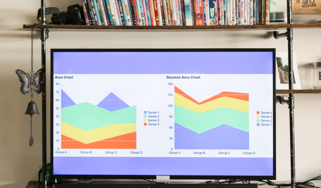
Use appropriate charts and graphs
There are various charts and graphs that you can use when visualizing data. They provide a quick overview of the information you are trying to communicate.

Make sure to use the right ones for your data sets, and format them correctly. For example, use a line graph to show changes over time and a bar graph to compare data sets.
Keep your visuals organized
Your visuals should be well-organized and easy to follow. This means using clear labels and headers and arranging your data in an orderly manner. First, ask yourself what you want your audience to understand and remember, then design the visuals to communicate a specific message.
Incorporate interactive elements
Interactive elements are a great way to engage your audience and make your visuals more memorable. They allow people to explore the data in more detail and can help them understand it better. You can use rollover effects, animations, and tooltips to give your viewers a more interactive experience. These elements can also provide additional information or context for the data you are presenting. Interactive visuals can also keep people’s attention for longer.
Use images in data presentation
Images are also an excellent way to add visual interest to your data. They can help you communicate complex information in a simple and easy-to-understand way. Images can also add emotion to your data and make it more relatable. Just make sure that the images you use are high-quality and relevant to your presenting data.
Use animation
Animation can be a great way to engage audiences and make data more interesting. However, you should only use animation if it is necessary and will add value to your visuals. Too much animation can be distracting and annoying, so use it sparingly.
Keep your visuals consistent
Make sure that your visuals use the same color scheme, fonts, and layout. This will make them easier to understand and remember.
In addition, a consistent color palette can define your brand and make it recognizable.
Best ways to present data presentation
Now that we know the essential tips for data visualization let’s look at some of the best ways to present data visually in 2022.
Infographics
One of the most popular ways to present data visually is through infographics. Infographics are images that combine text and graphics to communicate a message. They are becoming more and more popular because they concisely share complex information and help retain visitors.
Research shows that viewers spend up to 80% more time on web pages with infographics than without. That’s why businesses use them to share data presentations with their customers and clients.
Videos
Another great way of displaying data is through video. Video is a powerful medium that can be used to communicate a lot of information in a short amount of time.
Studies have also shown that people remember 10% of what they hear and up to 65% of that information if the audio is paired with video. That’s why making videos to communicate complex data is effective for different audiences.
Animation
You can also use animation to show something happening over time or at different speeds, which helps viewers see the changes better.
For example, offer two parallel graphs to compare data sets over time or an animated map to show how something changes geographically. Just make sure that the animation is well-done and adds value to your visuals.
Dynamic slideshows and static presentations
Finally, you can use a slideshow or a presentation to communicate data. You can use images, text, and graphs to convey your message. Static presentations are similar to slideshows, but they don’t move. They are perfect for print media or when you want to keep your visuals on-brand.
See also: Best Big Bundle Infographic PowerPoint Items in 2022 (Fresh from the Oven)
More tips for data presentation
Let’s look at some additional tips for making your presentation go smoothly.
Speak distinctively
When presenting data, it’s essential to use language that your audience will understand. Avoid jargon and technical terms unless you are sure that everyone in the room knows what they mean. It’s also important to speak clearly and slowly so that people can follow along.
Practice beforehand
It would help if you never tried to wing a presentation. It would help if you always practiced beforehand to know what you’re going to say and how you’re going to say it. Likewise, you can even make a transcript of your speech to get an idea of how you will sound.
Don’t rush
When you’re presenting, it’s essential to take your time. Rushing through your presentation will make it more difficult for people to understand and remember the information. Instead, take pauses between points so that people can process what you’re saying.
See also: 7 Tips on How to Make a Good Infographic
So there you have it – the best ways to show data presentation visually in 2022
Use these tips to create stunning and informative visuals that will engage and inform your audience. By using infographics, videos, animation, and interactive elements, you can ensure that your data presentation is exciting and easy to understand for your audience.
Let’s visit RRSlide to download free PowerPoint templates. But wait, don’t go anywhere and stay here with our Blog to keep up-to-date on all the best pitch deck template collections and design advice from our PowerPoint experts!


