Do you realize that most clients will look at a project’s appearance before taking a look at its content? You betcha! It is such a game for designers. They must play hard for the complexity of typography to get a good score in design.
Analogically, if the content is king, then the typography is the red carpet. That is true because typography is everywhere we look. It appears in online or printed publications, books, websites, or even in our daily life. We all know how typography means everything in all aspects.
According to Career Foundry, Typography is so much more than just choosing beautiful fonts: it’s a vital component of user interface design.
In typography itself, there are two elements that people often argue about the definition. If so, who are they actually? Now let’s get right down to the nitty-gritty.
Typeface vs. Font
Typeface and font are two critical elements in typography. But, we always have the misconception about whether they are synonyms or not. The fact is not.
The typeface is a set of fonts, each of which has its own mood and character, such as Serif, Sans-Serif, Script, Blackletter, and Decorative.
On the other hand, the font is a specific typeface with a set of width, size, and weight. For example is a Serif, which consists of Times New Roman, Garamond, Georgia, and way more. Both are just like an album with many songs, it is as simple as that.
Font pairing tips and tricks 1: Understanding Typefaces
The typeface can be a vast and complex thing, but it does not have to be. We only need a little to make a big difference in the stuff we do every day. Here are five basic typefaces that you need to know first.
Serif
Serif has small feet at the end of the stroke. The most popular Serif typeface are Times New Roman, Cambria, Cooper Black, Garamond, and many more. Serif is more ornamental. It is a good fit for the heading and logo since it creates a sense of formality and credibility.
Sans-Serif
Sans-Serif does not have an extra stroke. Popular Sans Serif fonts include Helvetica, Avant-Garde, Arial, Geneva, and much more. This style gives a feeling of casualty, simplicity, and approachability more than Serif. These fonts are great for the contents of websites, blogs, and other flat designs to create a sense of humanitarianism and classiness.
Scripts
Scripts are letterforms related to human handwriting, such as Bistro Script, Shelly, Minstral, etc. Scripts offer a wide assortment of moods and characteristics, from formal to casual. Traditional Scripts are used for invitations, announcements, and decorative letters with a sophisticated tone. In contrast, casual Scripts are often used for ads, brochures, and anything that requires an informal look.
See also: 20 Best Fonts for Professional PowerPoint: Adios! You Won’t See Arial and Times New Roman Anymore
Blackletter
Blackletter is Gothic or Old English with a dense black texture and highly decorated caps. Some Blackletter fonts are Fette Fraktur and Engravers Old English. They can express the spooky, mystical, and classical vibe on book covers, movie titles, and CD packaging.
Display or decorative
Display or decorative is another type of handwriting style. Some examples of Display typefaces are Morning Glory, Burnout, Carter Layered, and Pittsbrook. Different types of tattoo fonts, graffiti-style fonts, and many more can be listed in this category. A display typeface is suitable for the E-Sport logo, drink or food label, brand packaging, headline, quote writings, etc.
Good font choices help our design look more readable. Whether our content is good or not, if the font choices are sloppy, it will look unprofessional. According to Plum Grove, it’s important to understand what things affect the readability of your type. Scientists have measured eye movement and comprehension and verified these five rules that you should use when selecting type font and size for your marketing materials.
Then, how do we treat our design project to engage new clients in the fact that our clients will never know the way we work? So simple, it is merely by showing our professional content with good typography. Once our typography is on point, the client will trust us more.
See also: What Are Sans Serif Fonts? Don’t Get Stuck in the “Serif = Traditional, Sans Serif = Modern” Mindset
Font pairing tips and tricks 2: Getting started
Font pairing tips and tricks are like choosing color schemes. If we cannot combine them, our design project may look clumsy. So make sure to select fonts with different categories to complement each other. Here is an example:
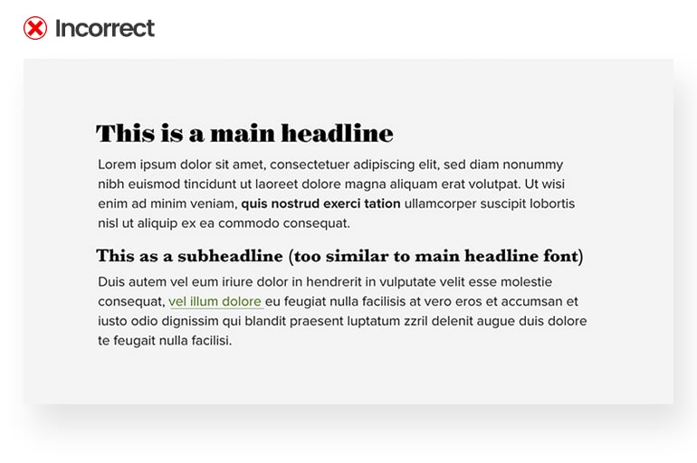
The problem is, that both the headline font (Surveyor Display Black) and the sub-headline font (Baskerville Bold) are alike. It is because they are classy fonts. It is okay, but some people may ask, “Which one is the headline?” after seeing the disastrous combination of our content.
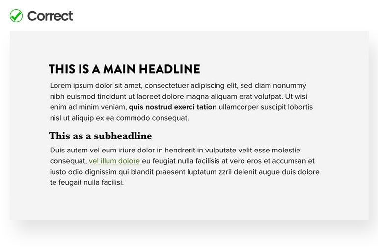
Then, how to fix it? What if we put a Bold sans-Serif as a headline font?
Know how many fonts to use
Looking for the right combination is excellent for choosing countless typeface libraries. Actually, there is no limitation on how many fonts we should use in a project. A senior designer can use ten fonts, and they still can manage to look good before moving further.
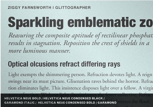
Take a look at the example above. The writer simply creates two typefaces using five fonts, they are three Helvetica Neues and two Garamonds. Both Helvetica Neue and Garamond can create good coherence with different personalities.
Create contrast between fonts
The next is to get the proper size between the header and body text. For instance, it uses a 24-point font for the title and an 18-point font for the body text on the left side.
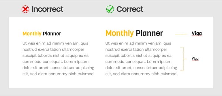
A visual hierarchy should clearly define the order in which we read the information in our design. For example, the header on the right side uses 36-point and 18-point as body text to allow the readers to perceive the point quickly.
Adjust font weights
In order to create a clear visual hierarchy is to adjust font weights with different boldness. For instance, we just use Roboto Light as a header and body text. They simply do not fit well together because they are similarly thin.
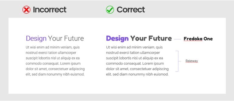
Or, in the example above, we see that the best combination is achieved by Fredoka One and Raleway. When we mix a lot of personalities, then you have a discordant design.
See also: 20 Best Creative Custom Fonts PowerPoint Design
Use a distinct font with a similar typeface
Using different fonts from the same typeface can save a lot of time and produce a simple look.
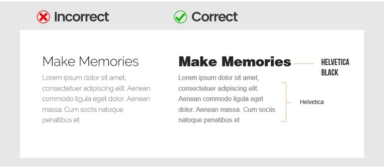
Do not try to match a similar font like combining Raleway Thin for the header as well as for the body text. It is a real definition of a mistake.
Avoid discordant combinations
Making a difference is beautiful, but it does not mean making something awkward. The things we should do are to create visual harmony and to repel the readers’ boredom. Well, combining different fonts is pretty fine since we consider the proportions and height.
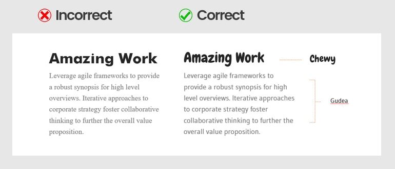
For example, Futura with Times New Roman does not work well because there is too much contrast between the widths. The right side is the perfect match. They are Chewi and Gudea.
Make it simple
If one of our fonts has a very artistic style, avoid pairing it with similar character fonts. Otherwise, our design looks terrible and illegible. Our best choice is to pair a different font with a more neutral or simple one.
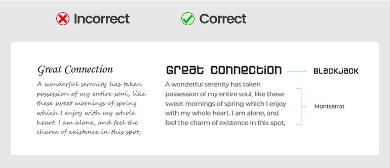
However, the illustration on the right side uses the more neutral Monserat as body text to balance the Blackjack font as a header. Look, our design is more pleasant and readable, isn’t it?
Mix with the right mood
Another key to pairing fonts is admitting that each font has a personality and a mood. Avoid making a mistake by pairing fonts with an unfit tone.
We can see on the left side of an example below, Impact font is bold and blocky while MTF Cool Kid is playful, simplistic, and childlike. Welp, they seem irritating to our eyes when going together.
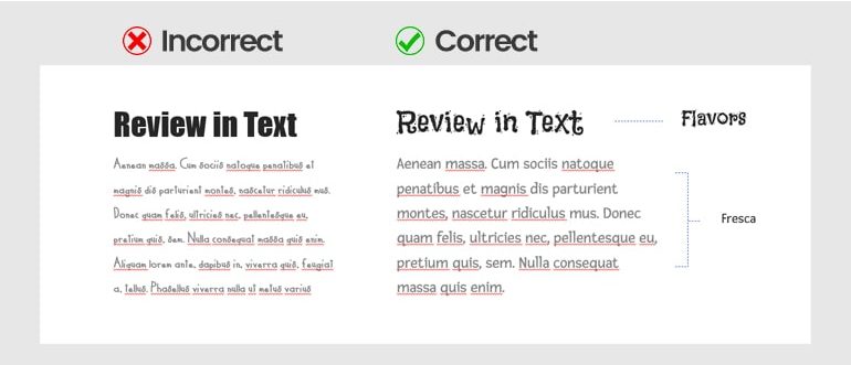
Let’s have a look at the right side. Flavors and Fresca are precisely a perfect match.
Pair fonts based on interest
Many people hate paragraphs. But what if it is the only way to present a piece of information? The only way is to learn to pair fonts based on interest, like headline arrangement in articles. Let’s take a look at how the way LinkedIn publish their article:
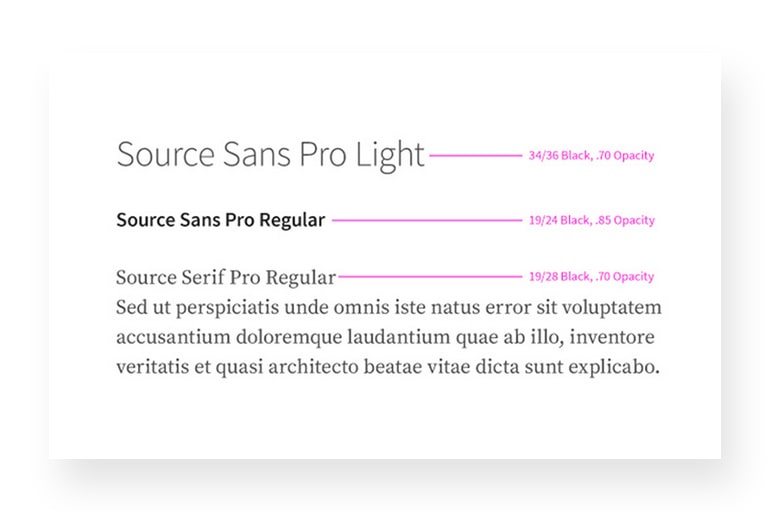
By contrasting the fonts, such as a very bold Sans-Serif font, lighter Sans-Serif, and a bold Serif font, we can vary our project’s look. This trick is to integrate the sense of their designs and products.
See also: The Only Guide You Need to Download and Install Fonts for Professional PowerPoint
Font pairing tips and tricks 3: More things to learn
We should implement all the tips and tricks above with the four essential concepts in typography kerning, leading, tracking, and hierarchy for enhancing our design experience. As beginners, we do not need to know everything about them, just enough to give some excellent references for all design projects. Take your time to learn them.
Hierarchy
Hierarchy is used to catch the reader’s eyes by showing them where to begin and where to go next about what they read. Indeed, this action needs to use different levels of emphasis.
How do we implement that? Just decide which points we want the reader to notice first, then make them stand out by adjusting the size, width, height, font styles, or differences somehow. Remember to keep it simple.
Leading
Leading is the space between lines of the text, it is also known as line spacing. If you are unsure how many rows to use, making it with the default setting is pretty okay.
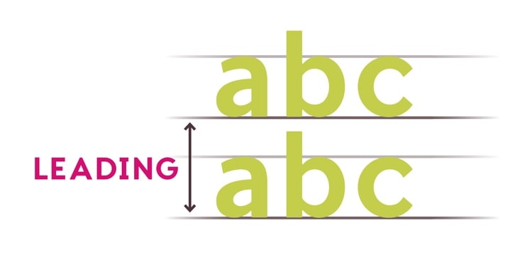
We need to avoid too much or too little spacing, as in the example above, it can make the text show unpleasant for the readers.
Tracking
Tracking is the whole space between characters. It is popular as character spacing.
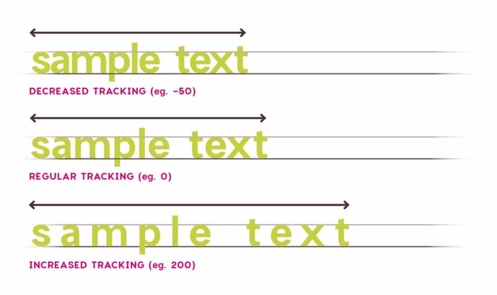
In some designs, we might adjust our tracking to create an artistic effect. Tracking can also help you to fix fonts with poorly spaced to put in.
Kerning
Kerning is the space in each specific letter. It is different from tracking. Kerning varies the length among the characters in extra width to match them perfectly.
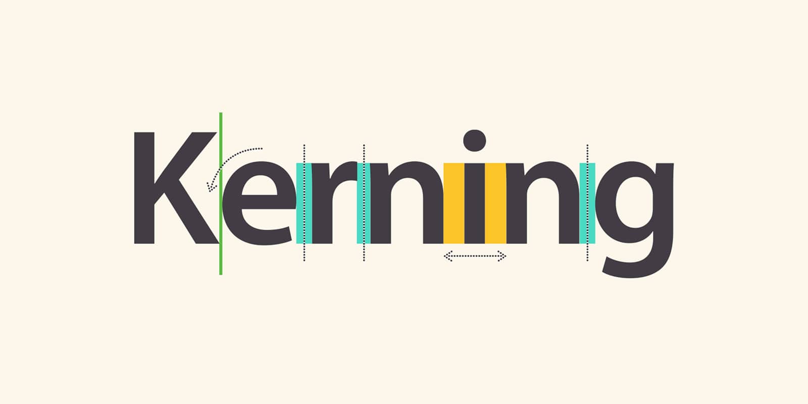
Making individual letters look properly spaced is tricky. If we use a font with bad kerning, it is better to cut our loss and choose something else.
See also: How to Embed Fonts in PowerPoint into Various Platforms
Putting it all together
Learning font pairing tips and tricks need a high curiosity and the determination to improve continuously. Once we are interested in typography, we will love to do more and more to meet perfection in every inch of our projects. In the end, well-crafted typography can make a design extraordinary.
What do you think about this Font Pairing Tips and Tricks for Dummies article?
We wish you have fun learning about typography from the basics. If this write-up looks enjoyable, be sure to check out the rest of our insightful articles here.
Let’s visit RRSlide to download free PowerPoint templates. But wait, don’t go anywhere and stay here with our RRGraph Design Blog to keep up-to-date on the best pitch deck template collections and design advice from our PowerPoint experts.
