

If you spend enough time on photo sites, you’ve probably noticed a lot of photos with deliberate image brightness. This, of course, is HDR. Basically, this means that an HDR monitor more realistically displays nuances and color tones, and shows more detail when it comes to light and dark. So it’s very important for graphic designers who care a lot about colors, especially HDR in photography and graphic design.
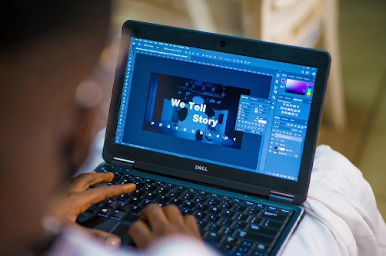
Beginners and professionals alike often have problems using HDR in photography. That’s why we want to understand in more detail how it should be applied correctly. Let’s start with the basics so that beginner photographers and graphic designers have fewer questions. You also have to use HDR software, the best options can always be found on Skylum’s blog.
Let’s begin with the basics
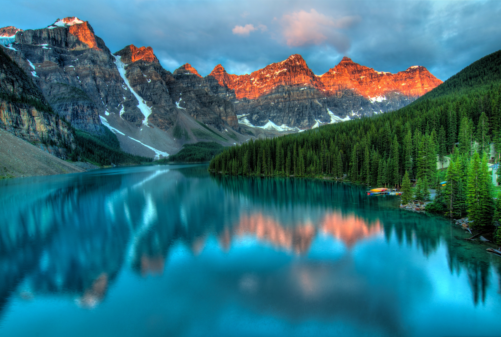
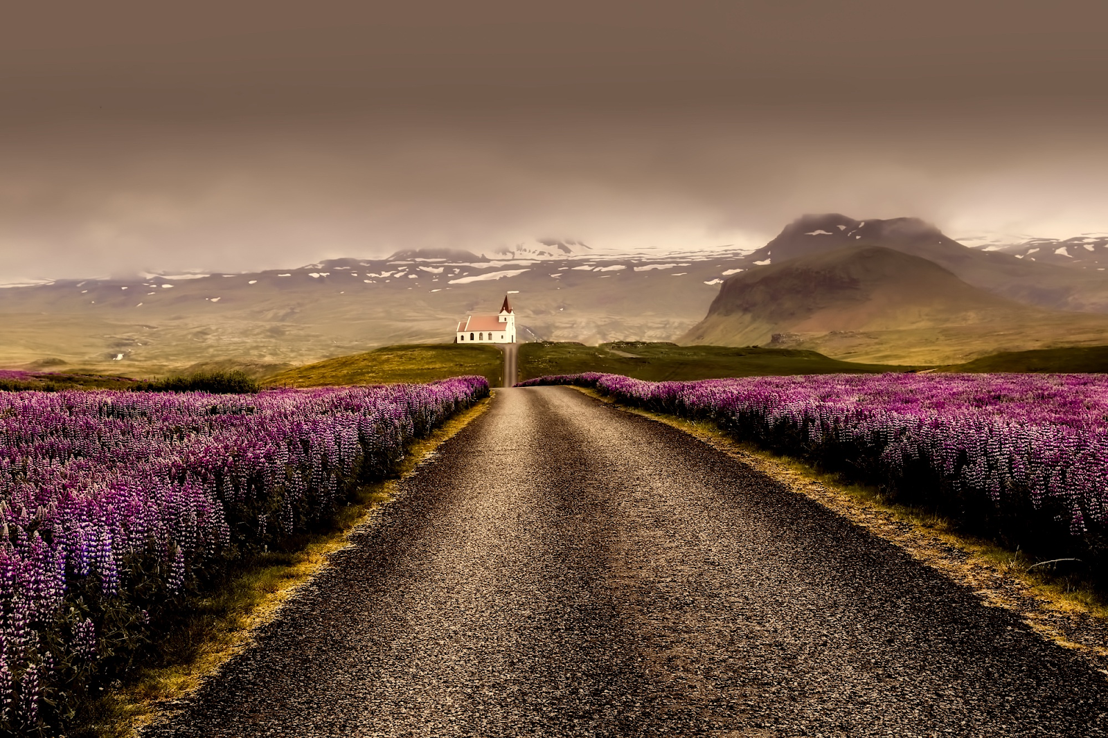
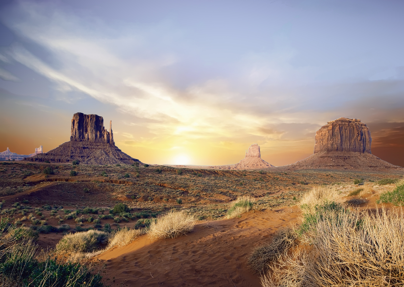
HDR is an imaging technique that produces a wider dynamic range of exposure than would be possible with ordinarily available photography. HDR is commonly used for landscape photography to emphasize the visual impact of light and shadow with a large range. Some points need to be discussed in more detail:
- Traditional HDR is achieved by taking multiple frames with different exposures. Up to seven photos must be taken, each at a slightly different shutter speed.
- After the images are combined into one, the result is a dynamic range that is much greater than what the latest digital technology, which cannot reproduce even a semblance of what the human eye can see, can provide.
- HDR photography is designed to bring the digital image closer in saturation and detail in light and shadow to what humans see and perceive. And as in any creative process, a lot depends on the photographer’s taste, his or her preparation, and ability to distinguish a good photo from a bad one. The same goes for graphic designers.
You need to know when you can use HDR without detriment to the final result. For example, when there is a large contrast difference between the sky and the ground in the landscape, it creates a problem for the camera, which cannot decipher how to properly process the image in the viewfinder because of conflicting data.
By exposing first to the ground and then to the sky, the photographer will end up with a more true-to-dynamic range image when superimposed
When you have to shoot a low-light or backlit subject, it can result in an image that is darker than you had hoped. In this case, using HDR may be just what you need.
It is often easier for graphic designers to work with a photo in HDR. The reason is that this format produces bright, contrasting images that look great as logos.
Original photos created for HDR can be stitched together in several ways – either automatically in the camera or manually in the photo editor. Regardless of how they are stitched together, the photos must be identical, that is, they capture the same area of the scene being shot. This is the task of the graphic designer, who gets the images from the photographer.
Now a tip for the photographer who works in tandem with a graphic designer. If you shoot with a handheld camera, even a short shutter speed can cause a slight camera shift, and with a slow shutter speed, a blurring of the image can occur. The resulting photo risks being blurred and of poor quality. Perfectly matched photos are easier to make using a tripod.
If you don’t have a tripod, or if you need to take a picture quickly and don’t have time to bother with additional equipment, you can take pictures without it. In this case, it is better to use the HDR auto function or turn on the exposure bracketing. To prevent the camera from shifting, you can find suitable solid support. It is also helpful to turn on the image stabilizer if the camera or lens has one.
When HDR is appropriate
An image with an expanded dynamic range does not look good in all situations. Determining whether to take a classic or HDR shot is fairly easy. You can do it by taking a test shot in normal mode. If a live-action picture of a landscape looks great, but your picture shows shadows going black and lights being overexposed, it is worth taking an HDR shot. When shooting a stormy sea, you can get amazing shots using this technique.
However, there are a few types of photography for which HDR technology is not suitable and you, as a photographer or graphic designer should consider that:
- Portrait photography.
- Subject and studio photography.
- Fog and mist.
- Reportage shooting.
- Shooting sports, children, animals, macro.
- Winter landscapes.
- Architecture and landscapes on a dark rainy day.
That is, if you want to create a poster or logo with such objects in HDR, you should not do it.
On the contrary, if you want to capture the beauty of a sunset, it is better to use classic photography. Here the dynamic range of the photo is already wide enough and it is not worth wasting time on HDR. An exception is if the photographer has a tripod with him. Then you can do a few test series.
How many shots to take with different exposures
When you start to get acquainted with HDR, it is better to use the classic scheme for this technology. Namely, take three shots with different exposures. It is worth evaluating the scene and lighting conditions.
Professionals often use a lot more different exposures up to nine. This allows them to achieve maximum detail in lights, shadows, and mid-tones. You can simply change the shutter speed in manual mode by one step for quick work. This will allow you to get as many different exposures as you need without too much fuss.
Five exposures are relevant when many details are hidden in deep shadows, highlights, and mid-tones. For example, on a bright sunny day. When the sky is overexposed, and shadows in the forest thickets are too dense. In such a situation, HDR photography will better render the picture, bringing it closer to what the human eye sees.
See also: Photography PowerPoint Templates for Amazing Portfolios
The bottom line
So, now you know a lot more about how to use HDR properly. If you’re creating an HDR shot in a photo editor, discover Luminar Neo. It can also be used by graphic designers who need good resulting photos. It’s a modern photo editor with a great set of professional tools and a simple interface. You’ll also find other HDR software options to try on the Skylum developer’s blog.


