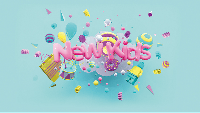
Memphis design had a bad history when it was invented. People called this style a shotgun wedding between Bauhaus and Fisher-Price as sarcasm. And, it is often being seen as bizarre and controversial art at that time. Later on, after passing trial and error, Memphis’s design gained a good appreciation. This shows its renewal to take over art and innovation over the world.
Memphis design goes back to 80s aesthetic colors and shapes to inspire people. It is such an antonym for Minimalism. Although everyone will dislike this 80s style, Memphis design is still on top of everything to bring a new light for designers and persuades cheerfulness for us today.
So, here is anything we need to know about Memphis design up and down.
Memphis design is very much back in vogue
Memphis design is a funky style between the 1981 and 1987 eras. This style is inspired by Art Deco, pop art style, and 80s retro, which is very iconic. Then, it grows faster with a good reputation here and there, such as art, furniture, interior, product, film, and music.
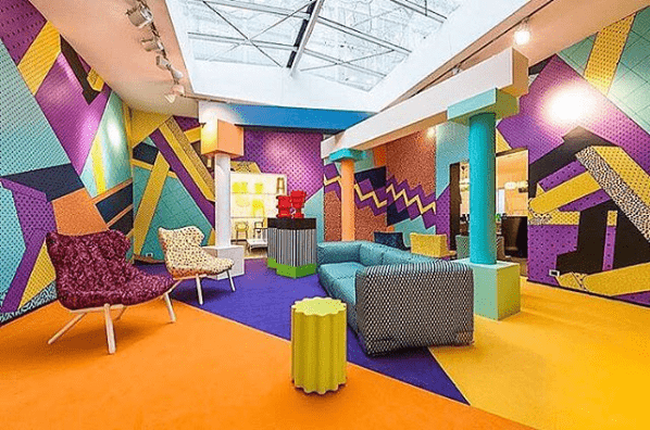
Memphis design is so familiar with geometric shapes, bold patterns, and repetitive patterns. This style has bright, neon, and pastel colors as we see. Discovering this old style makes us feel like we are back in the 80s or remember all our memories from that time.
According to MasterClass, Memphis design was a retro design style created by a group of Italian architects and designers known as the Memphis group. Bonded by a mutual dislike of the minimalist design movement from the 1960s and 1970s, the group set out to design postmodern furniture, fabric, patterns, and ceramics inspired by art deco and pop art.
Founded by Italian designer Ettore Sottsass in late 1980, the design group collaborated to create a style often described as kitschy and garish, centering around vibrant colors, geometric shapes, bold patterns, stripes, clashing colors, abstract designs, and plastic laminate.
How this Memphis design is reviving the bold colors and geometric patterns of the 80s
Memphis design was first created in Milan, Italy, in the 1980s by Ettore Sottsass with other designers who countered the traditional approach.
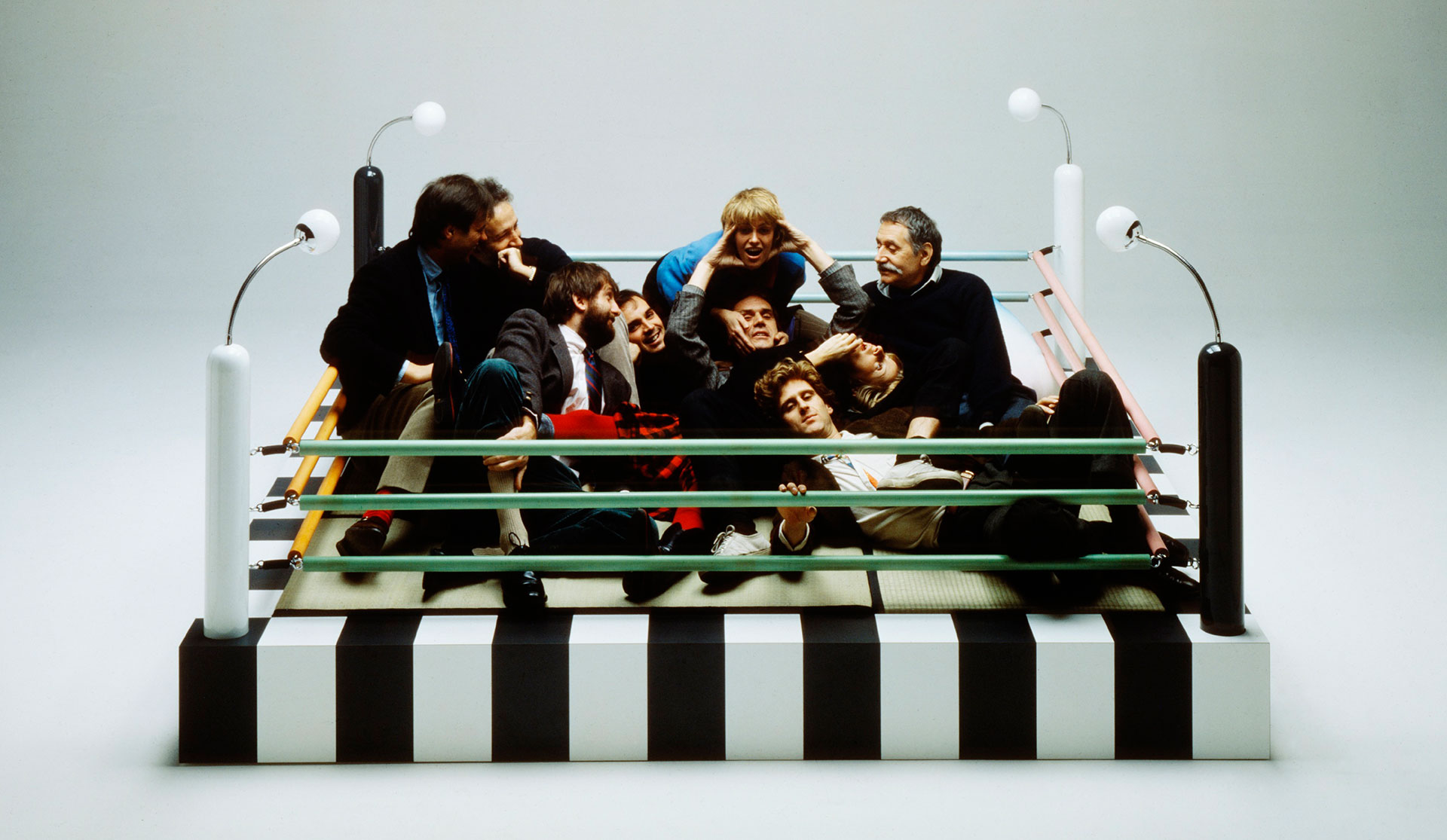
The Memphis group had a similar taste in creating colorful and quirky styles. They tried to convince people that Memphis’s design was not loathful. In the eyes of the Memphis group, this style makes an engaging and enthusiastic experience.
The name Memphis was given after Bob Dylan’s created a song entitled Stuck Inside the Mobile with the Memphis Blues Again when the Memphis group first met. After that, they launched their first furniture collection in Milan called Milan Furniture Fair or Salone Internazionale del Mobile di Milano in 1981. The show was celebrated every year to display innovative and unique furniture by famous architects.
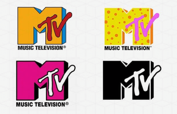
In 1981, MTV could be the first tv program that adopted the Memphis style. We have to look at the original logos of MTV above. That logo was designed with a lot of colors and scratchy graphics.
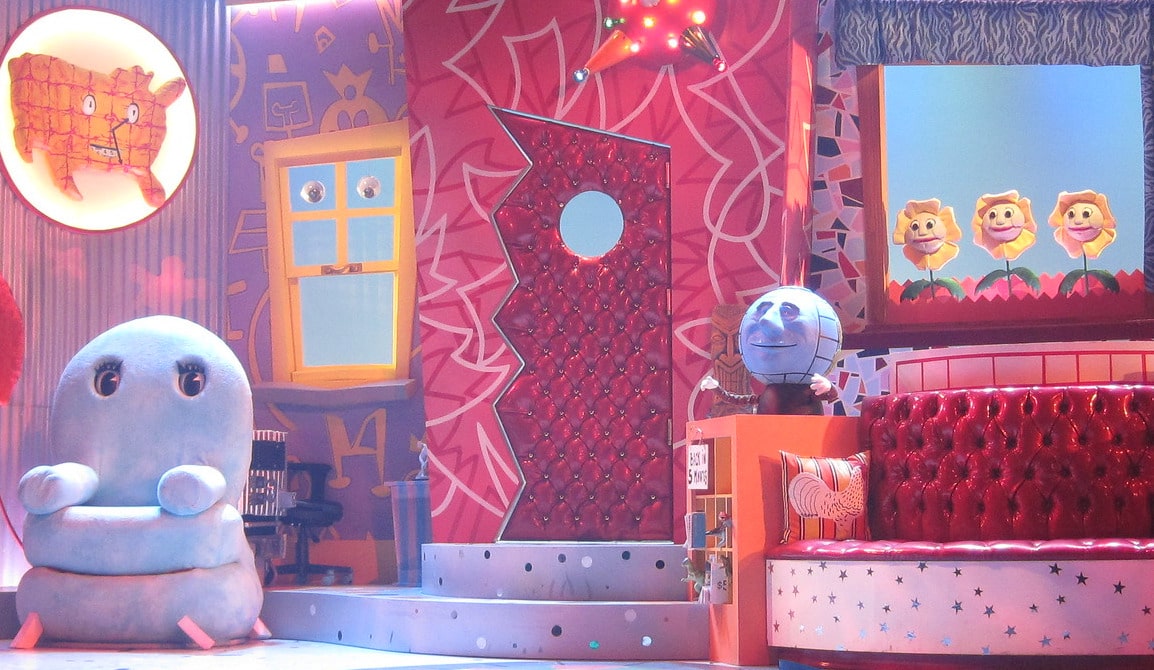
Then, in 1986, a vast Memphis design movement appeared in the kids’ TV show Pee Wee’s Playhouse. Paul Reubens Pee-Wee Herman created this program. As we see in the scene above, the show’s setting used Memphis design with abstract patterns, colorful items, bright colors, and wacky animations.
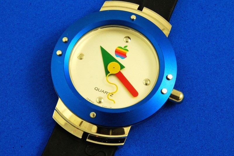
This trend didn’t end up there. The first Apple watch was created in 1995. Its design used an aesthetic Memphis in the mid-90s with geometric shapes, bold primary colors, and playful squiggle.
In 2013, one of the Memphis group members, Nathalie Du Pasquier, collaborated with the HAY company to create patterned bags. A year later, she designed a Memphis collection for the fashion exhibition in American Apparel. It can be proof that Memphis design is still rising to inspire some fashion retailers like Dior and Missoni, for instance.
Memphis design is still alive in so many aspects until this decade. It takes a long journey to prove that Memphis design is more than people think. Now some designers and artists can embrace this style to turn ordinary work into something spectacular.
See also: Understanding Minimalist Graphic Design Rules, Why Less is More
Memphis design has conquered digital work
Some people hate it. However, Memphis design is never truly dead. It goes to be widely influential in architecture and design and is coming back as a design trend. Memphis design inspires a wide range of new design movements for these reasons.
Has a unique style
Memphis design still keeps its groundbreaking. It uses clashing colors, sloppy arrangements, and colored plastic. In this concept, the design shows functionality and highlights a unique decoration to leave boredom.
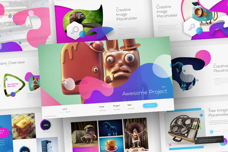
Memphis has changed everything with a more creative approach, although many people make fun of this style. We are pretty okay that not every person has similar good taste in it.
Shows its renewal
Many people assume that this style is just humor and short-lived. In a way, this is true that after Sottsass decided to close down his group, all the work ran to be abandoned for a long time.
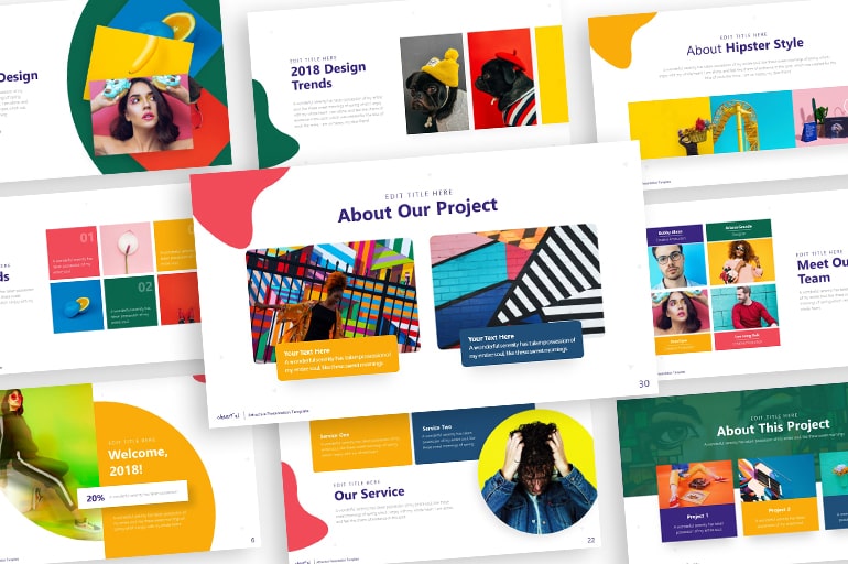
Six years later, Memphis design has raised its popularity after its retirement as many artists and designers make a new inspiration to blend their products with this unique style.
Creates lasting power
Although the Memphis group no longer exists, this influence is still strong today within the graphic, interior, and textile design. Some contemporary designers look for Memphis design as an invaluable idea to their work.
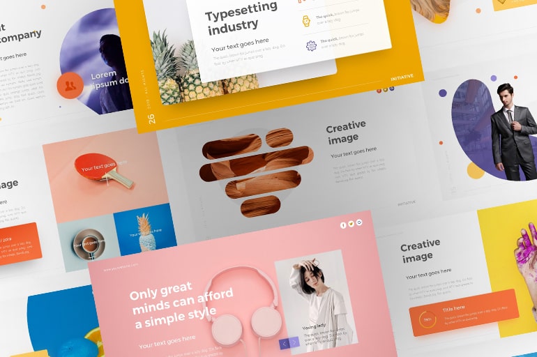
Even if it is not to everyone’s taste, the boldness of this style inspires us to come up with design freedom regardless of whether this style can go against the current trends.
Resolves the barriers
Sottsass and their friends have made a ‘political’ statement to break the gap between the high and low classes in the design world. Indeed, many of them think that this concept is a weird thing.
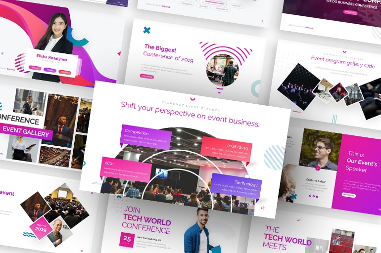
For us, Memphis design screams freedom and inspires designers worldwide to join this movement by creating their own Memphis. Fashion designer Karl Lagerfield and American architect Michael Graves have decorated their offices using Memphis designs.
Turns out to be a master communicator
The work of the Memphis design movement is depicted as vibrant, eccentric, and ornamental nuance, yet this style is less innovative at first.
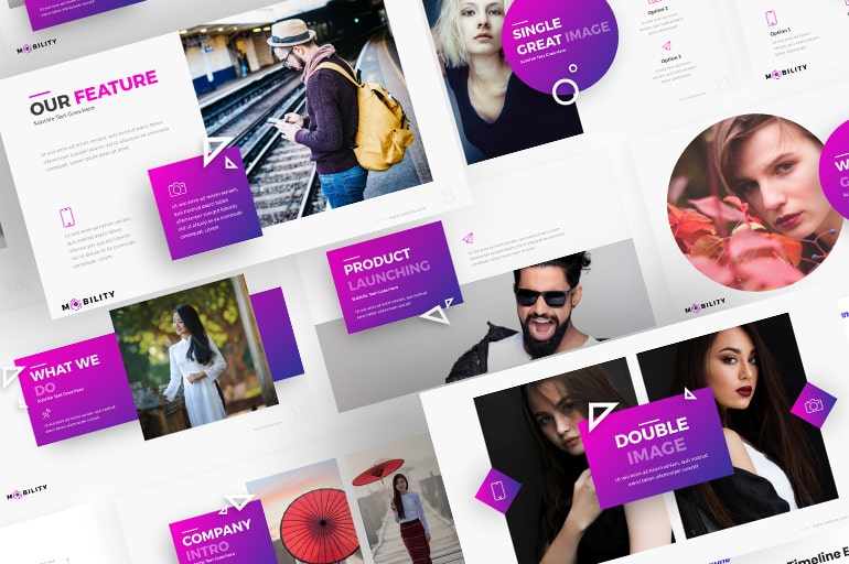
To make this trend more popular at that time, the Memphis group shared their ideas to influence and persuade Artemide, an Italian lighting manufacturer, to work with them by using Memphis design.
We know it is Memphis design when there are
Memphis design movement is never timeless. It is more like a new concept to kick against the functionality of the design that preceded this style. So, here are the characteristics of Memphis design to make you deeply understand how this style brings excitement.
Bright neon colors, wacky geometry, and vivid patterns
Mixing geometric patterns, wild graphic prints, and riot colors with stark black and white can express more in its iconic design. Also, Memphis design has softer and more muted shades, such as teal, pink, and grey.
Strokes and squiggles everywhere
Thick strokes and squiggles are also the main features when it comes to Memphis design. Almost every space includes a series of strokes and lines to fill up the design freely. To keep these old-school patterns looking fresh is to add a bit of animation.
For example, Cartoon Network and Riccardo Zanutta’s websites use the touches of this style to amuse the audience’s eye. Furthermore, the subtle animation is fascinating to escape the design from looking too flat.
Laminate and terrazzo
When designers like Mies van der Rohe and Milo Baughman made furniture with expensive materials, Memphis’s design came with terrazzo and laminates. We are often familiar with those materials on the floor.
Then, a fashion editor of New York magazine, Anna Wintour, said that “the luxurious furniture with stiffness wasn’t a whole lot of fun until 1981, when the Memphis design group, based in Milan, brought out their first collection, then they made a cheerful fusion to neutralize the stiffness in the rock n roll era.”
Block and bubble fonts
Typography never dies in all-around design movements, especially in Memphis design. According to UX Planet, Typography plays a vital role in this process: More than 95% percent of information on the web is in the form of written language.
Good typography makes the act of reading effortless, while poor typography turns users off. As Oliver Reichenstein states in his article “Web Design is 95% Typography”: Optimizing typography is optimizing readability, accessibility, usability(!), and overall graphic balance.
We may get to use typefaces with a geometric look and a class with strokes with this style. Choose font styles with 80s flairs, such as bold or blocky sans serifs, handwriting style, and bubble lettering.
When it comes to typography, don’t be shy about color. This is the time to go crazy with colored lettering. Pick a bright color with plenty of contrast to pop it off the background. Additionally, black or white can also be effective choices, particularly in crowded environments or patterns.
Seven ways to create Memphis design look in our work
We can lift this trend and apply it to our design, whether for websites, products, business cards, PowerPoint templates, etc. In this article, we also make some tips for creating Memphis designs that we can use anywhere. Ready to get started? Find out here.
Brush up your shapes
The original 80s-era Memphis style is familiar with triangles, wavy lines, and polka dots to create energetic and youthful vibrancy. To implement a modern Memphis design, use the same approach by creating a pattern with geometric shapes, but try to streamline our shapes to make them more elegant and smooth.
Have a look at the example above. Avoid overfilling our design by repeating simple shapes in a small arrangement with plenty of white space between them. Plus, add other images and typography as the main focus of your layout.
Explore with some new color palettes
What is more, Memphis’s design is defined by a bold and brash color palette. Choose bright and pastel colors to create eighties looks. We can give our modern Memphis layouts a quick update by injecting a more contemporary color palette for combination.
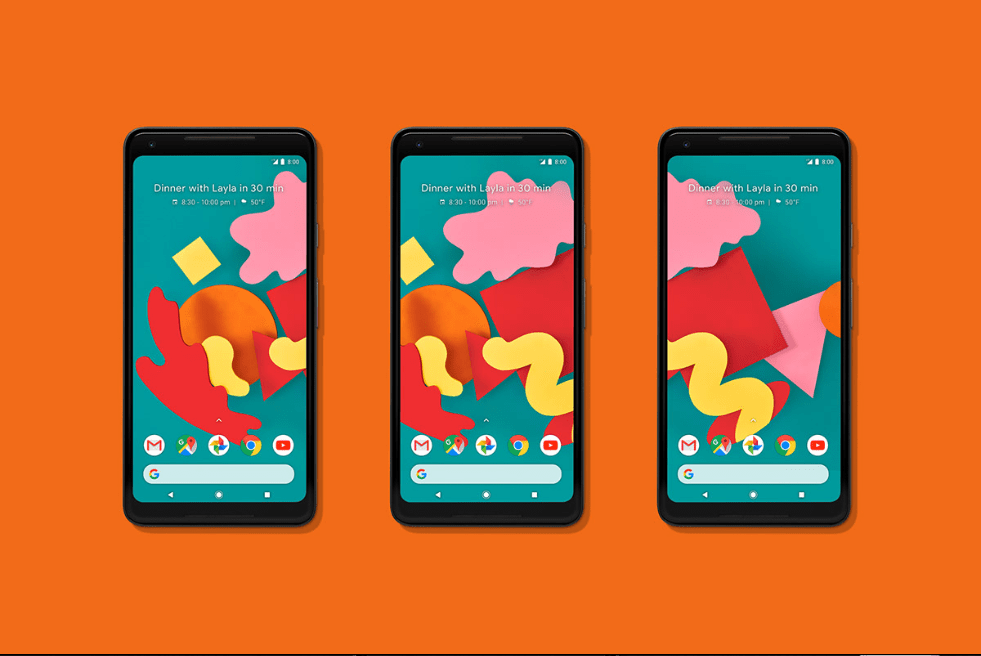
Try mixing our design in neon gradients, ice-cream pastels, and racy colors for a fresh look at the style. Take a look at the designs of Google Pixel 2 by Leta Sobierajski above. Tonal teal is blended with warm oranges, reds, and soft pastel pink, softening the pattern and enhancing abstractness.
Go 3D
Thirdly, digital technology is very fresh in that era. So, the original Memphis Style is defined by flat graphics or excessive pixelations.
With the growth of 3D in design software, Memphis design can jump out of the box. By using 3D objects, this style can enhance the youthful and energetic look for branding app design, website, illustration, and way more.
Add grainy texture
Next, add a grainy texture to a flat Memphis design instead of using 3D touches. This works well, especially for illustration work. Then, we can also add a suitable vintage charm to this design. This illustration for the New York Times by Yukai Du is the perfect example of balancing Memphis-style colors and shapes with a grainy texture overlay.
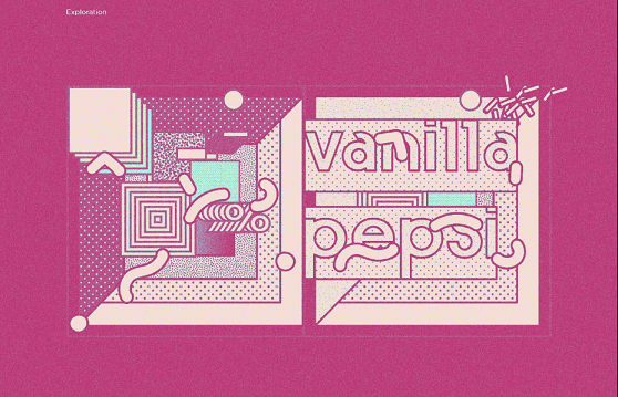
Indeed, this approach is all about getting an authentic vintage look and feel. We don’t have to use overlay textures to maintain a vintage sense in our Memphis designs. Try merging brush strokes to add more textures and interest.
Big it up with simplicity
Memphis-style patterns can look a bit hectic. However, we can instantly simplify Memphis patterns by reducing the proportions of the patterns without losing the essential objects.
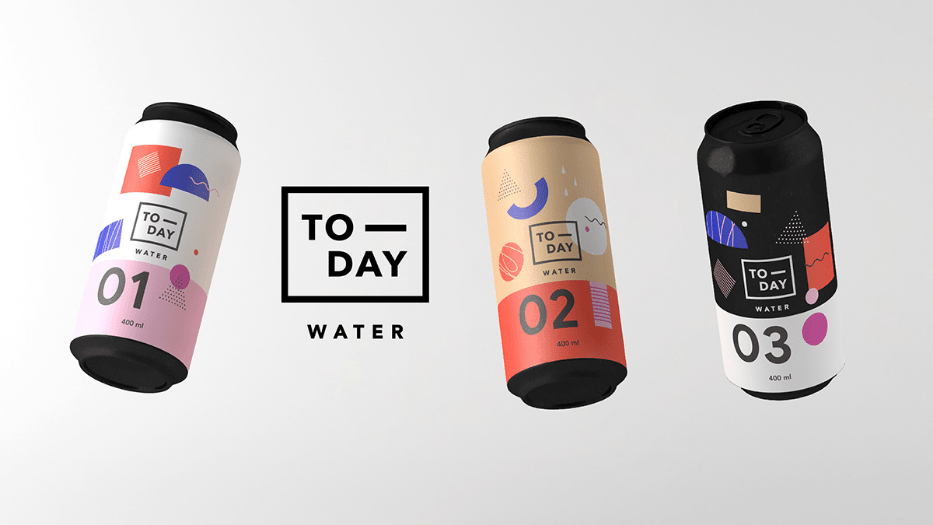
These design packages by Elisabetta and Lorenzo give you an idea. It looks so fantastic. Each item focuses on one or two isolated pattern elements, whether monochrome stripes, solid color blocks, or dashed lines. The result is straightforward but still attractive. Also, they use a simple font look for perfectness.
Choose the right font for the perfect touch
We cannot be separated from the typography again and again. As we probably understand already, Memphis is not about ordinary projects. Indeed, the typefaces used in Memphis design are so tricky.
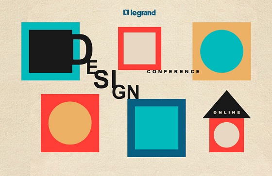
Good font choices for Memphis design typically have a geometric feel and curved edges. Bold, blocky sans serifs, bubble lettering, or handwriting style is supposed to be good choices for this style. Still, choose something with lots of contrast in the right way.
Don’t leave the details
Lastly, thick strokes and squiggles are the key styles to identify Memphis’s design. Almost every pattern includes a set of strokes and lines that freely fill the screen.
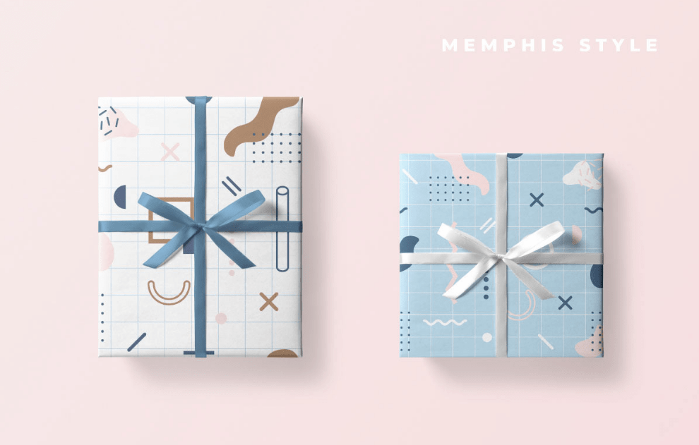
Indeed, no matter what colors for the background we choose, ensure the contrast elements attract the users through the design.
Conclusion
If you are looking for a design with a whimsy style, Memphis design style is an excellent idea to start. It is an excellent technique to help stretch your design skills and work with colors, typefaces, and even patterns confidently.
When exploring this style, the most important thing to keep in mind is that it can evoke strong emotions. Make sure that your design matches the messages before creating a Memphis design.
We hope this topic can level up your skill for the following projects. Moreover, don’t stop learning everything. Everyone needs a creative spark now and then—best of luck with your following creative works.
Let’s visit RRSlide to download free PowerPoint templates. But wait, don’t go anywhere and stay here with our RRGraph Design Blog to keep up-to-date on the best pitch deck template collections and design advice from our PowerPoint experts.

