Muted color palettes 2021 will replace vivid color palettes across the board. In graphic design, this means we’re switching the bold and bright color schemes to something more reserved and harmonious, and in fact, the trend forecasters say, in 2021. After a dramatic, tumultuous year, we’re all yearning for tranquility and peace of mind.
This year we spent a lot of time looking at the screen. It was the year of online lessons and socially distanced celebrations. However, we learned that some colors are more comfortable to look at than others. These six muted color palettes 2021 that are cozy and easy-on-the-eyes colors will be trending.
What are muted color palettes exactly?
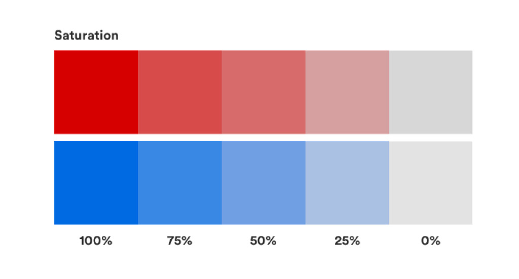
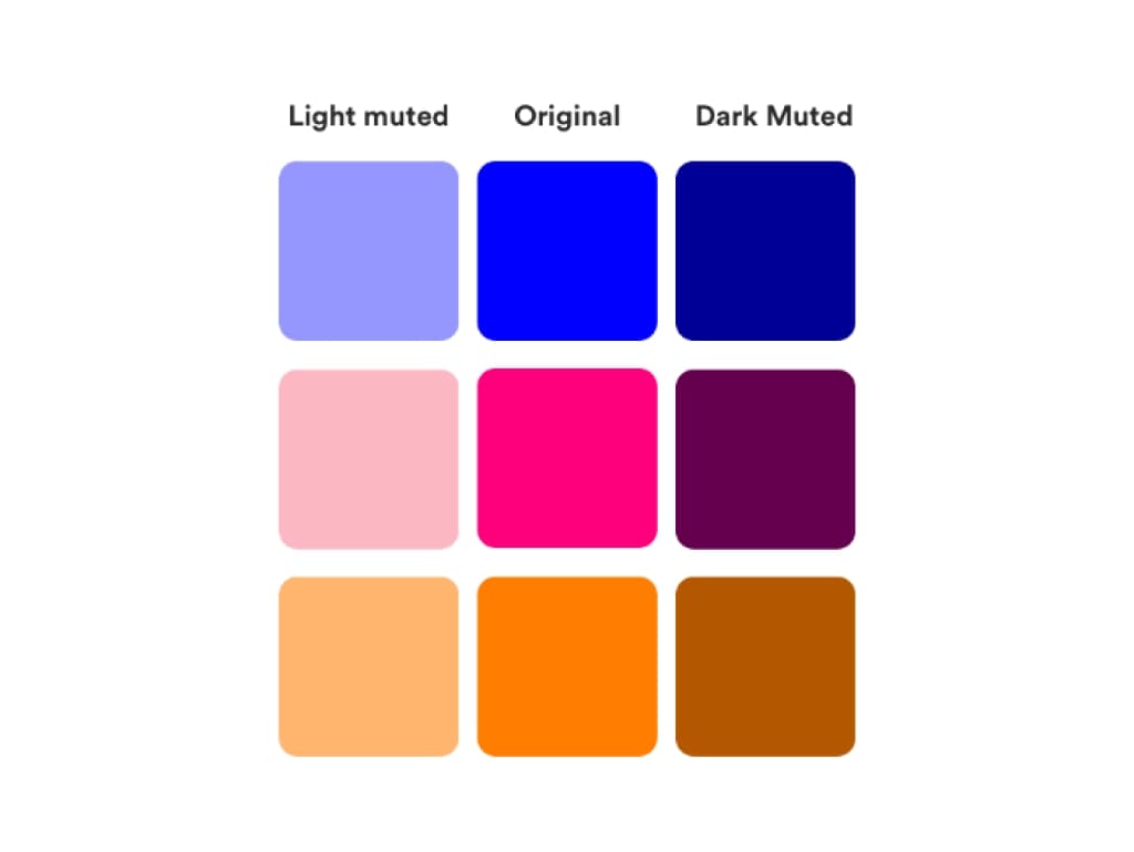
Muted colors refer to all colors that have low saturation (or chrome). These are subtle colors that are not bright or have been subdued, dulled, or grayed. The opposite of a soft hue is a bright, vivid, saturated color. Compare the colors you see in the sky on a cloudy day to the colors you see on a bright and sunny day.
Color Saturation refers to the brightness/intensity. Highly saturated colors are vibrant and radiant, while low saturated colors are dull.
Why use muted color palettes?
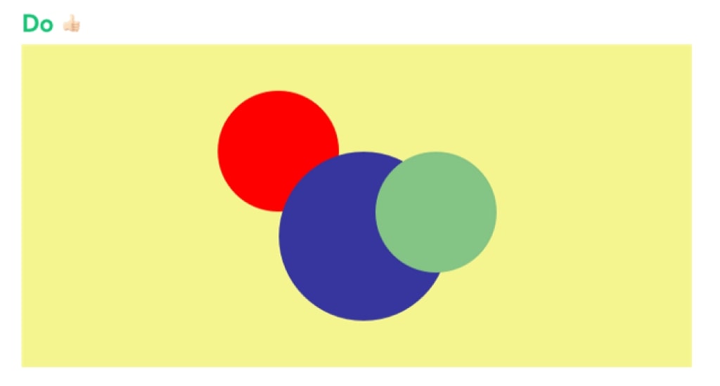
Vivid colors sure have their place. But it is usually far more effective to use vivid colors sporadically, in combination with muted colors.
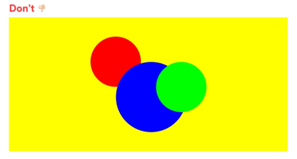
The colors fight each other for attention. If you combine two bright colors, it will not be the best result. For example, take the red, blue, and green below, surrounded by a vivid yellow.
You may find this color combination jarring and uncomfortable to look at.
How to “Mute” a color
To mute a color, you can mix it with any of the following:
- Black (this will also darken the color);
- White (this will also lighten the color);
- Gray;
- The complement of the color (for example, you can desaturate blue by mixing it with orange); or
- An earthy color such as raw umber or burnt sienna.
Each of these methods will produce slightly different results, but the saturation of the color will decrease.
See also: 2022 Color Trends You Will Meet: Serenity Will Take Part This Year (+Pantone Color of the Year)
Muted color palettes in the painting of the past
While Degas and Klimt use very muted, earthy palettes with low contrast, Veermer uses a high contrast: the bright whites of the eyes, the collar, and the pearl earrings pop against the dark colors, bringing focus to the feminine features of the girl.
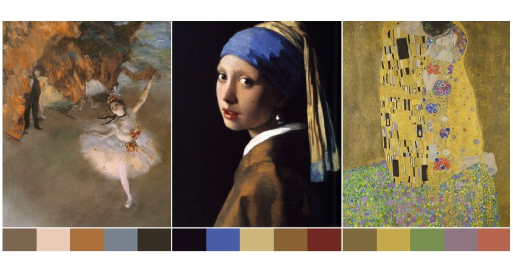
Similarly, red is used only on the lips — drawing your eyes into the rich color that contrasts with the muted and cool tones in the rest of the painting.
See also: Best Colors for Presentation Slides That Will Dominate Today’s Trends
Muted color palettes in UI Design & Presentation Design
In honor of inspirational design, let’s take a few minutes to see some examples where the different brands use muted colors.
Winc
Winc is a wine club that sends wine to your doorstep. The whole structure of the company, born as one of the many wine distribution platforms and then became a real producer in the first person, is based on the customer and its feedback in real-time.


Illo
Illo is a design studio focusing on motion design, illustration, and set design. The site is explicit and characterized by game colors.
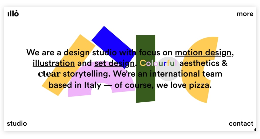

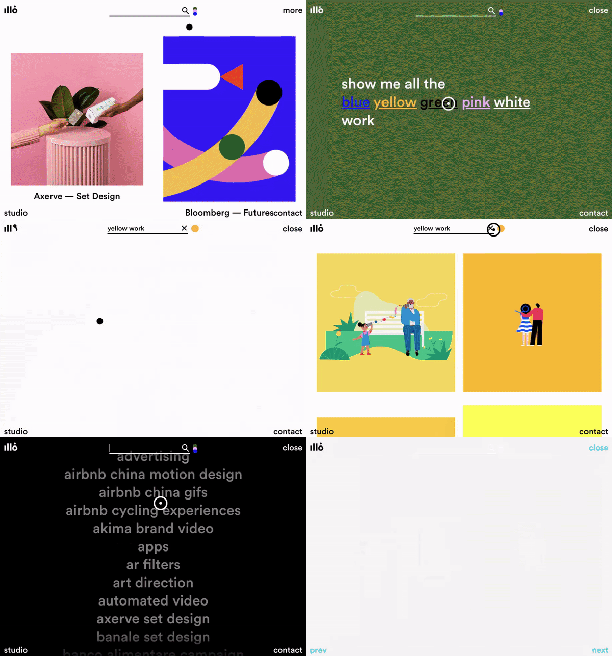
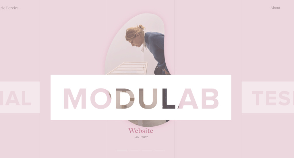
Cédric Pereira
Cédric Pereira is a product designer, and this is your website. He uses a muted, pastel color scheme to create a soft and inviting look.

See also: The Science in Using the Right PowerPoint Color Palette to Attract Audiences
Subtlety is everything with muted color palettes
Subtlety helps give muted colors meaning. Because of the subtlety in the painting, we can see and feel all the beautiful color harmonies happen. If there were a loud, bright red, it would wash everything else out!
Imagine if a loud rock band started playing during an adagio movement performed by a string quartet. The rock band would surely drown out the sound of the string quartet, and we would never be able to hear beautiful and subtle harmonies.
See also: 20+ Color Tools for Designers to Help You Creating PowerPoint Color Schemes
How to begin using muted color palettes
The best place to begin using muted color palettes in 2021 is to start color mixing more. Try not to paint from photographs but rather paint from real-life studies. You will not be able to see the richness of color from a picture. Also, steer away from color mixing formulas. Try instead to mix colors from what you see and trust your eyes.
Be sure to grab my free color mixing guide which will help you learn the basics of color mixing. You will have everything you need to know to start mixing muted colors!
Let’s visit RRSlide to download free PowerPoint templates. But wait, don’t go anywhere and stay here with our RRGraph Design Blog to keep up-to-date on the best pitch deck template collections and design advice from our PowerPoint experts.


