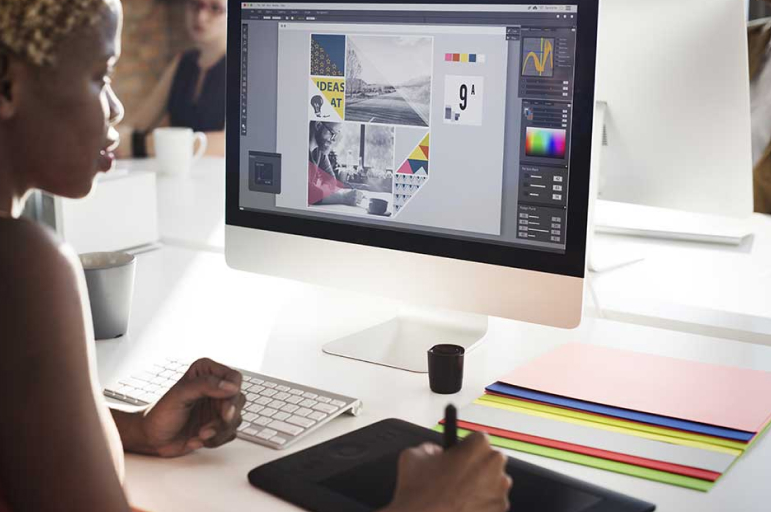
It’s one thing to have an online presence, and it’s another thing to stand out at it. As a non-profit operator, you can make a difference by investing in outstanding graphic designs that appeal to your audience. You should understand that you could achieve much more with good visuals than just using word content alone.
Several non-profits have infused outstanding graphic elements into their brand communication, adding substance to their fundraising campaigns. These elements can be incorporated into resources such as infographics, web designs, posters, etc. To inspire you, we have elected to discuss ten (10) powerful examples of graphic design that strike a good chord.
BuildOn
BuildOn is a non-profit organization created with the objective of breaking the illiteracy and poverty cycle through educational empowerment. One thing consistent in its graphic design is the humane feeling – this could bring hope to the needy and connect donors to the struggle of a group.
Graphic design isn’t so much about colors, but it remains highly effective. Plus, the integration of its logo – a distinctive ‘O’ – into the name does the overall appearance some good. This is certainly a graphic design you can build on if you want to incorporate compassion and creativity into your (graphics) work.
United Way
United Way’s message sent out to thank donors and volunteers oozes impressive graphic flair. The page shows multiple hand-written “Thank You” messages, with a stylish font type employed. There are hands extending upwards at the center of the page – amidst the messages.
The extended hands look like the children – whose lives have been impacted by the donations – were also reaching out to thank the contributions. Viewing it from another angle, it could be translated as more vulnerable children calling out for help. The mix of colors used in this graphic job is also quite exciting and remarkable.
Take 3 For The Sea
The Take 3 For The Sea graphic design is top-notch in every facet. It tells what the project is all about while providing the necessary CTAs. Tagged “Where does your plastic go?”, the work shows a carpeted sea tide flow, and under this were several plastic wastes. The colors used in this work are on point, and so is the font type/style.
Save The Children International
A child in a box should trigger some thought on the need for redemption, isn’t it? That seems to be what one of the graphic designs by Save the Children International aimed to achieve.
It was explicitly aimed at communicating the need to speak and take action against children being recruited for military responsibilities – with weapons in hand. This graphic design could inspire the creation of other works on specific social concerns.
Feeding America
The logo design of Feeding America has got a distinctive and bold appearance about it. For one, the design was created using green and orange – that reflect the earth on which farm products are grown. This aligns with the organization’s mission to ensure people across the U.S. have access to healthy foods.
More so, the letter “I” in ‘America’ flows into the one in ‘Feeding’, with the top [of the “I”] bearing an element that represents wheat’s ear. The letters forming each of the component words sit on themselves, giving the entire logo an aesthetic feel.
Bill & Melinda Gates Foundation
Bill & Melinda Gates Foundation’s website graphics also deserve a mention. It is primarily a source of inspiration for any non-profit looking to have a minimalist graphic design. As this non-profit seeks to combat inequity, poverty, and disease across the globe, the graphics reflect the broadness of its vision. Additionally, the color contrast hits home with great aplomb.
Fridays for Future
Friday for Future is a movement that was started to raise a voice against the lackadaisical approach towards the issue of climate change. The graphic design on its website is consistent with its vision as it shows people in protest. The choice of words and pictorial representations integrated into this design are major talking points.
Additionally, the use of color – predominantly green – is also right on point. This is factoring in how the color is often associated with clean, safer, and eco-friendly space.
Oxfam America
Oxfam America is a non-profit committed to addressing global inequality as it makes an effort to end poverty. And most striking thing about its webpage graphics is the considerate use of symbols and words. Plus, the color blend – while being attractive – is not heavy on the eye.
America Heart Association
America Heart Association’s educational infographic design on cardiovascular health – the one on “How to be more active”, to be precise – is also worth considering. The title and subtitles were written in block letters, making it easy to grasp the audience’s attention. This design – with two (split) columns – is an illustrative piece filled with information and graphic elements that will appeal to children and adults.
Amnesty International
Amnesty International has been at the forefront of combating injustice and human rights concerns across the world. The graphic design that caught our attention is the infographic prepared on the maternal healthcare crisis in the U.S. The work shows a balance in layout, color, and imagery, reflecting significant creativity on the whole.
The design showed a graphic representation of a pregnant woman, with five statistical datasets, are written within her. The font size, color, and style were thoughtfully selected, making it easy to read. Other stats are presented in the body of the infographic design. To top it all up, Amnesty International inserted a description of what they are about at the bottom of their donation page.
Conclusion
You don’t have to keep cracking your brain while attempting to describe what your non-profit’s graphic design should look like. You can simply look to any of the non-profits briefly discussed in this article to get some inspiration. It’s good to know that you already have forerunners, and you can save a lot of time and energy by resorting to one or more of them for inspiration.


