

It is a great choice to go back to the basics, especially learning about design principles to create your next presentation. Occasionally, terrible things can happen to us out of nowhere if we undervalue the pitch deck fundamentals.
As we have seen, some design compositions look pretty messy without attention. Hence, we can swap our presentation to look more fabulous, easy to follow, and visually pleasing by understanding the design principles.
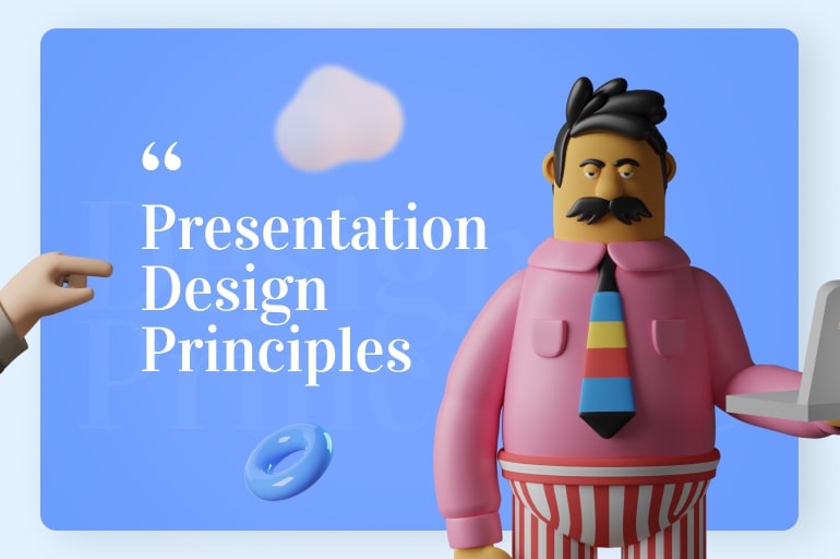
Without further ado, we break down the twelve presentation design principles to ponder and give you a little inspiration to dodge your presentation design from plainness without being PowerPoint experts.
Find inspiration, research, and experiment
Designing our presentation will not go perfectly without exploring knowledge with in-depth research. Let’s gain more inspiration here and outside to improve it better. Then, don’t stop learning to do the experiments of your design skill. However, if you are stuck, there are many sites that you can visit to gather inspiration for your presentation design. Some examples include RRSlide, Dribbble Behance, and Creative Market.
Arrange our content
We make a common mistake when designing the slides without creating an outline for the content. Our topic with the best content and ideas will be performed useless if it is not organized coherently. Not only confuse the audience, but we will also find it challenging to design the slides. One way to manage the content is to create an outline to make it clear and concise. After deciding on the points, start arranging them to transition from one to another smoothly.
One idea per slide
Everyone gets overwhelmed with a sea of information. There is also a logical reason behind this. Low memory can happen when our audiences divided their attention between reading the text on the slide and listening to our speech. Must think about these outlines:
- Identify the main points
- Assign one slide per point idea
- Elaborate on the details like the sub-points in our remarks or put them under the notes as reference.
Hence, ‘less is more when it appears on presentation slides. It boils down to crumbling the content so that our audiences can understand and keep up with it.
Learn visual hierarchy
The third presentation design principle will tell us about visual hierarchy. Please think about the audience’s eye movements as they look at the slides. Plus, the visual scale provides a wide assortment of elements to create an endless number of unique graphical designs. The graphic visual` scale includes:
Shape
The shape of elements can convey purpose. For example, a rounded shape looks more engaging than a pointed shape. Indeed, we can engage our audiences by organizing a variety of icons.
Size
The element size is relative. It can alter in proportion depending on different factors, such as purpose. When designing our presentation, keep in mind the various elements that should be required. Consider the appearance, icon size, resolution, and balance of details on the layout.
Contrast
We can use color, shape, and size alone in harmony to show the concept of contrast. Use contrast to distinguish elements. We can notice the difference when the features are displayed in comparison. In other words, one piece might look small by itself, but it appears enormous compared with the small parts next to it.
Proximity
Proximity is a primary yet robust design fundamental for grouping similar elements together, converting one optical unit rather than any specific ones.
Alignment
Like proximity, proper alignment formulates a sense of unity and coherence to keep our design matched and appropriate for presentation.
Repetition
Also known as consistency, repetition is about repeating design elements to add visual interest and indicate the style we want to keep in our presentation.
See also: 20 Books about Presentation Design
Set the mood boards
After organizing and structuring our content, we can set mood boards to visualize our presentation design from the primary step. Plus, creating mood boards can give a rough idea of our presentation’s look, feel, and tone. Mood boards of presentation design generally consist of the following:
Color
We can utilize color schemes in a wide variety of spaces due to modern technology. Color presents significantly to the attractiveness and usability of an interface. Detailed contrasts are possible, but the misapplication of colors can have crushing effects. Also, remember that some users may be incapable of detecting colors due to disabilities. Remember that the colors are divided into three-dimensional, such hue, saturation, and value.
Hue
the colors on a rainbow vary from red to orange to yellow to green.
Saturation
color modifies from gray to vivid. For example, a greenish-gray and a vivid green have the same tone but have different saturation levels. The greenish-gray has a low saturation, which is sprayed with gray.
Value
colors modify from dark to light. For example, dark red and pink have the same tone but have different values, darkness, and light.
Images
According to the expert, we are six times more likely to memorize visuals than text. However, including images on the slides is not enough. Then, these four points bring us to visualize our slides with images correctly.
- High-quality images
- The rule of thirds
- One image per slide
- White space
Need high-quality images to free download? You can open the Freepik website for free stock photos instead. If you want to go full screen, we suggest finding pictures at least 1,000 pixels.
Icons
An icon can be represented as a high symbolic value to communicate ideas and messages without words. Our audiences don’t have time to read everything they view thoroughly. With icons, we can scan and skim while ensuring the news for being conveyed. Indeed, the icons quickly tell our audiences what the point is about.
Font Pairing
Think to go for a lecture where the speaker is in a monotonous and rigid tone when speaking. There is a lack of intonation, speed change, and enthusiasm. Boring right? It also comes to the fonts. It would be fine if we have different fonts to add flavor and taste to our presentation. Consider using at least two to three fonts to keep it consistent. If not, it will end up distracting and messy.
Create a simple slide
When performing our presentation, we tend to use whole sentences to define the main concepts. But it creates a wall of text that would make our eyes glaze over. Audiences go to listen, not to read. Don’t cover whole sections of content in one slide. One slide should only feature one point or topic. The less text we apply, the greater the visual slide we have.
Be interactive
We can do polls and Q&A sessions into the speeches to engage the audiences, understand their questions, and see what concepts or ideas they find most interesting. This interaction improves our audience’s engagement, and their feedback will help us improve our content. It is a win-win solution to create our slide better.
Use video
Imagine that images are our brains to retain information, and video content is the learning technique. Both visuals and audio make our presentation more engaging. It is good to use it only once or twice per slide. Oppositely, it can steal the focus from the rest of our speech. Video is best applied to highlight a point or engage our audiences in a crucial part of our presentation.
Sketch the storyboard
A storyboard is a sketch of how we plan our presentation deck to run. Just like the content and even our designs still need a strategy. Storyboards are necessary to help us create a slide with less effort, time, and money.
Build closeness with audiences
If we have the time to do one thing, use it to build our audiences’ familiarity. They are the ones that will get benefit from it. Plus, put yourself in the audience’s shoes, and try to imagine what they would want to get from your presentation.
- Tell who we are
- Tell them why we are there.
- Tell them why they are there.
- Respect the audience’s reaction
Try also to imagine how our audiences understand the topic. Then, think about how we simplify the connection between audiences and our material.
Present our material comfortably
Be yourself and know your stuff. Otherwise, you will get nervous about what you face. Without understanding our material, we can easily ruin our performance by merely showing our silliness.
Provide a summary
After the climax, provide our audiences with an outline. It will give them a meaningful experience, practical purpose, explicit material, and legible points.
See also: 13 Best Places to Learn Presentation Design
Show an actionable to do
Give our audiences real action on how they can apply the new light into their life. It is the best reward we can leave them with. Now it is time for us to give them hope, wishes, and experience.
PowerPoint design with text formatting
A high-level presentation design perspective will consider grids, colors, and white space. We all love presentations that use effective visuals, even though there are always slides filled with boring text and even boring bullet points.
Breaking up the text by paragraph spacing will help your audience to parse content more efficiently. Consistent fonts and the use of color highlighting and white space around the content make a bigger impact on slides.
Drive focus by making good use of whitespace
Imagine a presentation in which every slide is crammed full of information without even a single whitespace. At that moment, you might have realized the importance of white space in calming the audience and letting them breathe.
Creating a whitespace between design elements draws the audience’s attention to key elements and organizes the presented information in their minds. Furthermore, whitespaces give designs openness and a clutter-free, minimalist, and elegant look, ensuring a great user experience and good reading performance.
Layout your content clearly using a grid
Slides that are badly framed and misaligned will completely lose your audience’s interest. Guides and grids in PowerPoint can help here! You are absolutely wrong if you believe that using grids will limit their creativity. Grids have nothing to do with your creativity; rather, they define clear spaces for logos, main content, disclaimers, and other content, thus giving your slides a consistent, neat, and balanced look.
Don’t be the default
People will take notice when you put effort into your presentation. You almost feel like the effort you put into your presentation commands more respect and attention from your audience. However, you do not have to struggle with your visuals in order to earn respect. The key to making a presentation stand out is to go beyond the default settings.
For example, if you’re putting a chart in your presentation, you could just plug in the data and call it good. However, that is not what will capture your audience’s attention. It might even put them to sleep. Make it a point to simplify your data, and your audience, and stand out if you put a little bit of extra effort into your design choices.
Symmetry makes your presentation balanced
Every element in your PPT presentation (symbols, images, 3D models, or SmartArt) has a visual weight. In order to be seen, the elements in the PPT presentation must be balanced. There are 2 balances through symmetry or asymmetry, as we explained below.
Symmetry
You position the elements with the same visual weight on the opposite side of the imaginary center line on your slide to get a symmetrical balance.
Asymmetry
You position the elements of various visual weights without considering the imaginary center line.
See also: Want to Make Engaging Presentation Design? Follow 25 Tips Here
Movement: Eyes Must Move
The role of element regulation in slides can determine how your audience navigates through visuals, which we often as the term movement. You should position your elements harmoniously so that the eye transition from one element to the next because the movement gives your presentation tidal, allowing your slide to flow more naturally such as narration or story.
Divine Proportion
You can apply classic proportions, such as the Fibonacci sequence, to your presentation slides. Of course, you don’t need to be mathematically precise when creating a layout. If you create a design based on Divine Proportions, you will be surprised to see that your slides look very sleek and flow well from one piece of content to another.
Use animations in moderation for maximum impact
PowerPoint provides you an option to apply animation or transition to all slides and add custom animation to specific objects of the slides.
- Using random animation will give your presentation an unprofessional appearance and divert your audience.
- Use animation if it serves a direct purpose in your presentation, not just for the sake of using it.
Be consistent with your choice throughout the presentation.
See also: Good Presentation Design Tips and Tricks to Develop
Conclusions
And there we have it! Presentation design principles drop a spotlight on our performance. Assure that we have to analyze the structure, design, delivery, and topic. Additionally, creating a delightful, informative, and modern PowerPoint design looks needs a lot of patience, commitment, and discipline. Which of these presentation design principles do you use frequently and work virtually for you? Thank you for reading this write-up.
Let’s visit RRSlide to download free PowerPoint templates. But wait, don’t go anywhere and stay here with our RRGraph Design Blog to keep up-to-date on the best pitch deck template collections and design advice from our PowerPoint experts.


