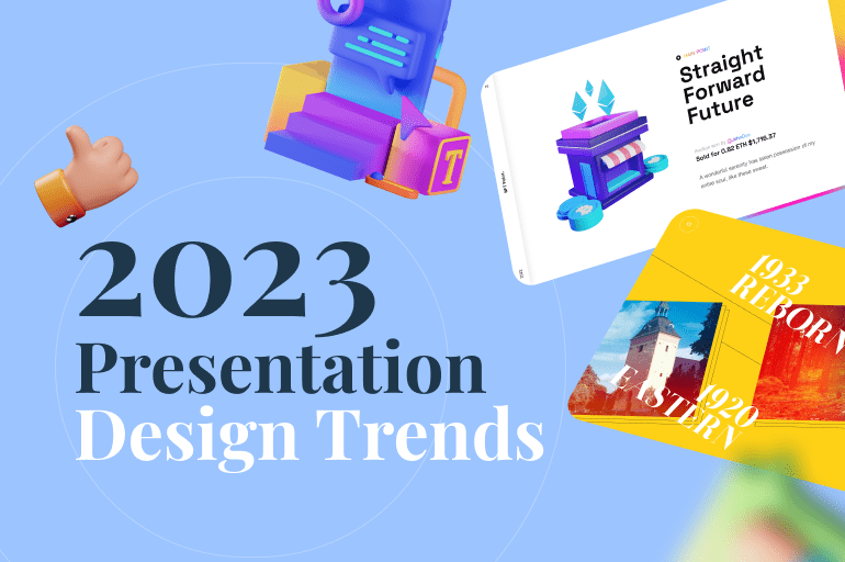
Presentation design trends for 2023 will provide experts with some brand-new ideas to experiment with. There are a number of visual solutions here that are relevant and resonate with people. Imagine how boring life would be if design remained the same. That is why this topic is so interesting to the presentation design community, which is why we have selected 16 presentation design trends for 2023.
You can also read about the presentation design trends in 2022 here, and some will also continue on into 2023.
As a side note, we would greatly appreciate your feedback. Tell us what you think will be trending or what you would like to see trending. Could you share it with us in the comments?
3D graphics
The trend for 3D graphics will continue to grow as we move further into the metaverse. The growing demand for virtual reality experiences and graphics that pull the viewer in as realistic will continue to evolve across industries. Modern 3D backdrops are also used in ways that extend beyond simply adding depth through the use of shadows and contours. They also include motion and texture, which enhances the realistic feel of the scene.
The characteristic of the 3D graphics in presentation design trends 2023:
- 3D models are composed of vertices, which come together to form a mesh.
- Each point on the model can be manipulated to change the shape.
- This software uses coordinate data to identify the location of each vertical and horizontal point.
According to SelfCAD, With the evolution of multiple new and individual technologies like 3D printing, AI, ML, AR/VR, cloud computing, simulation, and big data, we will see more and more integration of Industry 4.0 components.
Throughout its long history, 3D modeling has become progressively advanced. While it’s impossible to predict exactly how technology and new applications will affect its future, for 3D modeling the future has always been bright.
Whether you’re designing for a creative project, retail, healthcare, education, or travel – expect to work 3D graphics into your creative roadmap. Moreover, you can also implement these two 3D style options for more diversity.
The 3D Memphis style
Known for its bright colors, bold combinations, patterns of contrasting colors, and simple and abstract geometric shapes, the Memphis art movement has returned to the graphic design stage. This time, however, all of it is viewed through the lens of 3D digital reality.
The 3D Memphis design style of 2023 invites you to a feast of colors, stimulating your senses to create new and exciting sensations.
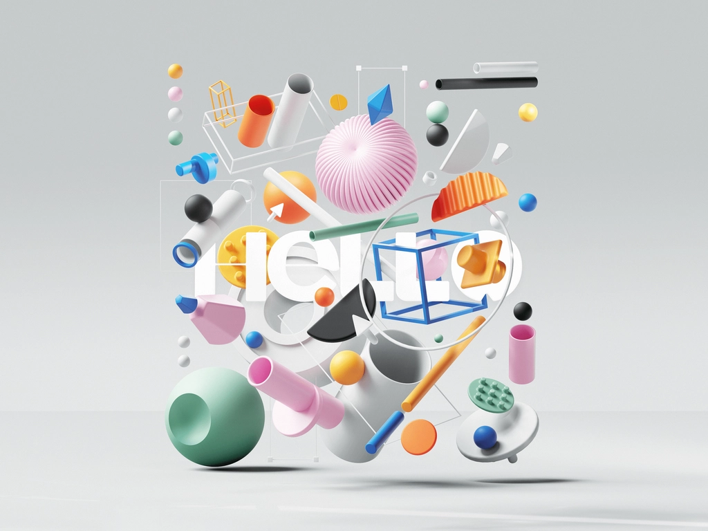
The characteristic of the 3D Memphis style in presentation design trends 2023:
- Through the prism of 3D reality, a well-known 80s style is reborn.
- Combining bold geometric shapes with bright colors.
- Finds the extraordinary in the ordinary by encouraging you to look for it.
It’s a brilliant design approach based on 3D geometry and an experimental play of colors that reminds you to look for the extraordinary in the mundane.
Simplified 3D style
The simplified 3D style is also one of the coolest current trends in graphic design because many designers strive for perfection in simplicity. “Perfection is achieved when there is nothing left to take away,” said Antoine de Saint-Exupery.
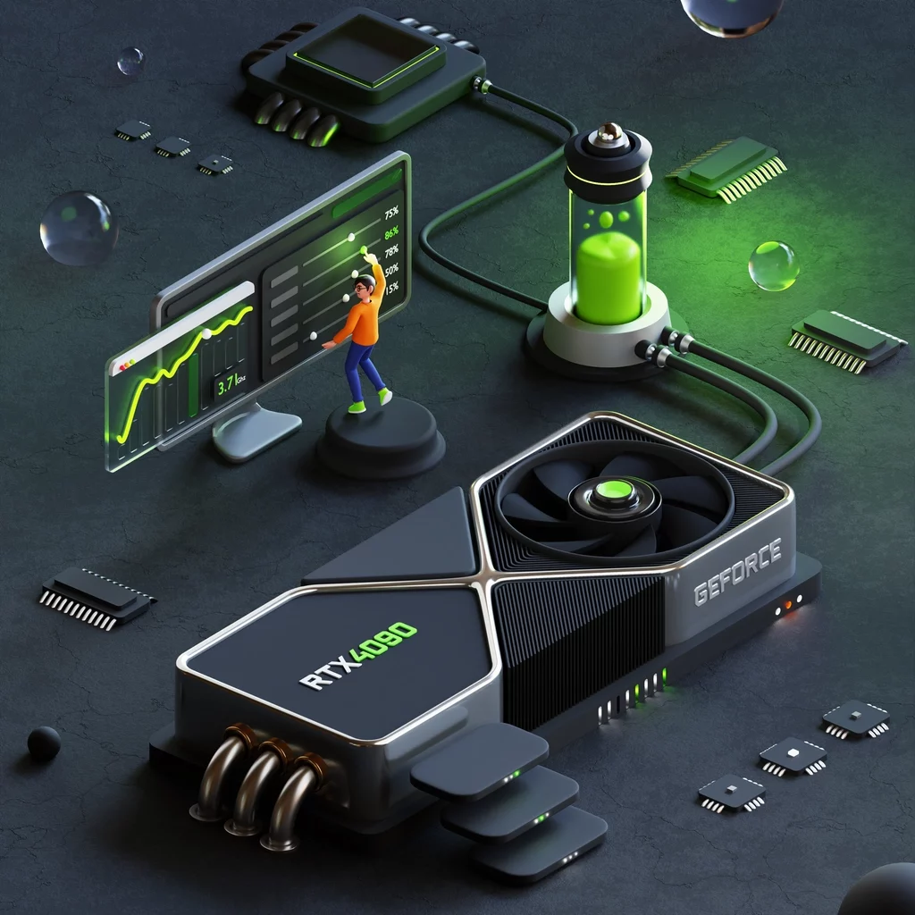
Geometric shapes lay the foundation for this type of design, simplifying all elements as much as possible. A baby toy is a simple, stylized, recognizable object that combines smooth, bold shapes with simple shapes.
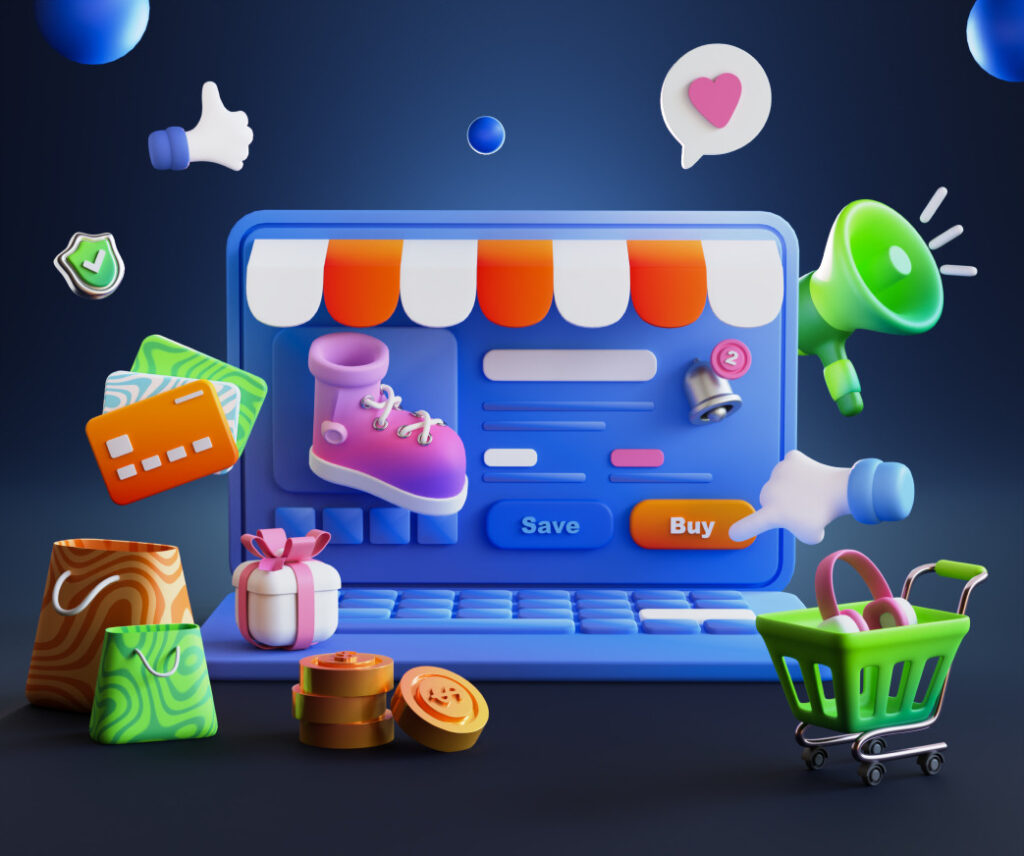
We can also find another reason for the effectiveness of simplified 3D design in this way. Our perception of the world is shaped by basic three-dimensional shapes such as spheres, cubes, and cylinders in our early childhood. Because it is familiar, approachable, and fun, the simplified 3D design is instantly understood.
The characteristic of Simplified 3D design in presentation design trends 2023:
- Reducing details to a minimum in order to achieve perfection in simplicity.
- Shapes such as spheres, cubes, cylinders, and others are based on simple, smooth geometric shapes.
- As it resembles simple toys from childhood, it is easily understood, familiar, and appealing.
In addition to making icons, this style is used for reducing all details to a minimum. However, when a simplified 3D design is taken to the next level, it creates an unforgettable experience that makes you feel as if you’ve landed in a toy world.
See also: 8 Possible Presentation Design Trends 2022 We Need to Prepare
Motion design
According to a report published by 99 Firms in 2022, 73% of marketers will produce product explainers. Here’s the news! You’ll want to use Motion graphics and Animated graphics if you’re one of the 73% (and we hope you are!) Users are more likely to pay attention to a video than to a written piece or static image, which is why Motion graphics have become more popular.
You can expect higher conversion rates, more traffic, and more engaged leads from these scroll stoppers.
The characteristic of Motion design in presentation design trends 2023:
- Motion
- Graphics
- Design
An animation is a combination of graphics that move through space and time.
It is becoming more and more common to use Motion design in experiential design as technology continues to create innovative solutions. Here are a few examples of Motion design:
- Animated films
- Videos
- Animated text
- Web-based apps
The use of animation and visual effects, it was originally used in filmmaking and video production.
Why is motion graphics design important?
According to MIT research, a person can process visual information in as little as 13 milliseconds, which proves that visual information is processed more quickly by the brain. In addition, many people consume social media content while their phones are muted. As a result, it is even more important today to convey your message only through visuals.
To capture their audience’s attention, marketers all over the world use motion graphics.
How can motion design enhance the user experience?
Content marketers work hard to create an impactful strategy that includes articles, infographics, videos, and more. In spite of this, videos are still preferred over other formats more than anything else.
81% of businesses use videos as a marketing tool because it encourages engagement and enhances user experience, according to Wyz Owl.
Collage design
Mix It Up graphic design trend for 2023 features collage elements, eclectic typography, grunge textures, and messy mood boards. This trend is reminiscent of David Carson’s gridless approach to Ray Gun magazine in the 1990s.
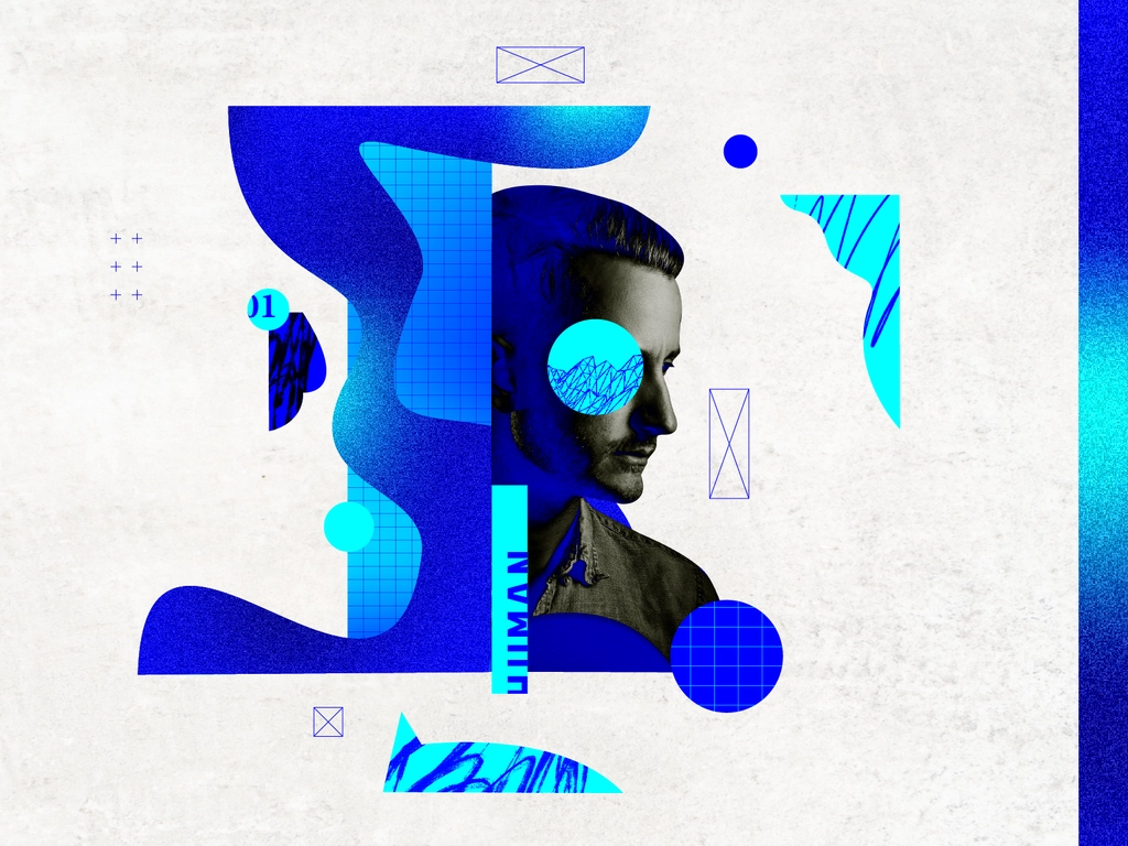
In 2020, 99designs predicts that collages will be more confident, expressive, and abstract than in previous years. There will be less carefully placed vintage imagery and more of an “anything goes” attitude: playful mark-making, abstract photography clippings, and tons of texture.
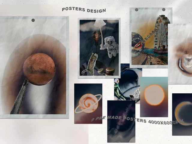
As environmental and economic realities force us to be more resourceful, contemporary collage design uses materials all around us and boldly showcases our modern culture.
The characteristic of Collage design in presentation design trends 2023:
- Start with a mood board template and build up naturalistic images.
- Mixed-weight typography.
- Noisy textures for instant grunge appeal.
Especially effective for social media channels, this trend gives brands a behind-the-scenes feel.
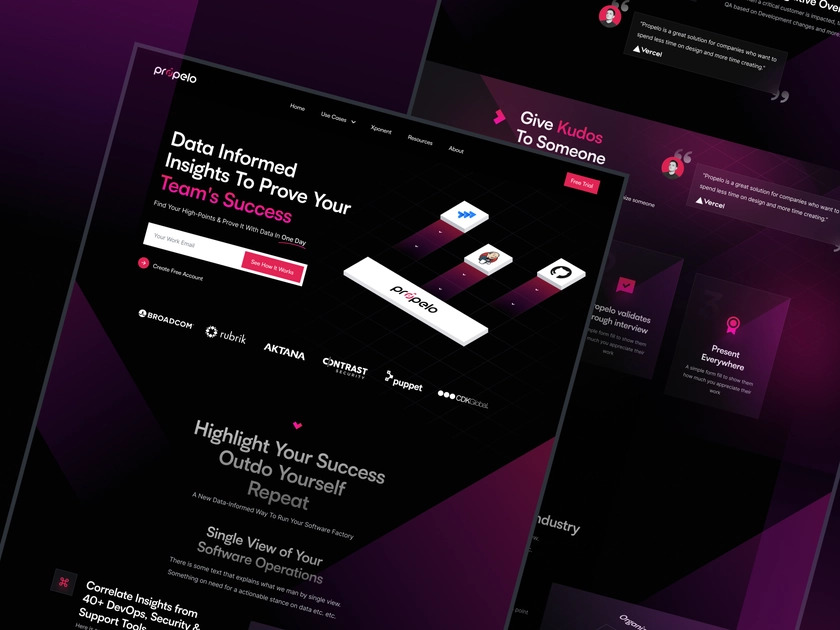
Dark mode
In 2023, more apps will support light and dark modes, and websites and UI designs will follow suit, focusing more on dark mode designs.
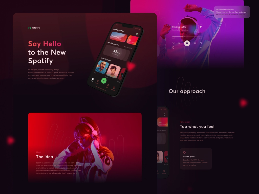
As well as being mysterious and dramatic, the dark mode is also easier on screen-weary eyes than pale or colored backgrounds. Taking things over to the dark side will add tech-inspired moodiness to a range of designs, as well as translate nicely to print layouts.
With blackout sections, a traditionally white magazine spread can be given an inky touch. In addition, you can draw attention to a marketing message on social media with a white or neon type against a dark background.
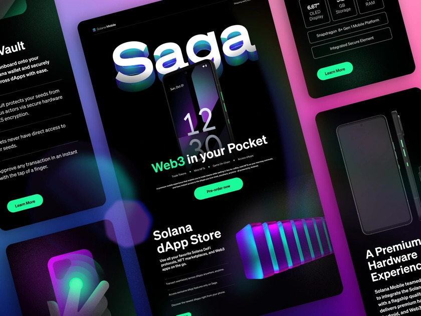
To give your layouts a point of difference, use dark blue, dark green, or deep violet-purple colors in dark mode.
The characteristic of dark mode design in presentation design trends 2023:
- Avoid pure black
- Avoid pure white fonts
- Be careful with saturated colors on dark themes
- Use brand colors wisely
- Don’t lose your brand’s personality
- Never use shadows
- Communicate depth
- Meet accessibility color contrast standards
- Review your imagery database
- Allow users to switch from regular to dark mode
- Test your solutions with end-users
In the opinion of Olivier Berni, a writer from “UX Collective”, a dark mode is useful when you quickly scan a screen for visual or colored elements. SalesForce designers wondered what mode was most suitable for developing dashboard features in 2018. The researchers interviewed many users and found that Dark Theme charts helped users make decisions faster, and just as accurately as Light Theme charts.
The 1990s Sans Serifs
The use of curvy, fluid serifs has dominated rebranding for the past few years, adding authority and longevity to identities. Due to the saturation of serif fonts, a shift is just around the corner. For minimalist branding, sans serifs fit perfectly with the metaverse mood and are simpler and cleaner.
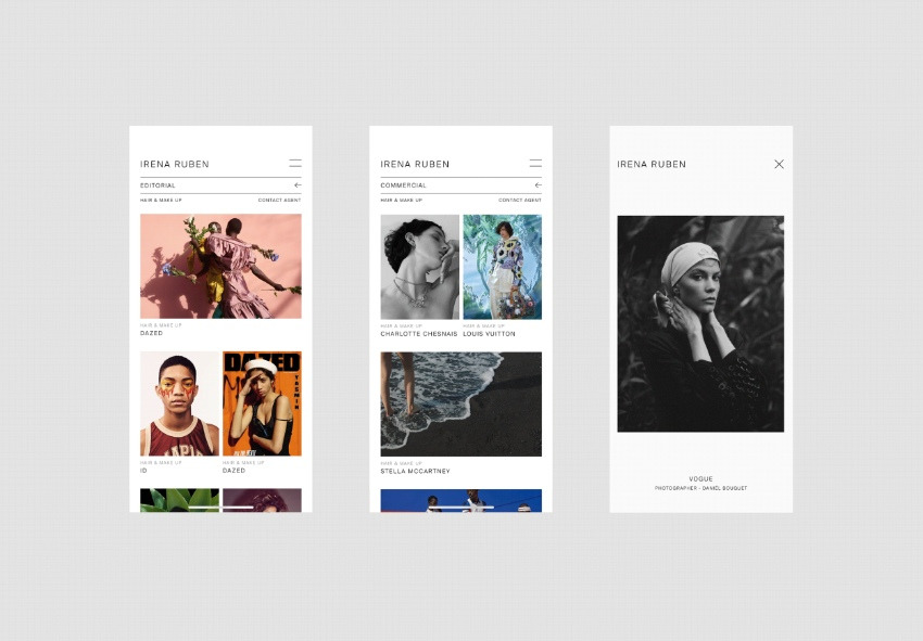
The 90s minimalist resurgence made popular by online fashion and lifestyle influencers is next year’s hottest trend: sans serifs with a 1990s vibe. To nail the minimalist Nineties look, choose ultra-clean sans styles with slightly rounded forms.
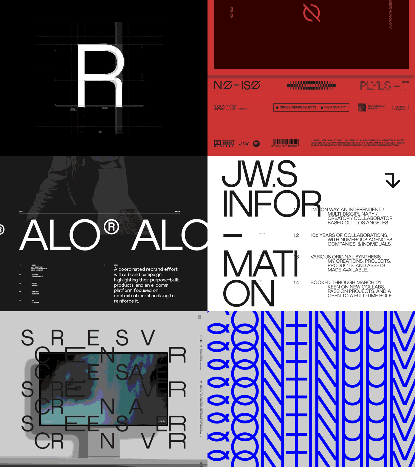
That said, Samantha Barbagiovani, design director at ThoughtMatter, believes that some of the wilder type designs of the 2020s so far will start to take a back seat.
According to her, “The experimental and almost non-designed letterforms we have seen over the past two years – partly owing to Gen-Z and partly to living a surreal life facilitated through screens – will simmer down.” So, in the future, we’ll see typefaces built on solid foundations with purposeful optimizations on top, such as Muoto or CoFo Sans.
The characteristic of 1990s Sans Serif in presentation design trends 2023:
- Modern
- Contemporary
- Approachable
- Clean and very precise ends
So with all that in mind, you can check popular sans-serif fonts, we’d recommend checking out for 2023. These top typefaces will help you future-proof your designs and help you stay bang on-trend.
Artistic Serif
Small decorative flicks are added to the ends of each stroke of serif fonts to mimic the appearance of a quill or pen. Due to their readability and visually appealing form, they have remained popular since the mid-1800s.
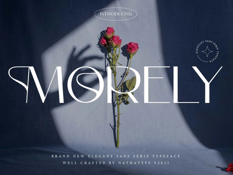
Serif fonts are commonly used in magazines, books, newspapers, and most long-form print formats. As far as web fonts in general, they’ve taken a back seat to sans serifs, but putting them together is a clever idea!
Using serif fonts evokes warm and pleasant feelings. Among other things, handwritten fonts are often associated with them. Their confidence inspires confidence at the same time.
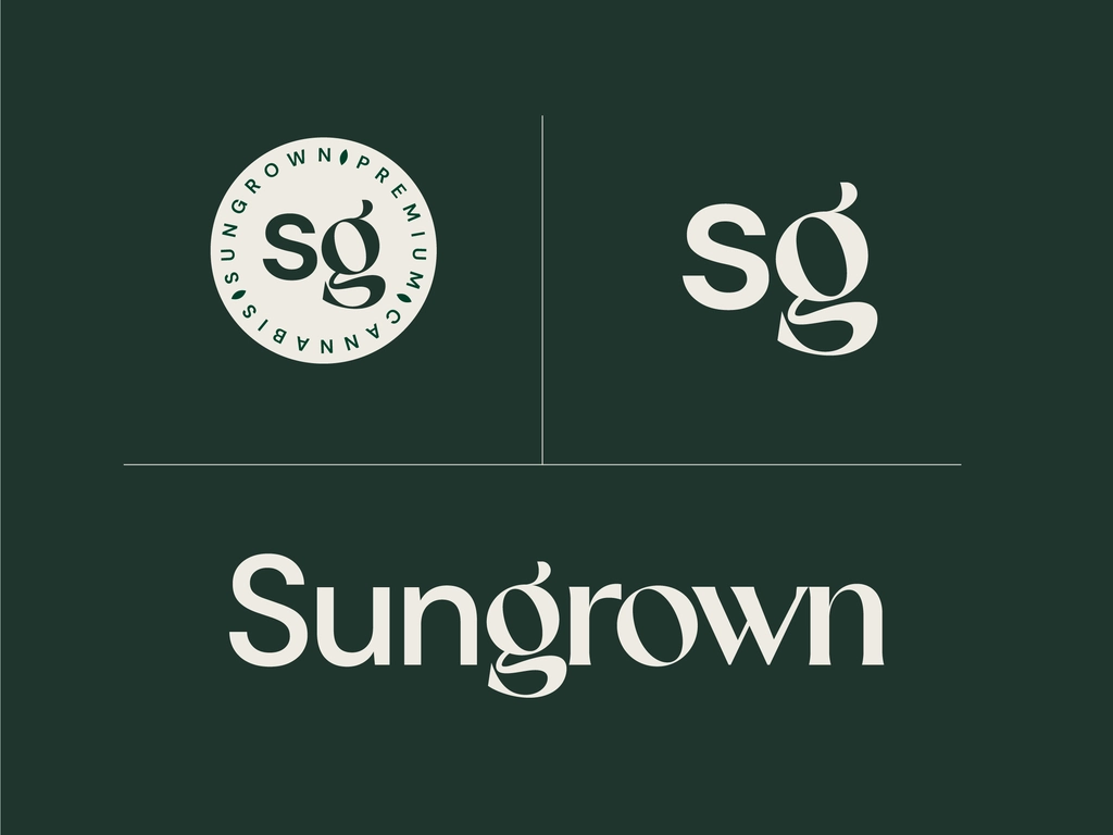
You don’t have to use Times New Roman in all projects, as you can find plenty of other cool options here. Our vendor program lets you upload fonts and earn passive income if you create them.
The characteristic of artistic Serif in presentation design trends 2023:
- Traditional
- Established
- Trustworthy
- Readable
- Small decorative flicks at the ends of each stroke
Long letters are not suitable for serif fonts because they add expressiveness to the text. When highlighting headings on a website, it’s good to use serif fonts, but for body text, it’s better to use sans serif fonts.
Let’s take a look at the most popular serif fonts for 2022 here that are still on trend in 2023! Fonts like them can make a design stand out – and that’s what we strive for, right?
Pink is in
Here’s a graphic design trend for 2023 that can trace its roots to fashion, reality TV, and cinema. Next year is all about one unashamedly brash and flash color. That’s right, pink is back… and it’s pinker than ever.
This isn’t the washed-out Millennial pink of years previous. This is Pepto-Bismol pink on acid—a hyper-pink that made an appearance on the Valentino runway and, before long, in the closets of the Kardashians. A natural evolution from the fascination with all things the Noughties currently happening in fashion and on social media, pink is set to be the color of the year given the much-anticipated release of Greta Gerwig’s Barbie movie and all things Barbiecore.
On the other hand, Celebrity stylist, Natashaa Bothra believes, “It can be credited to Gen Z ready to take risks and to break gender stereotypes”. She elaborates, “The color has been more like a breakthrough for brands where psychologically it challenges men as well.” The hue, which is culturally one of the first colors to ever appear on planet Earth 1.1 billion years ago is now being used as a means to beat the pandemic blues.
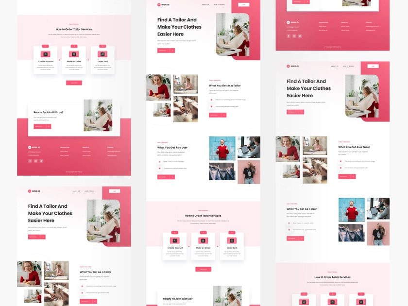
Designer Lakshmi Babu explains, “With dopamine dressing trending in the post-pandemic era, loud colors have become a favorite among designers and celebrities. The bright hot pink hue struck a chord because while it looks angry, it also helps one get out of the dull and gloomy times.”
Of course, pink doesn’t have to be insipid or stereotyped, and this new incarnation of ultra-pink is quite the opposite, instead loaded with a feminist statement and a loud-and-proud attitude. For graphic designers, bright pink can bring power and punch to a wide range of designs, and it embodies a punk attitude when teamed with jet black.
Using kinetic typography
The term kinetic typography sounds fancy, but it’s really just a technical way of saying ‘moving text.’ Motion typography is an animation technique that integrates motion with text, which is why it is also sometimes called kinetic typography.
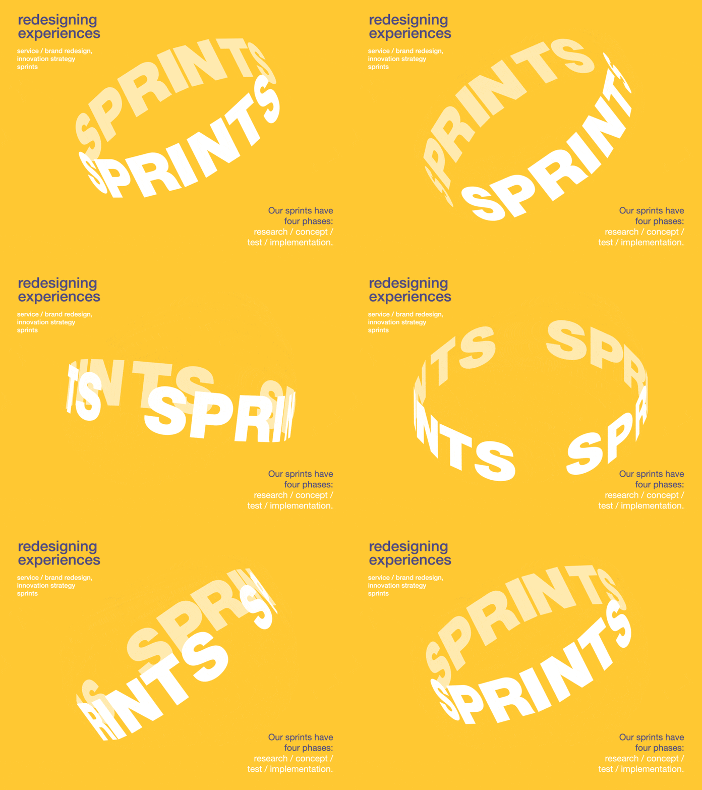
When text is transformed with movement, it can achieve a wide variety of effects — it can create emphasis where it is desired, it can convey emotion and conjure up ideas, and it can create a powerful message out of the simple text. In terms of kinetic typography, only your imagination limits you.
The characteristic of kinetic typography in presentation design Trends 2023:
- Lettering can shrink or expand, move around the page, change color, undergo distortion, or be subject to any number of creative techniques.
- It is possible to create text animations that are simple and short, or more elaborate and complex.
Modern kinetic typography is more accessible than ever, making it easier for anyone to get started. There are more opportunities than ever to create and deploy cool typography animations due to the explosion in web design and higher broadband speeds.

In 1959, Alfred Hitchcock’s feature film North by Northwest introduced the kinetic type. The use of motion typography in film and television title design was pioneered by this pioneering kinetic type title sequence. Some of the most iconic and striking examples of animated typography compositions come from this field.
Over time, animated typography began to appear in more and more contexts beyond film and TV. In advertising, moving type has been used to capture audiences’ attention, as dynamic text is much more fascinating than static text. There are now a variety of info videos and explainer videos using kinetic typography.
An excellent example of motion typography is Apple’s video announcing that all of its products will be carbon neutral by 2030. A combination of accelerated typography animations and hand-drawn animations is used, and the use of green as well as white helps to reflect the sustainability message. This is one of the best kinetic typography videos we have ever seen.
An exciting futuristic world
Metaverses, NFT, crypto world – this is our new reality.
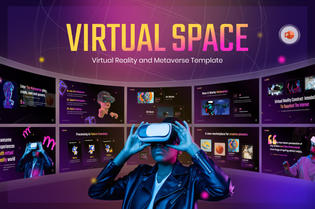
NFT is also not far behind in popularity – major brands are collaborating with well-known NFT artists for exclusive collections. We can assume that this is far from the limit.
The characteristic of NFT in presentation design trends 2023:
- The development of unusual characters and objects, space gradients.
- The combination of a dark background with neon colors.
- We can also assume that AI will be integrated into the work of designers.
But what exactly is NFT, what is the metaverse, and what are the advantages of virtual artworks? It would probably take a whole book to explain NFTs. Digital works should not be dismissed. For the first time, non-fungible tokens – NFTs – give digital artists a traceable way to identify their works. An unalterable record of transactions can be created using the much-discussed blockchain technology.
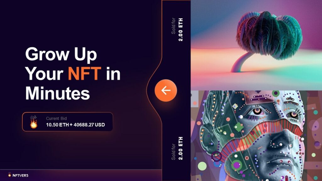
Using this technology, it is possible to trace and document the rights of use and value of digital objects. By removing all ambiguities regarding ownership, digital works now enjoy the same status as analog art, which has long benefited from physical proofs. In simple terms, NFTs are like certificates of authenticity or invoices from reputable galleries.
When you dive deeper into the world of NFTs, it quickly becomes very complicated and abstract. One idea that keeps appearing in connection with NFTs is the metaverse, an idea that’s been making headlines. As avatars, we can enter the metaverse, a second online world. Inside, we can see artworks and products such as furniture, decorations, and clothing that were purchased with NFTs. Eventually, if you were to become the proud owner of the Mars House by Krista Kim, you could use this house in the metaverse and furnish it with Andrés Reisinger’s furniture from The Shipping collection.
In the words of designer Misha Kahn, NFTs allow objects to be freed from their physical context. This presents a significant advantage for the interior industry and opens up completely new possibilities for online businesses. Designers can unleash their creativity when creating a digital piece of furniture and produce extraordinary works that are utterly divorced from reality. After that, they could consider how their ideas could be implemented in reality. Creative innovations could be unleashed by this process.
The metaverse and NFT relationship
Non-fungible tokens (NFTs) are one of the fastest-growing areas of the metaverse, appealing to people’s curiosity, creativity, and investment desires. In addition to art, music, in-game goods, and videos, NFTs also represent physical assets. As with most cryptocurrencies, they are often purchased and traded online using cryptocurrency.
In the days before NFTs and blockchain technology, it was virtually impossible to verify ownership of anything online, let alone a digital asset. The answer is yes. As NFTs are used to prove ownership accurately and transparently, especially in a virtual world, they will continue to play an important role.
Moreover, NFTs can be used to build several metaverses, including the “TradArt” universe. Despite the efforts of creators, intermediaries and corporations fail to adequately reward them. In virtual real estate, NFTs play an influential role. NFTs also serves as the legal agreement of ownership for the metaverse’s land and buildings. In order to purchase, trade, or build land in the metaverse, an NFT symbolizing the property must be minted.
See also: 10 Top Presentation Design Trends 2021, Bye Minimalism!
Inclusive design
Inclusive visual is a movement that extends beyond graphic design and impacts many areas of modern life. In essence, it entails showing mankind and its diversity in many contexts, including people of all backgrounds, cultures, and abilities. It may address accessibility, age, economic situation, geographic location, language, race, and more.
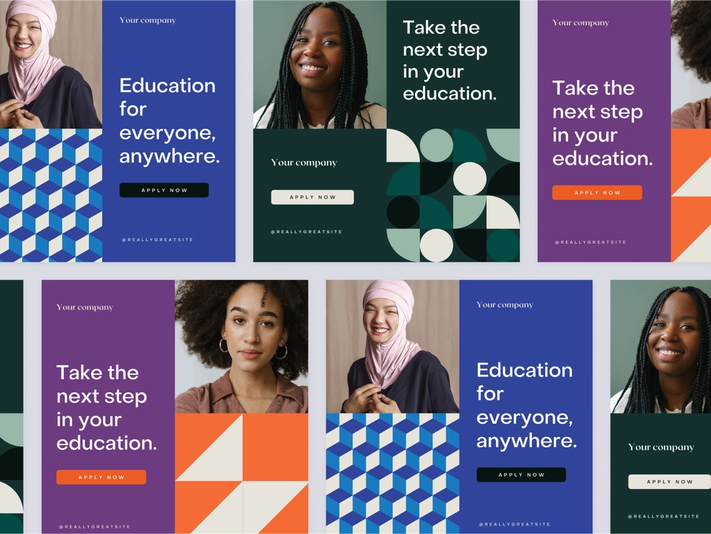
By fostering a sense of belonging, inclusive digital interfaces can positively impact user experiences.
An inclusive design methodology creates products that understand and enable people of all backgrounds and abilities. As part of inclusive design, accessibility, age, culture, economic situation, education, gender, location, language, and race may all be addressed. We strive to meet as many users’ needs as possible, not just as many users as possible.
Inclusive design is about empathizing with users and tailoring interfaces to meet their needs. As a result of inclusive design, universal design patterns are generated. An inclusive design pattern can be illustrated with the following example.
The characteristic of Inclusive design in presentation design Trends 2023:
- Text legibility and dark mode for older user
- Surname inputs for global audiences
- A variety of demographic identifiers
- Inclusive facets
- Diverse Illustrations
All people should be able to access and use an experience that is universally designed. Unlike inclusive design, universal design enforces a single design solution without the need for adaptations or specializations. When multiple design variations achieve the desired outcome, inclusive design accepts and embraces them.
Since producing multiple functional variations of a physical object or space is costly, universal design is more commonly used in tangible and environmental contexts. Compared to conventional design, inclusive design is applied more often to digital products due to their low cost and ease of adaptation.
The clay look
One powerful message behind this trending graphic style is finding perfection in imperfection. A digital technique or real plasticine can be used to achieve the Plasticine Clay design effect.
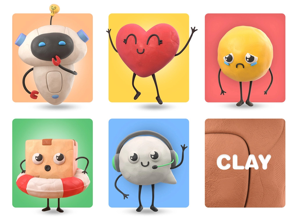
This is a reminder that beauty is hidden in imperfections.
However, there was more to it. The Plasticine Clay design undergoes a continuous metamorphosis. There is no drying time. There is no limit to what it can do. Modeling and reusing can be done in an infinite number of ways, many times. This revolutionary graphic design trend for 2023 motivates you to seek constant change, explore, and experiment. This is to tell you that you have the power to change the world.
The characteristic of the Plasticine Clay style in presentation design trends 2023:
- Introduces imperfect bumpy surfaces made by a digital technique or real plasticine.
- Reminds you to search for perfection in the imperfect.
- Encourages an ever-going metamorphosis, a drive to shape your own future.
This collection of Plasticine Clay graphic design examples illustrates the imperfection introduced by this style and the constant metamorphosis that one undergoes as a result.
Psychedelic design
That’s right, you read it correctly. In response to the growing demand for visually stimulating content, this design style offers a surreal experience.
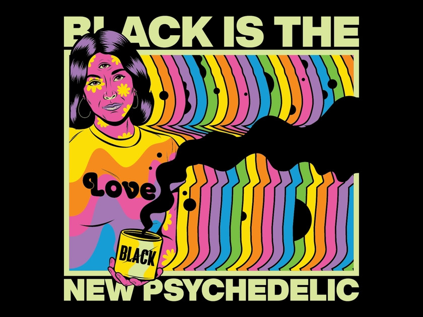
The Trippy Design is not defined by any particular rules besides distorting reality as much as your imagination allows. Designers usually present a mishmash of styles that may or may not follow logic.
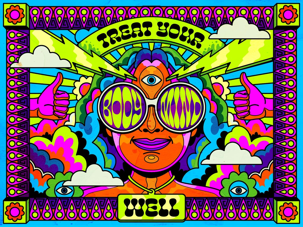
There are no restrictions on the sequence or combination of styles, either. Hallucinations are the desired effect. It can make you dizzy, and its aesthetic is challenging to discern. However, Trippy’s design is definitely rebellious, which is why it managed to become one of 2023’s most popular trends!
The characteristic of the Trippy design trend in 2023
- A mishmash of styles that may not follow the logic in terms of design aesthetics.
- Creates a surrealistic experience that resembles the effect of having hallucinations.
- Challenges the designer to push their imagination beyond all established design rules and restrictions.
Trippy carries a rebellious spirit in its design. Here are some awesome examples of Trippy design in action.
Neon & abstract cartoon stickers
Stickers have been popular for decades, as they offer a low-cost, accessible way to personalize your belongings and express your individuality.
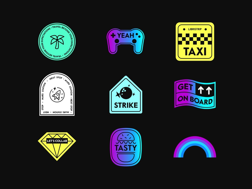
There are two styles that are super trendy and hot in the current graphic design trends of 2023: neon and abstract cartoon sticker styles.
There are many digital stickers that are designed to resemble physical stickers. These stickers have a borderline indicating the cut or a strict shape like a circle or a rounded rectangle. A modern design approach also distorts the shape and even adds volume and motion to re-interpret a well-known object.
Conversely, some designs offer a near-realistic perception that makes you wonder whether you’re looking at a picture or a digital image.
The characteristic of Digital Stickers trend in presentation design trends 2023
- Neon and abstract cartoon sticker styles pop among others.
- While some resemble flat physical stickers, others are presented with motion and volume.
- Abstract cartoon sticker style conveys the sense of art drawings.
The vast majority of modern digital sticker collections fall into the abstract cartoon category, all conveying the sense of abstract art drawings, even stickers that include words.
70s retro flat styles
Flat designs inspired by the 70s art movement are making a huge comeback. The bright, saturated colors of these design compositions stand out no matter how simple or complex they are. Despite being bold and quite flashy, the color combinations of the 70s retro flat design style are aesthetically pleasing.
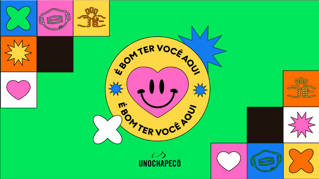
A significant trademark of this style is the thin black outlining, aiming to put a border to each element distinguishing it from the rest.
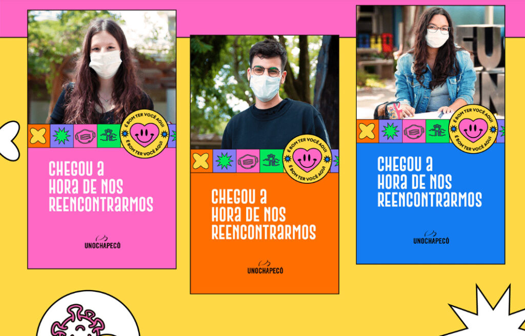
In fact, typography here is often a main element of the design composition. A popular practice is to add a 3D-effect thick border line to make the letters pop.
The characteristic of 70s Retro Flat design in presentation design trends 2023:
- Bold, flashy, saturated colors that look aesthetically pleasing together.
- All design elements are outlined by thin black borders.
- Bulky, rounded letter types with a 3D effect or simple black outlining.
The 70s retro-style flat illustrations with outlining also paved their way up the charts, modernized with futuristic, less saturated color palettes. Multi-color gradients are also introduced on the stage but black thin outlining still remains a must-have feature of this style.
The style was popularized by the famous interface design app Figma. Although super simple, this 70s retro design style looks pleasing and catches the attention with ease.
Anti design
Today’s anti-design resurgence is reminiscent of the 1960s, except it takes place online. The web isn’t the Wild West that it once was. It has reached an age where it is “relevant to start borrowing from the past,” as noted in “The Rise of Brutalism and Antidesign,” a research paper published in 2019 by students at the School of Engineering in Jönköping, Sweden.
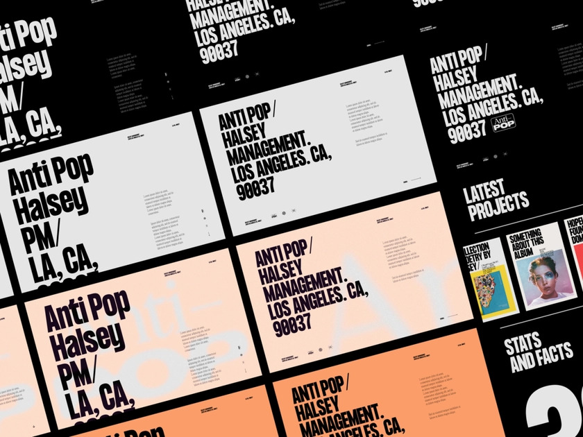
A now widely circulated tweet asks, “Which of the two possible websites are you currently designing?”,” above images of two similarly generic website templates. Thousands of people have retweeted this in the six years it has been around, indicating a larger, industry-wide sentiment that the design is getting stale.
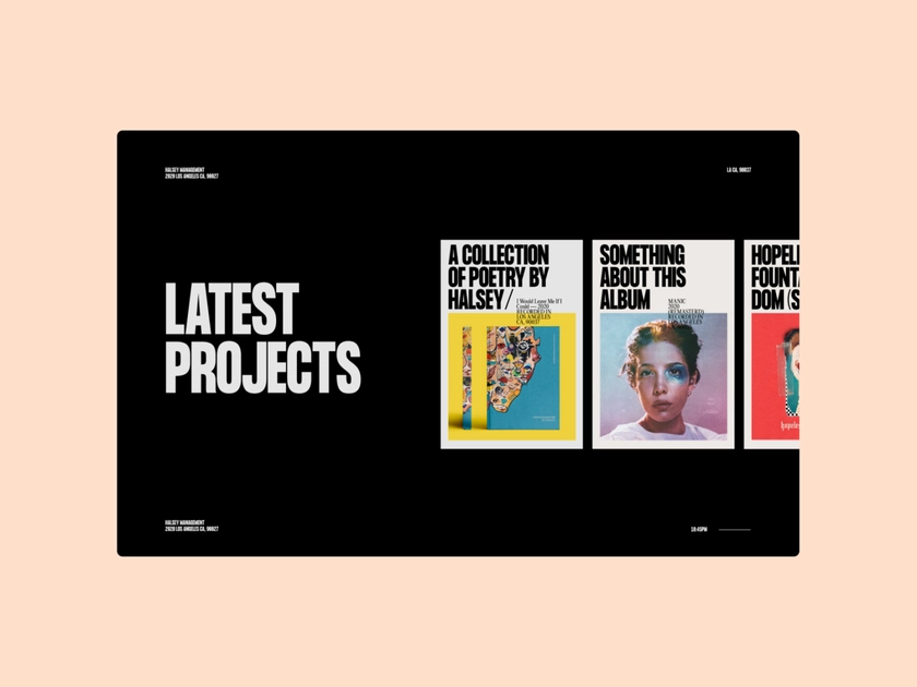
The reason design has gotten this way, specifically, web design has been attributed to website builders like Squarespace or WordPress. Others point to our increasingly competitive capitalistic society – businesses know what works to get sales or followers, so they don’t stray too far. Whatever the reason, Julia Tylor, who works as the creative director of the design consulting firm Throughline, said we have “exhausted the clean design.”
The characteristic of Anti design in presentation design trends 2023:
- Asymmetry
- Overlaid and crowded text and imagery
- Clashing colors
- Lack of a grid
- Mismatched elements
In the past, every website had a white background, a big Helvetica, and a colorful button with a call to action, she said. I have spent so much time following the rules that I’ve gotten to the point where everything looks the same.”
Also contributing to this disenchantment may be the pandemic, which has disrupted seemingly every aspect of normal life. Tylor says they have challenged many assumptions because they had to. “We’ve thrown everything out the window, we don’t really know what the playbook is, so why not try something new? ”
Brutalism
The brutalist design eschews decoration in favor of exposing and celebrating the raw materials that were used to construct it. Architecture during the 1950s and 1970s saw its heyday, but it has recently experienced a resurgence in modern digital design.
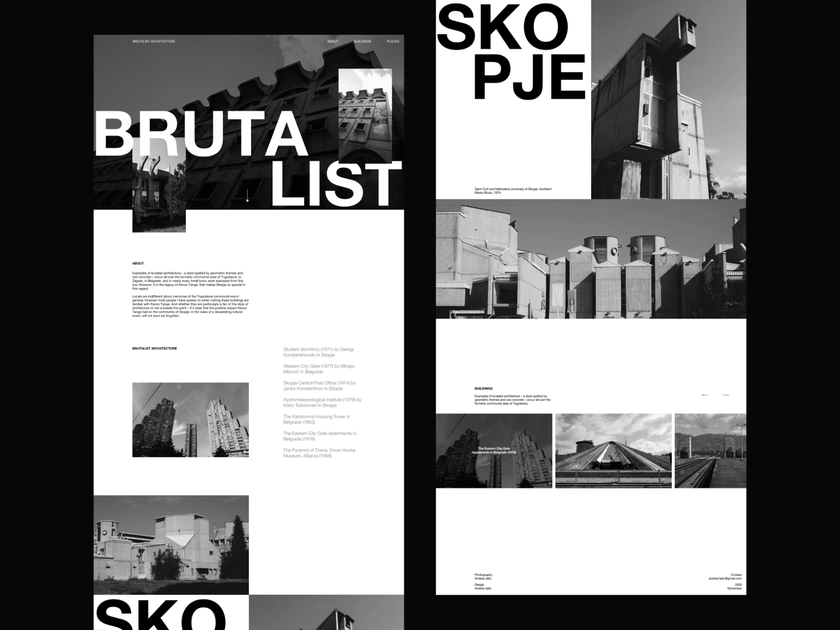
By exposing the materials of construction, brutalism has nothing to hide.
Brutalism’s visual characteristics vary from designer to designer as well as from medium to medium. The following are some of the common features of brutalism:
The characteristic of Brutalism in presentation design trends 2023:
Brutalism is about the lack of rules and challenges for society. It will help to distinguish the design from the rest. It can be assumed that it is becoming one of the 2023 graphic design trends because people are tired of the same old designs.
- Exposure of materials—concrete for architecture, the default, unstyled HTML for websites
- Monochromatic color schemes, often black and white or grey
- An emphasis on bare functionality, devoid of decoration
- Modular, repeated design elements
- Layered, articulated, or extruded pieces
- Rectilinear edges
- Unedited or as-is design elements
In this trend, you can add flashy fonts, boring images, and other “freaky elements” without looking boring and familiar. It makes it possible not to hold back the most daring and unusual decisions, moving forward with progress. A designer can break away from traditional design ideas by adding bold colors and combinations.
By the way, this “tiredness and boredom” was the cause of the trend
According to Nielsen Norman Group, brutalism, and anti-design differ primarily in their raw design approach and abandonment of conventional aesthetic principles. Anti-design (as the name implies) emphasizes ugliness, using clashing colors, no discernible visual hierarchy, and distorted, hard-to-read text.
It’s more punk than brutalism, which has its roots in efficiency and functionality. Whether a design is brutalist or not is sometimes determined by intent, but the heart-stopping emotions it evokes are often the same.
See also: 2020 Best Presentation Design Trends
The summary of presentation design trends for 2023
These presentation design trends for 2023 are not critical to follow, but they are always good to know to be educated on to see what clients may potentially expect.
Besides, paying attention to trends gives you a look into how the creative space is developing in the world of technology. If you follow presentation design trends year by year, you can even start predicting trends for the next few years.
Let’s visit RRPicks to download free PowerPoint templates. But wait, don’t go anywhere and stay here with our RRGraph Design Blog to keep up-to-date on the best pitch deck template collections and design advice from our PowerPoint experts.
