
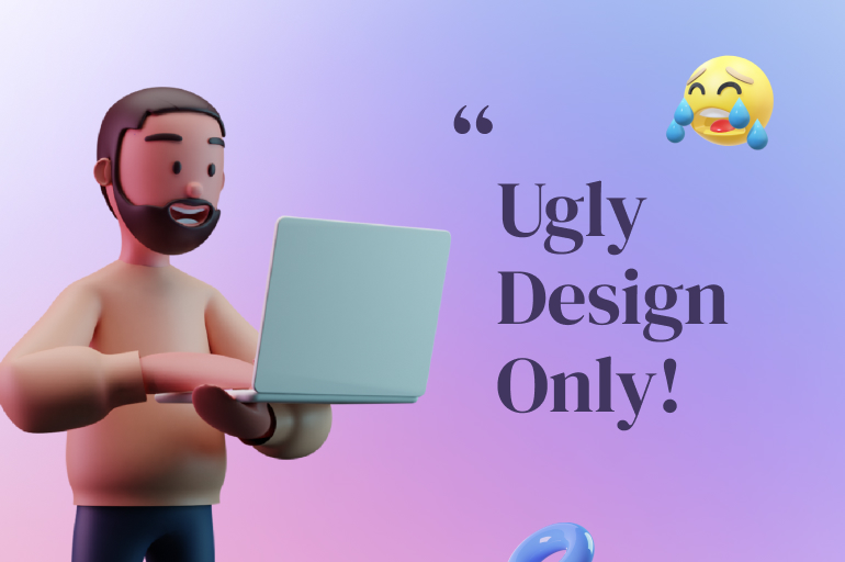

In this article, you’ll find a list of the design trends that aren’t cool anymore. The design style is always evolving, and we are all affected by that. It’s jumping from one style into another, and all we can do is follow it.
According to Adobe Blog, Jonathan Joshua Pimento, a product manager on Adobe XD who regularly gives talks on the evolution of design, the design falls under two big umbrellas: screen design, and designing for off-screen.
It’s no surprise then that the design process itself has also evolved, and so too have the opportunities for designers. However, some of us are a little slower in ‘evolving’ in design. This is why we bring this list, so you know which design style should be left behind.
What are design trends?
Design trends are more than just fads: they represent a year’s worth of constraints and clichés being flipped on their heads. If design remained the same, life would be boring.
Design trends help us understand and predict what will happen in the future by interpreting what’s happened before. It is important to have something different from what we have now, but not too different from what we have now.
The gradual transition from what was to what will be. What we have now will soon be what was in the past, ready to be re-analyzed and adopted at a later time. Design is ultimately cyclical—pulling from the past continuously.
The key to analyzing design trends is to remember that they aren’t inherently good or bad. Instead, they merely serve as a way to observe and remember the collective tastes of bygone eras.
Bevel and emboss
In the early 2000s, this effect is like a holy grail for almost all designers.
Well, nothing beat that bevel-looks shadow on your designs.
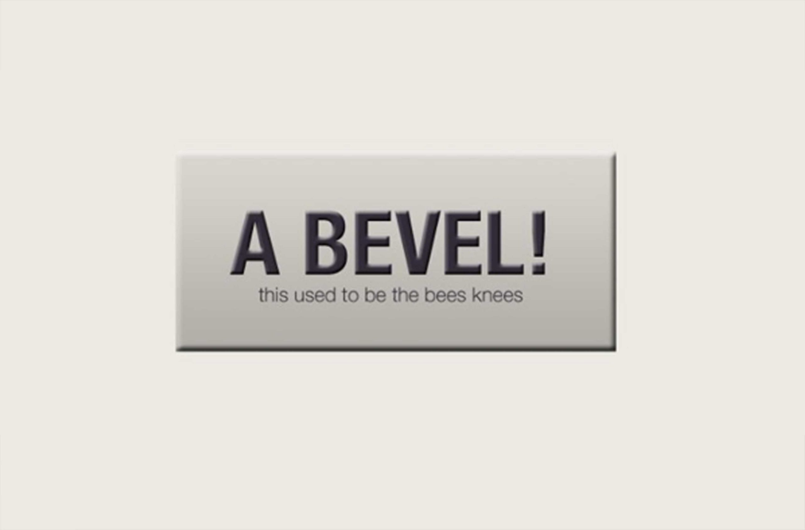
But come on, this was years ago.
The bevel effect is cool, but what you can do NOW for and shadowy effect for your design is better than that.
Do this instead:
According to the Response source, 46% of People Choose Minimalism as the Top Trend for Summer 2019. According to Civic Science, Minimalism was a trend long before the pandemic hit.
CivicScience asked more than 3,000 U.S. adults about their experience with minimalism to better understand current interests.
As the data show, interest in minimalism has seen a slight decrease since last year. As it stands, current minimalists are just 11% of U.S. adults, while intenders are 26%.
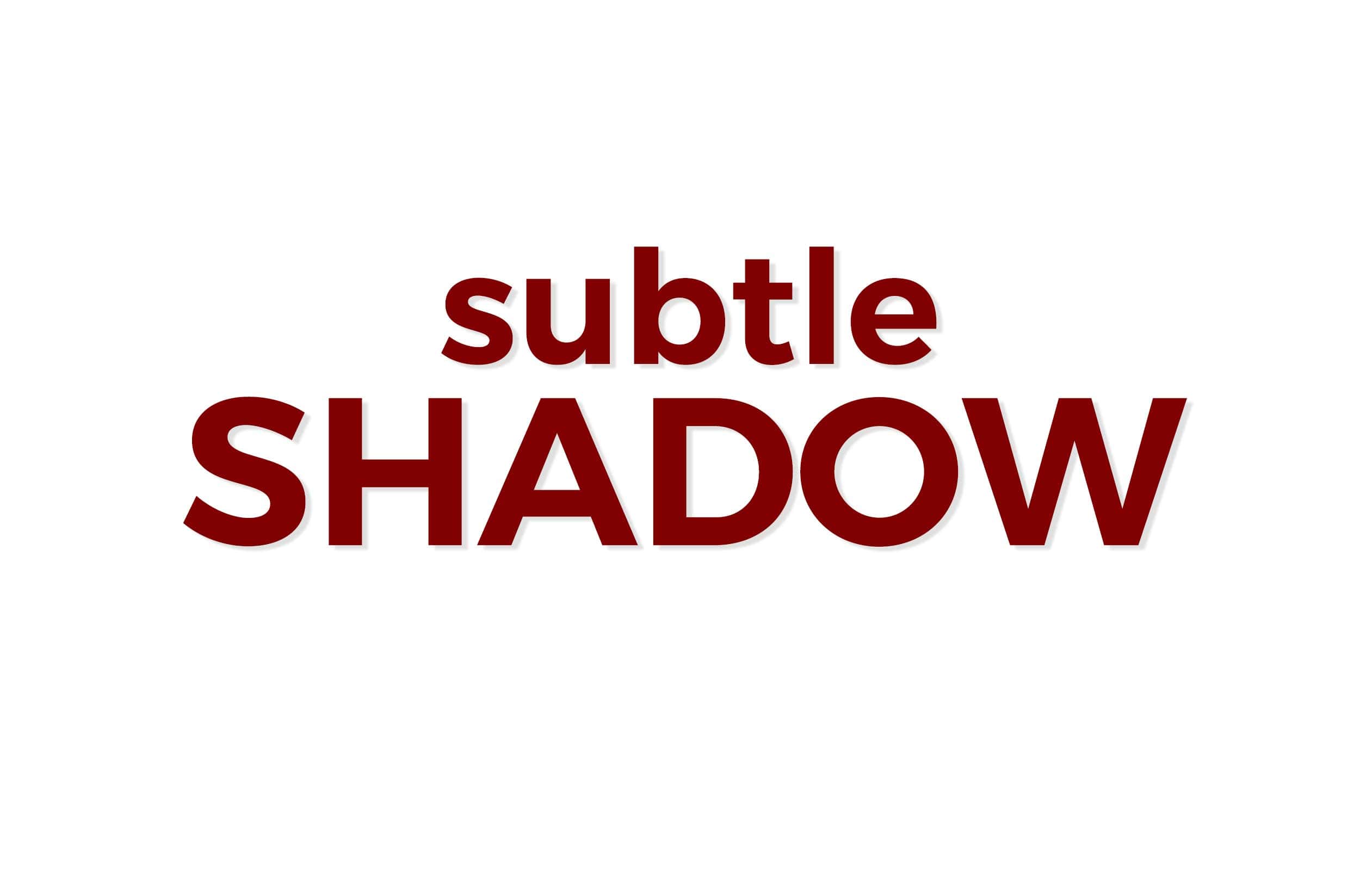
No room for a realistic bevel anymore. Now objects tend to have simple, almost no effects. Just a little subtle shadow. Like that one. Get rid of the bevel effect and add subtle shadow, like, right now!
Praise minimalism, we can get rid of beveling and embossing. But wait! There is more, unfortunately. Bevels tend to give an almost clay look to an object.
See also: 24 Common Mistakes in PowerPoint Presentations Design: Being Too Artistic
Gloss
Add some shine and you’ll get fancy and glass effects.

This gloss effect is usually used to make an ‘attractive’ and increase the urge to click it.
Do this instead:

The good news is, it’s easy to make attractive buttons without a gloss effect.
All you need is to add some gradient or slight-drop shadow.
The result is a nice button without being too flashy.
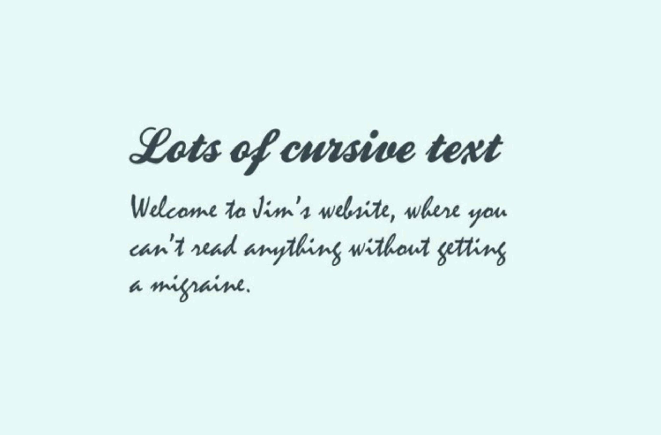
Too-much cursive text
We know that calligraphic fonts are popular now. According to the Font meme, Calligraphy fonts resemble elegant handwriting.
Burgues Script created by Alejandro Paul is a typical font family of calligraphy style.
According to the designer, the font is an ode to the late 19th-century American calligrapher Louis Madarasz, known as “the most skillful penman the world has ever known.”
But using that one-type font for all designs is just too much. Not only it makes your design uncomfortable to look at. Cursive is good and it gives your design a unique vibe if you use it right.
Do this instead:

For that, I only need one sentence to tell you. Choose one cursive font that is readable, and don’t overuse it!

It is intended to say “Hey, look at me! I have some important information!”. Well, it’s actually easy to use and instantly recognizable. The problem is, it’s not so nice to look at anymore.
Do this instead:

While there’s nothing worse than an invasive pop-over to promote a sale or discount, putting some thought into a stylish and well-designed solution can work well.
Dramatic drop shadows
The story here is the same as that of the bevel. That Photoshop “Drop Shadow” layer style is just begging to be played with.

If you start by tweaking the default effect, you’re likely to come up with something like that.
Do this instead:
If you like the soft, feathered edge look, try blending the shadow in with the background so that it serves to make the text a tad more realistic without being a major distraction.
Another shadow treatment that’s popular right now harkens back to the days before it was common to use soft shadows.
This effect uses a non-feathered drop shadow that has a little bit more of a retro feel.
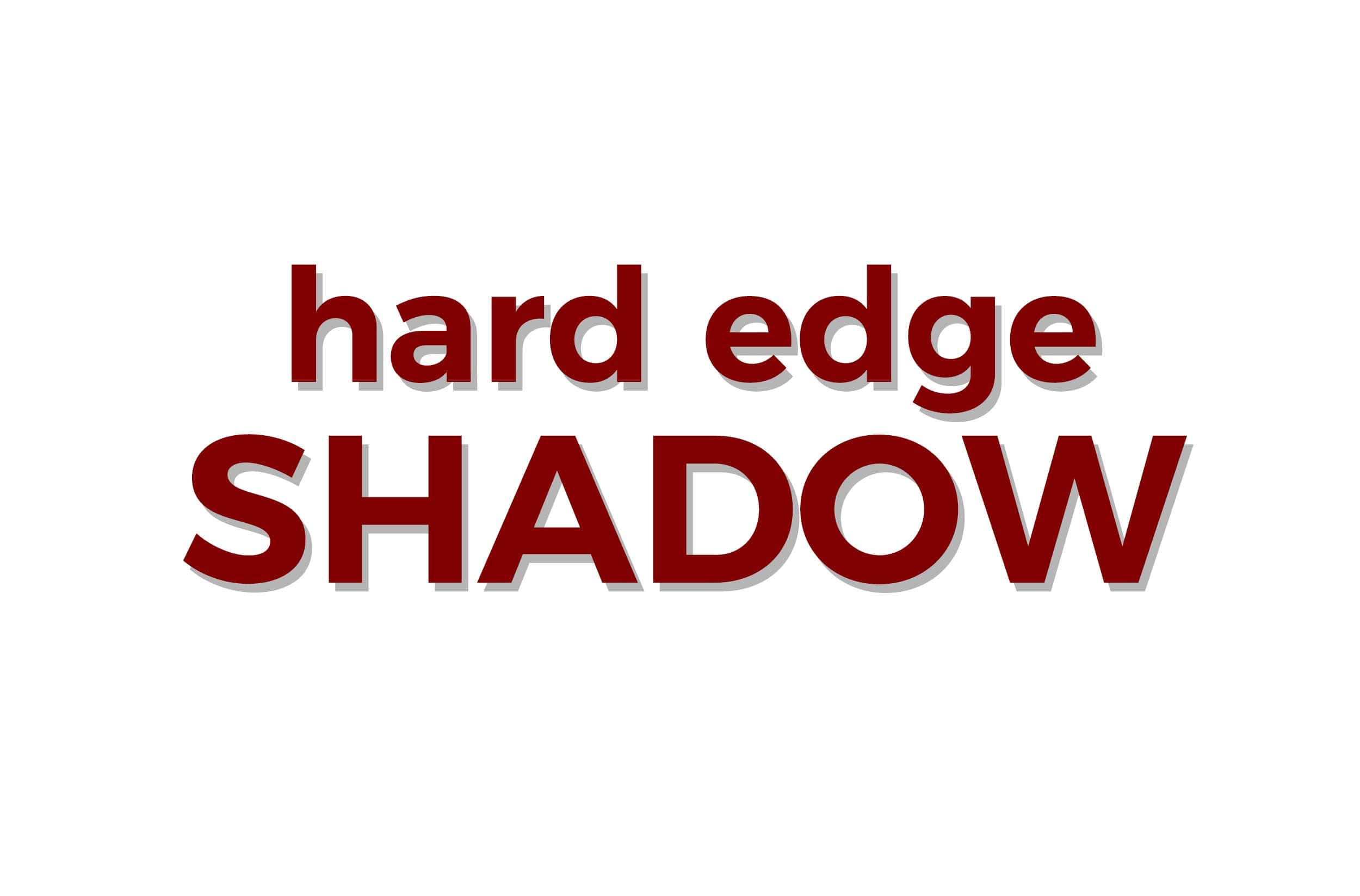
You can take this a step further by layering the shadow with a knock section in between the shadow and the text.
Closing
Well, the Design Trends That Aren’t Cool Anymore above is also applicable to Presentation Template too. Just like graphic design, presentation design trends are changing every time.
Let’s visit RRSlide to download free PowerPoint templates. But wait, don’t go anywhere and stay here with our RRGraph Design Blog to keep up-to-date on the best pitch deck template collections and design advice from our PowerPoint experts.


